Redefining Care for a New Generation: The Blueyoung Transformation
从蓝丝带到Blueyoung:打开年轻认知的入口
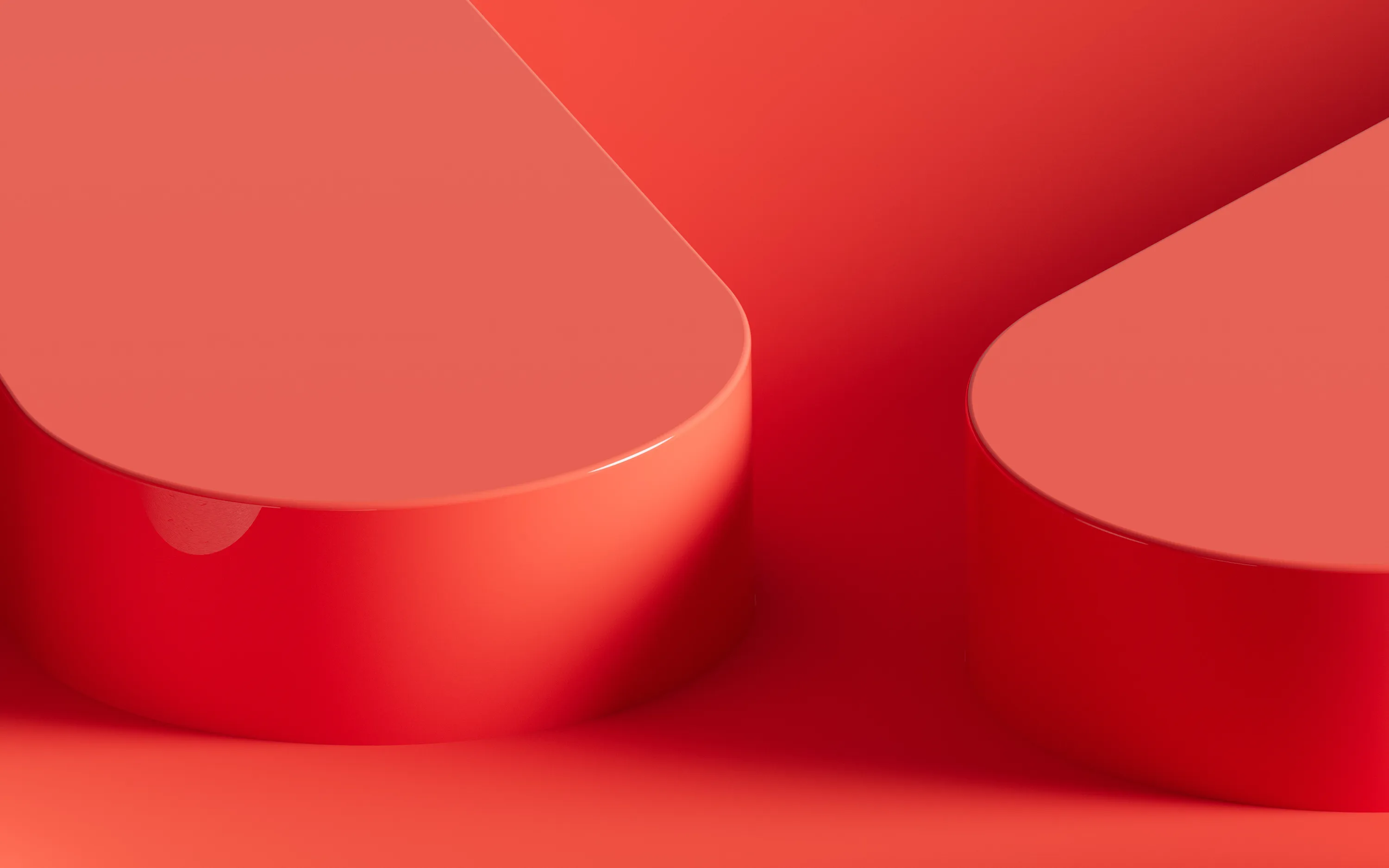
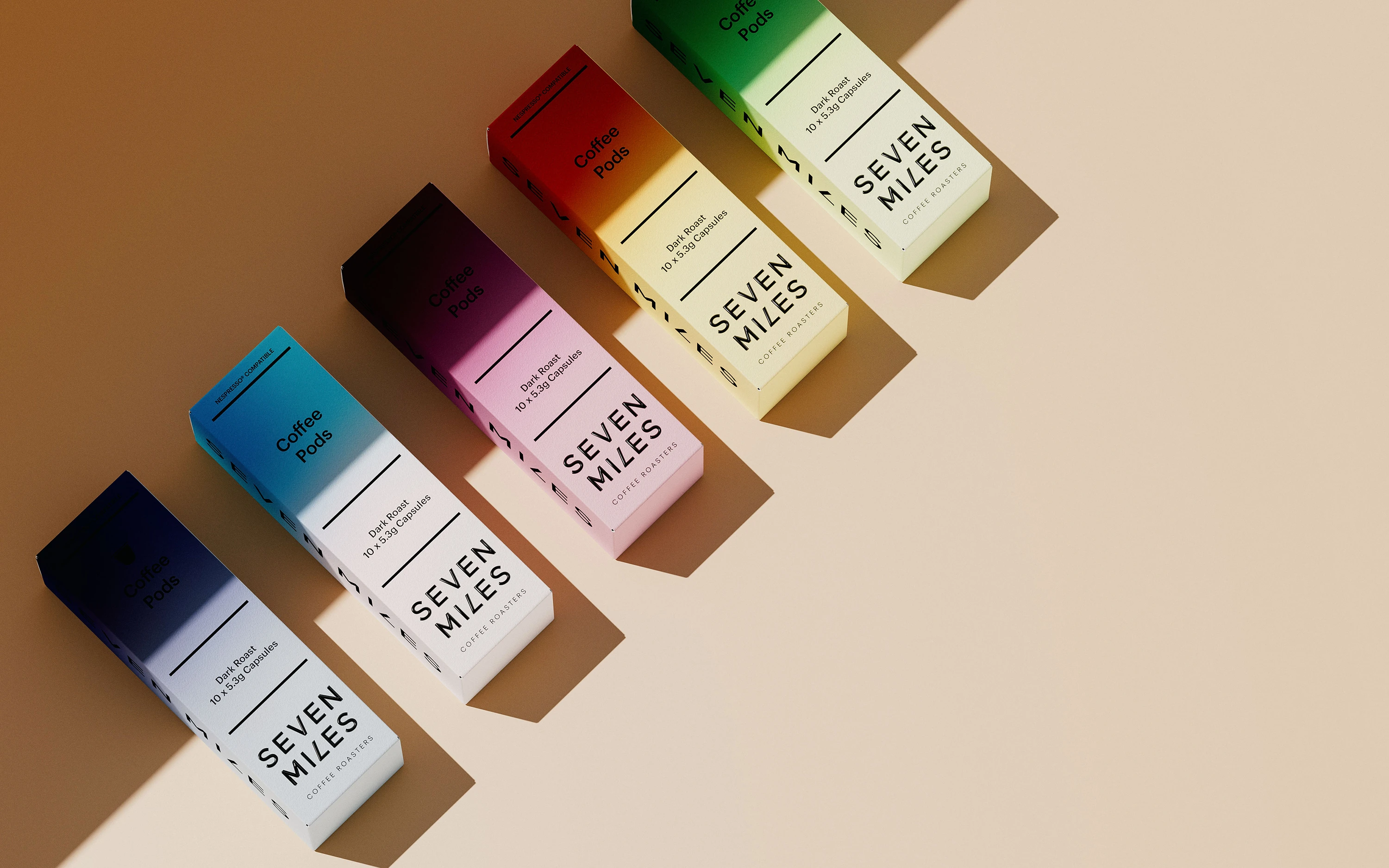
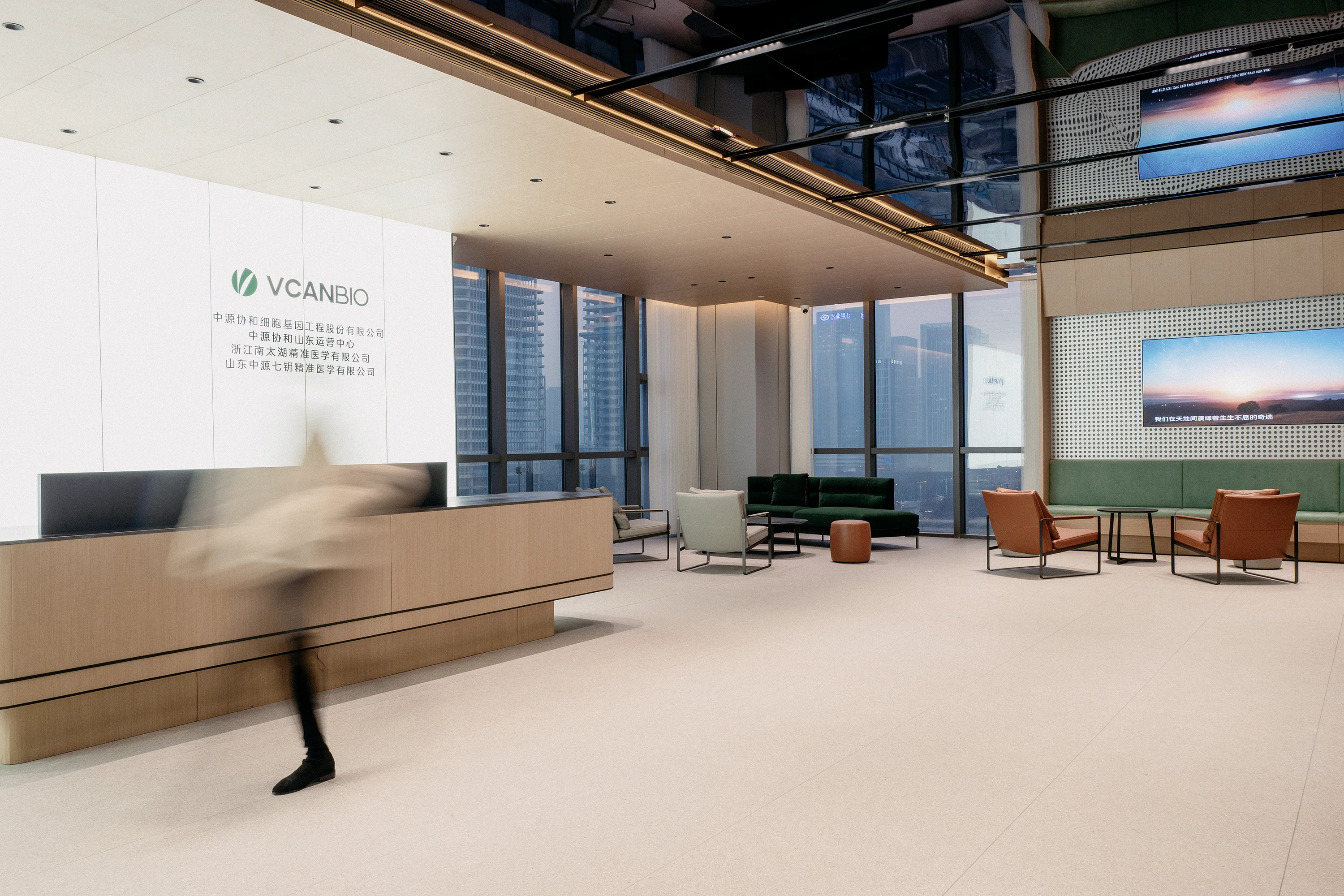
Blueyoung, formerly known as Blue Ribbon Clinic, underwent a complete rebranding to resonate with a younger generation seeking freedom, empathy, and authentic self-expression in aesthetic experiences. Facing a widening gap between brand language and youth perception, we redefined the brand from the inside out. The new identity revolves around the concept “Beauty, freely becoming,” using a fluid ribbon-fish symbol to embody care, lightness, and individuality. The custom logotype features a lowercase, sans-serif wordmark with softened geometry, ensuring high readability and a modern emotional tone. This visual system expands consistently across digital, spatial, and communication interfaces — creating a cohesive, young, and trustable brand experience.
Blueyoung蓝丝带年轻诊所的品牌升级项目,源于传统“蓝丝带”医美品牌希望与Z世代用户建立更直接、真实的情感连接。在年轻消费群体审美不断演化的当下,旧有形象与表达方式逐渐失效,品牌急需完成语言、视觉与空间体验的整体重构。我们以“美,自由发生”为核心理念,提出全新的品牌命名与超级符号系统,构建以“蓝丝带+小鱼”为基础的视觉语言,将“被看见的温柔关爱”转化为品牌主张。标志系统采用低区分度Sans Serif字体设计,小写、流动、识别性强,延伸出完整而统一的视觉表达系统,从品牌精神、语言、触点体验到空间美学实现整体焕新。在Blueyoung的全新品牌进化中,视觉系统不仅是表象的改变,更是品牌精神与策略的直观表达。我们以极简而富有生命感的图形语言重构品牌符号,用更具识别性的标志、更有温度的色彩体系、更年轻化的字体风格,完成了一次从理念到感知的全面升级。
- 品牌VI系统识别设计
- 品牌策略设计
- 店面空间设计


Background
The Blueyoung rebranding project stemmed from the legacy “Blue Ribbon” brand’s need to connect with a younger, freer generation. As aesthetic consumption shifts from function to emotion, the brand faced outdated visuals, a singular message, and fragmented touchpoints. A bold transformation was necessary to stay relevant.
Blueyoung品牌升级的背景源于“蓝丝带”传统医美品牌希望打破原有形象,与更年轻、更自由的受众建立情感连接。随着医美市场从功效主导向情绪驱动转变,Blueyoung面临“视觉语言过时、理念表达单一、体验触点不统一”等问题,迫切需要一次面向未来的品牌重构。


Challenge
The core challenge was to retain the symbolic warmth of the “blue ribbon” while translating it into a design system that speaks to Gen Z. The new brand had to break away from cold, clinical aesthetics and move toward an emotionally warm, trustable, and visually cohesive identity — across naming, symbol, tone, and spatial language.
如何在保留“蓝丝带”关爱精神的同时,构建一个符合Z世代语言的品牌体系,是项目最大的挑战。品牌需要摒弃传统医美冷感表达,转而打造一个更轻盈、更有情绪温度、更可信赖的整体认知形象,涵盖命名、标志、色彩、语言与空间的全方位升级。


Solution
RDA introduced the new name “Blueyoung” with the central idea: “Beauty, freely becoming.” A new visual symbol — a hybrid of a ribbon and a fish — was created to represent fluid youthfulness and gentle protection. The custom sans-serif, lowercase logotype features distinct letter treatments for memorability. This cohesive system extends across brand visuals, storytelling, and spatial experience, creating a truly unified lifestyle aesthetic brand for the next generation.
我们以“美,自由发生”为品牌核心命题,提出Blueyoung这一新命名,并设计融合“丝带”与“小鱼”的全新视觉符号系统,代表年轻状态下的流动与被守护。标志字体采用无衬线、小写结构,并在字母细节中融入独特处理,增强识别性与年轻感。整体设计贯穿视觉识别、传播语言与空间体验,构建一个既统一又富有情绪温度的“年轻医美生活方式”品牌。


RDA.Studio
Re-Define Aesthetics.
RDA specializes in brand identity, commercial space design, and digital marketing with a focus on essentialism and international design aesthetics. We create emotionally resonant brands that drive business success. Beyond design solutions, we uncover brand potential through strategic positioning and innovation, delivering lasting value in competitive markets. Whether domestic or global, RDA offers expertise to shape a promising future for your brand. Contact us to start your branding journey.
塑造品牌,定义领先。RDA以极致和国际主义的设计风格为企业提供品牌形象识别设计VI系统,商业空间设计和数字营销设计服务。塑造感动人心的品牌和体验,让品牌成为驱动商业向前的力量。辉盛不仅是设计解决方案的提供者,更是品牌潜力的开掘者。我们通过深度的策略定位和创新设计,致力于在竞争激烈的市场中为品牌塑造独特而持久的价值。无论是在国内还是国际舞台,辉盛都以其独特的视角和专业能力,为品牌的未来指引方向。 联系我们开启品牌之路: