

Skincare Branding and Packaging Inspired by Silica
ATSI Skincare Brand Identity and Packaging Design
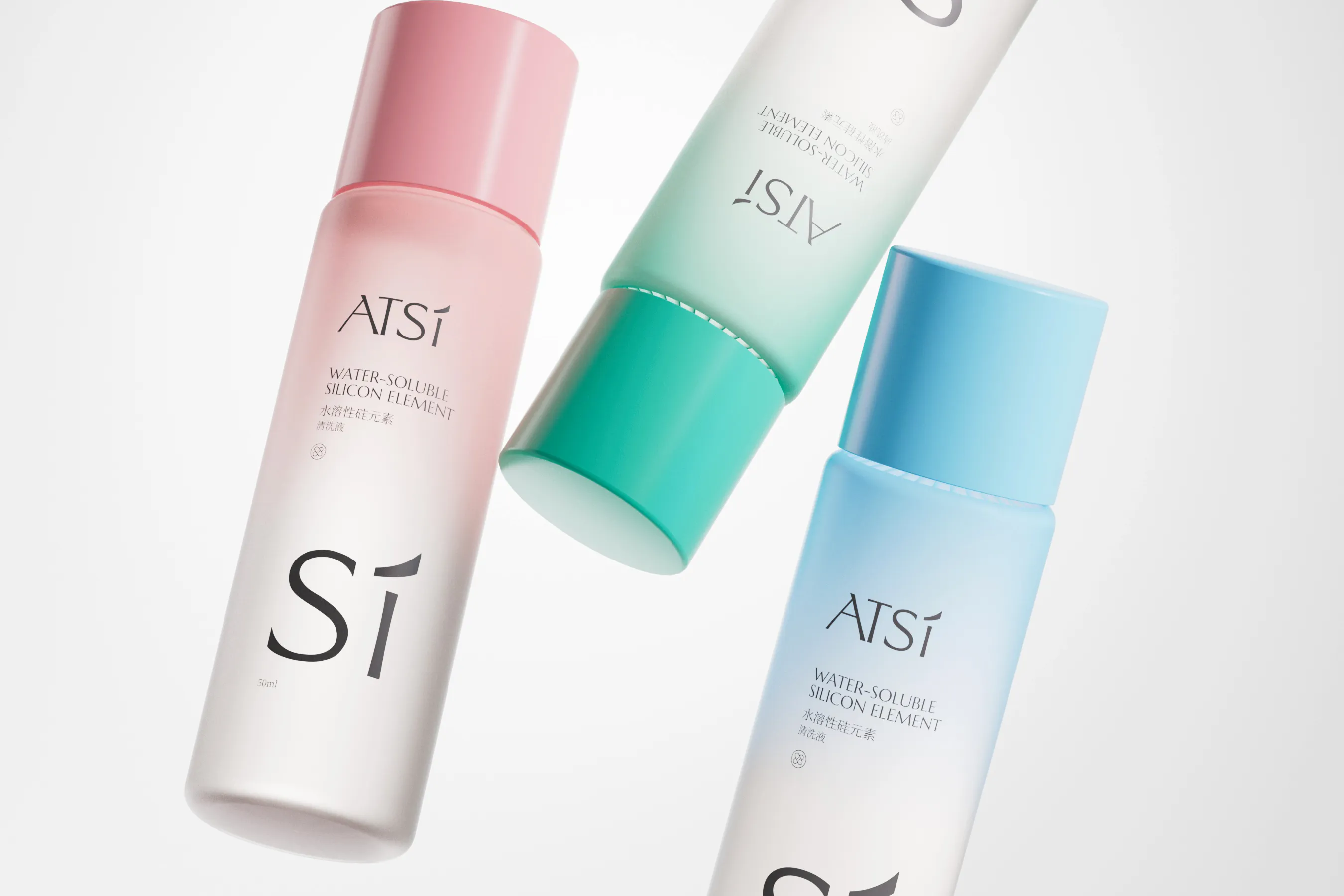
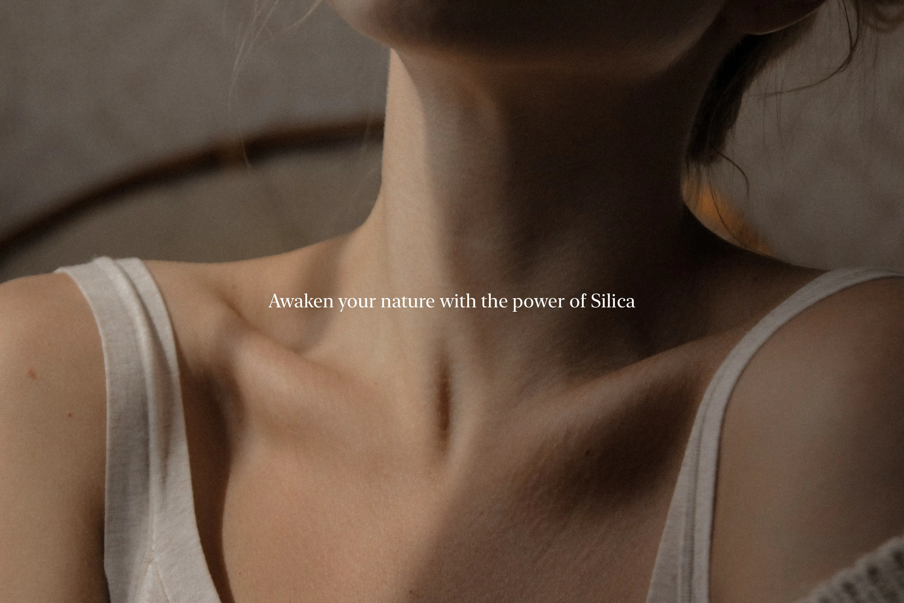
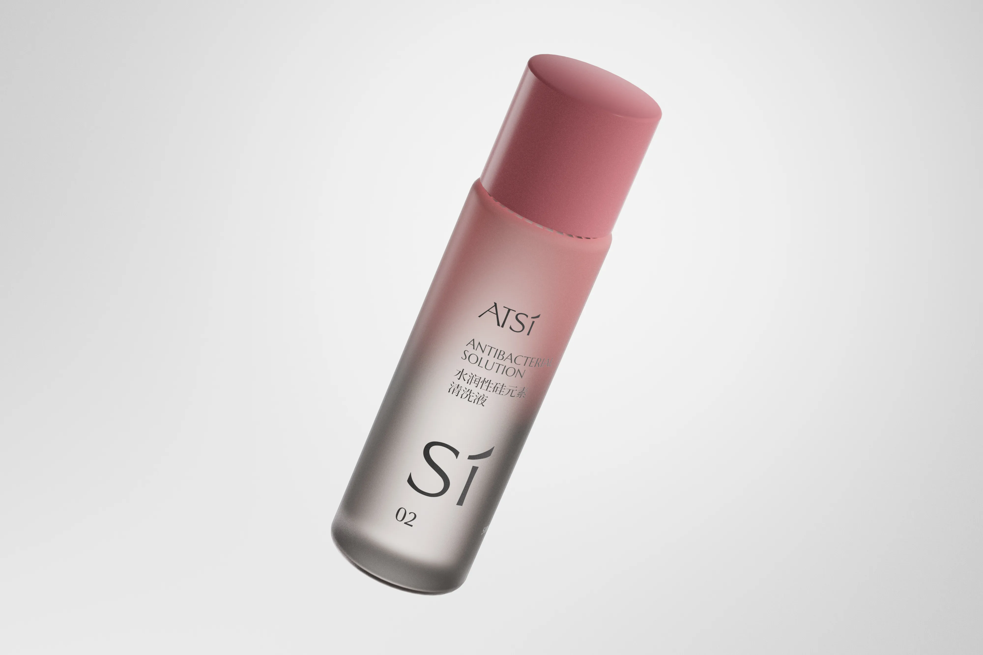
ATSI Health develops water-soluble silica applications for skincare, wellness and wound recovery products. The brand needed a coherent identity that could communicate scientific ingredients, product efficacy and professional credibility without losing consumer accessibility. RDA turned the silica structure into a distinctive visual symbol and used it to organise the wider identity and packaging architecture.
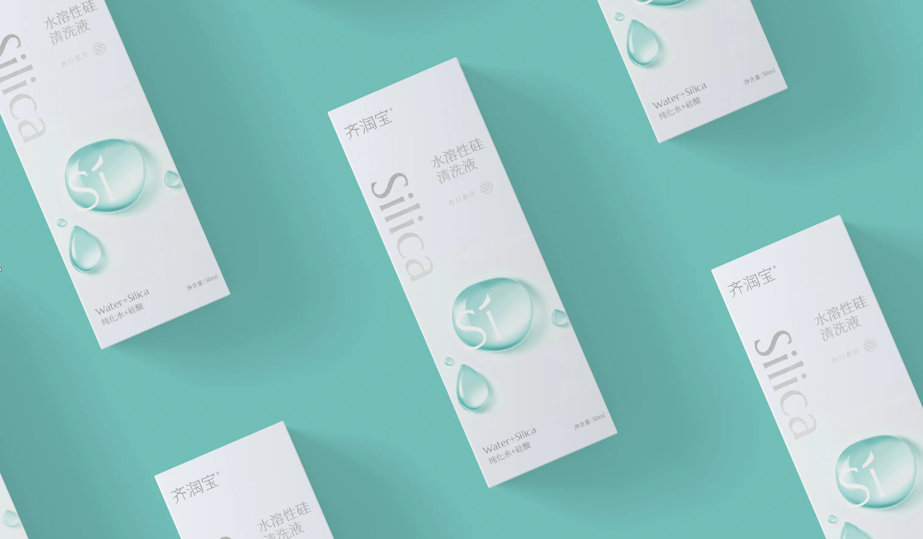
Refined typography, a calm professional palette and a consistent product hierarchy balance health-technology credibility with the clarity expected in skincare packaging. The system gives ATSI a stronger platform for product extensions, retail communication and digital content.
- Skincare Brand Strategy and Identity
- Product Packaging Design
- Brand Communication Design
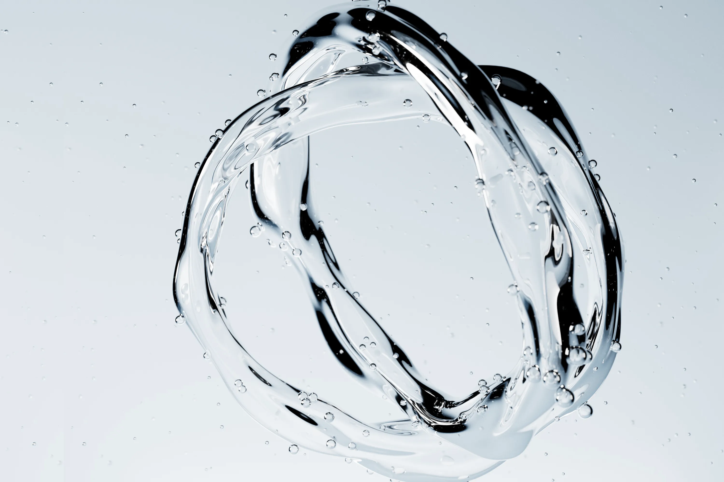
Silica-Powered Brand
ATSI Health specializes in water-soluble silica applications within the wellness and skincare industries. The brand sought a comprehensive visual transformation to establish a unified identity and enhance market clarity across its product lines, including skincare and wound recovery solutions.
ATSI Health Technology focuses on water-soluble silica applications in health and wellness, with particular innovation in skincare and wound recovery. The brand needed a systematic visual transformation to clarify its market position, reinforce professional trust and improve communication efficiency across its product lines.
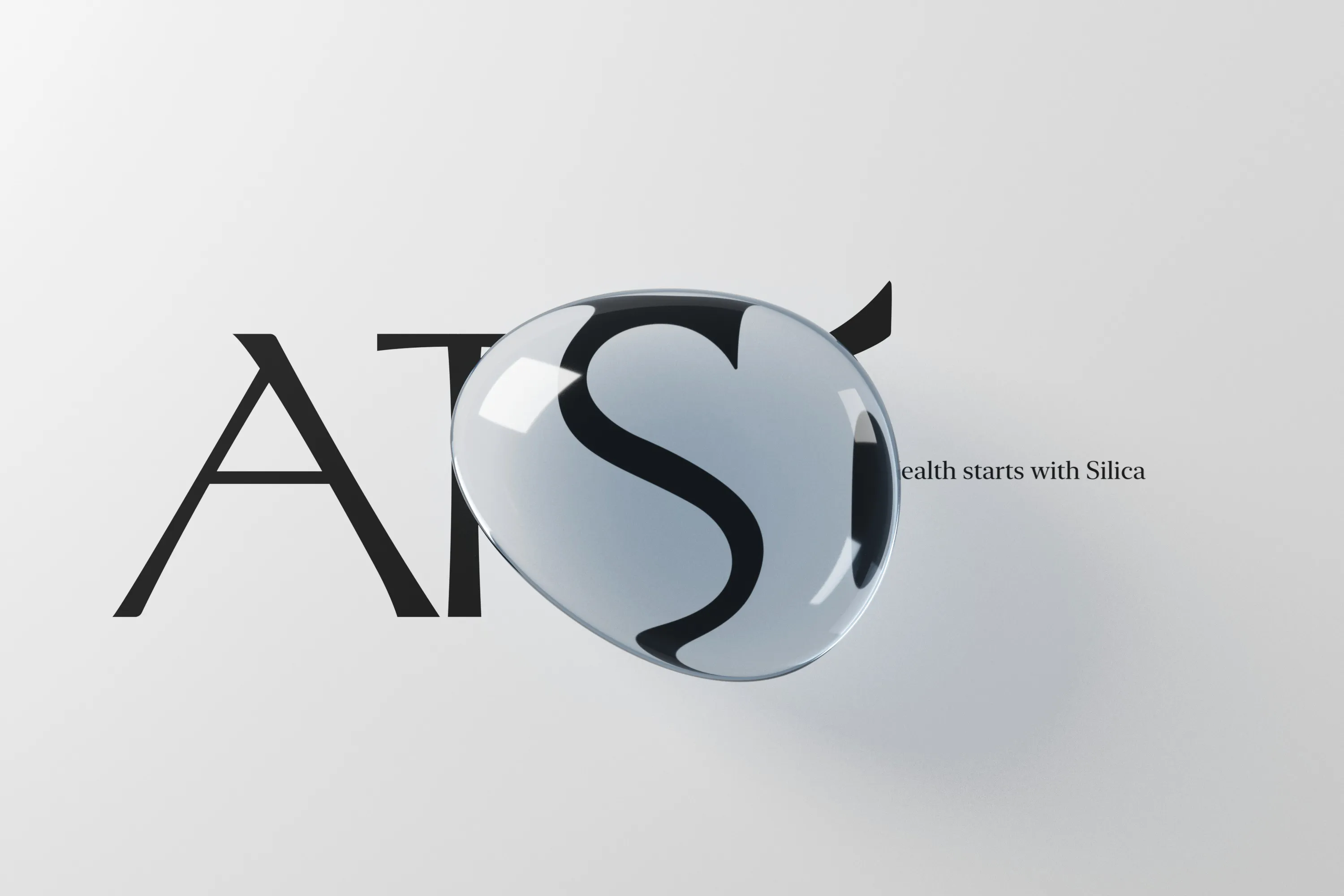
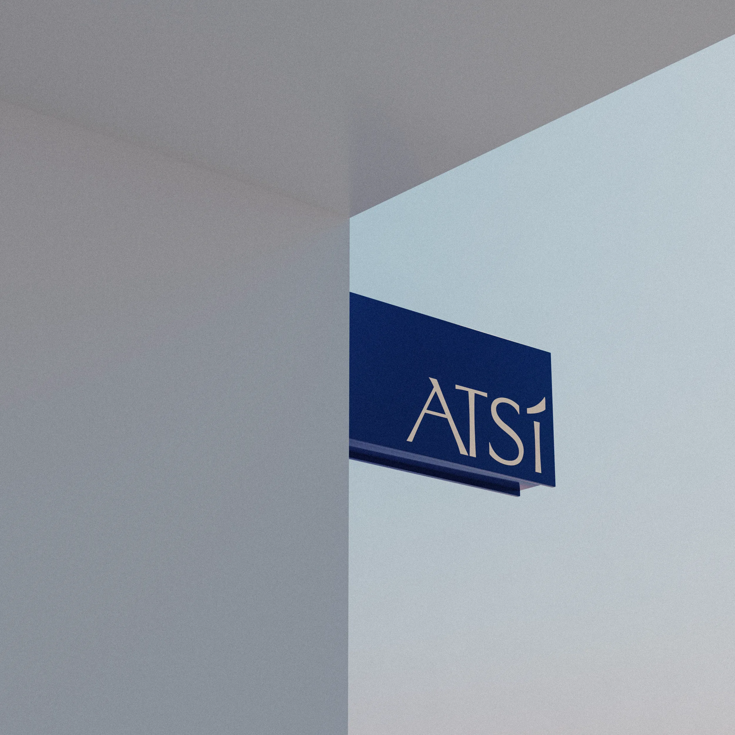
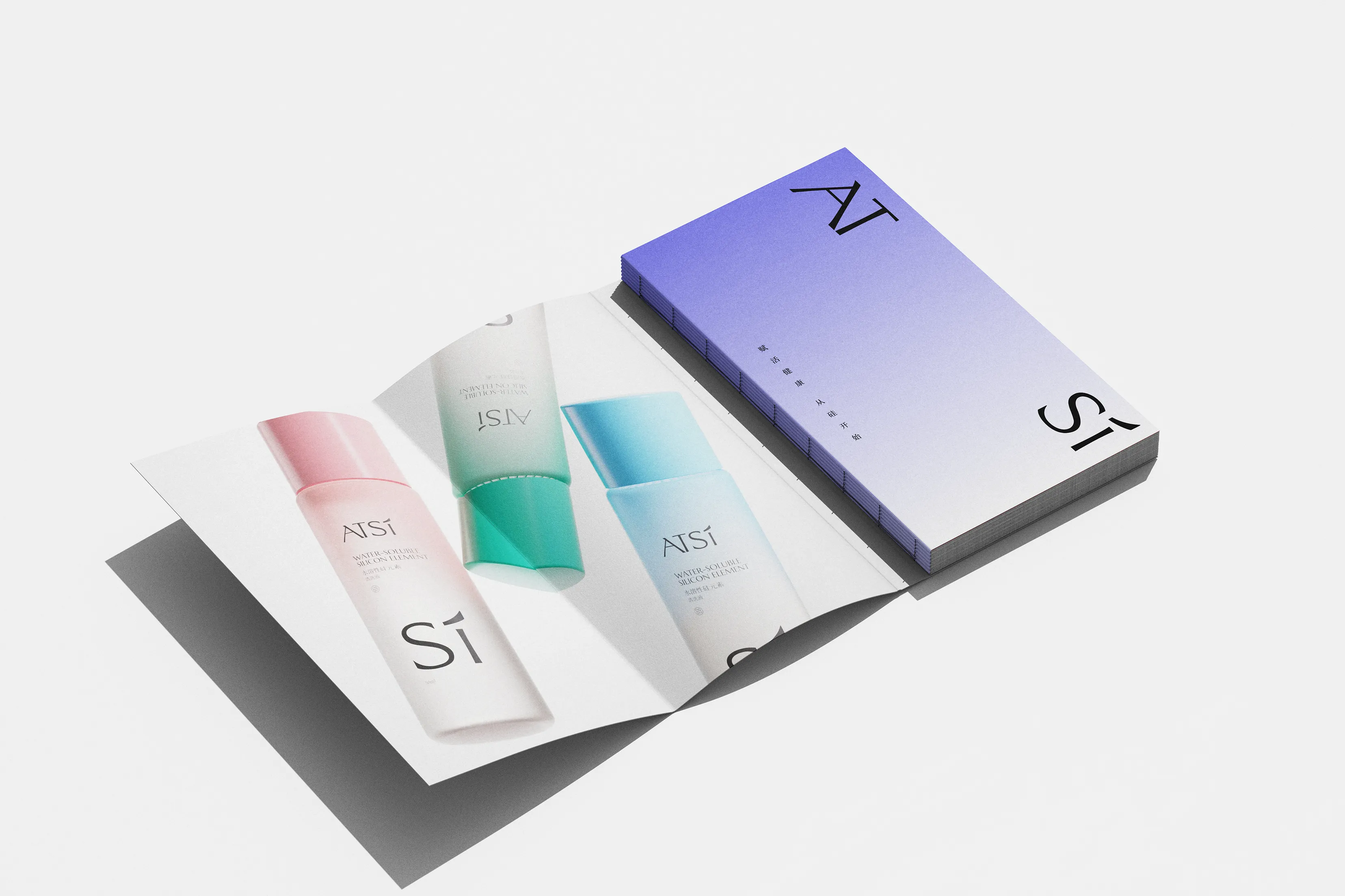
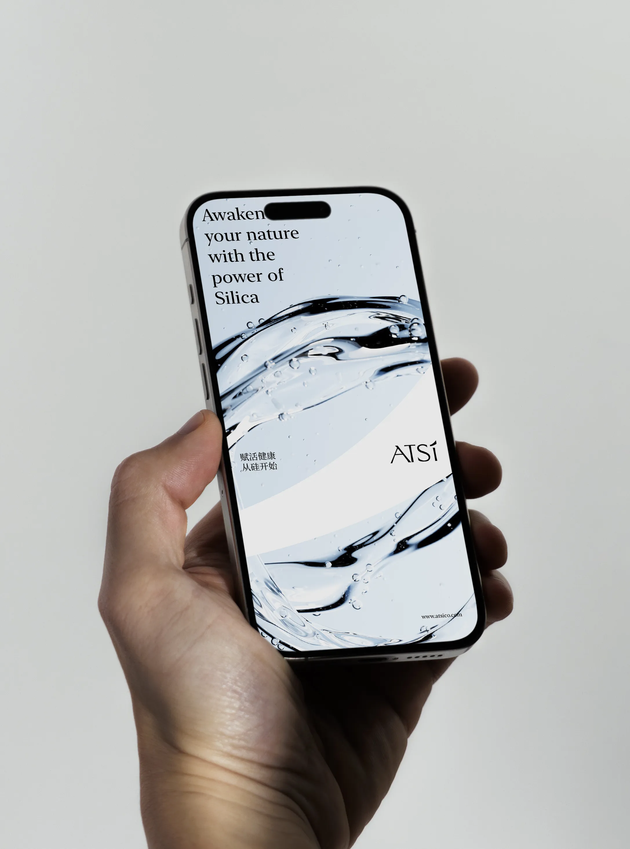
Defining a Cohesive Language
The core challenge was to build a consistent and science-driven brand language that could effectively communicate both technological innovation and consumer accessibility. The former identity lacked cohesion and failed to express the brand’s differentiated position.
The challenge was to combine technology and wellbeing into a differentiated brand structure, while balancing functional clarity and aesthetic coherence across the packaging system. The former identity was fragmented and lacked a consistent recognition framework, making it difficult to express a growing product portfolio.
Symbol-Driven Brand System
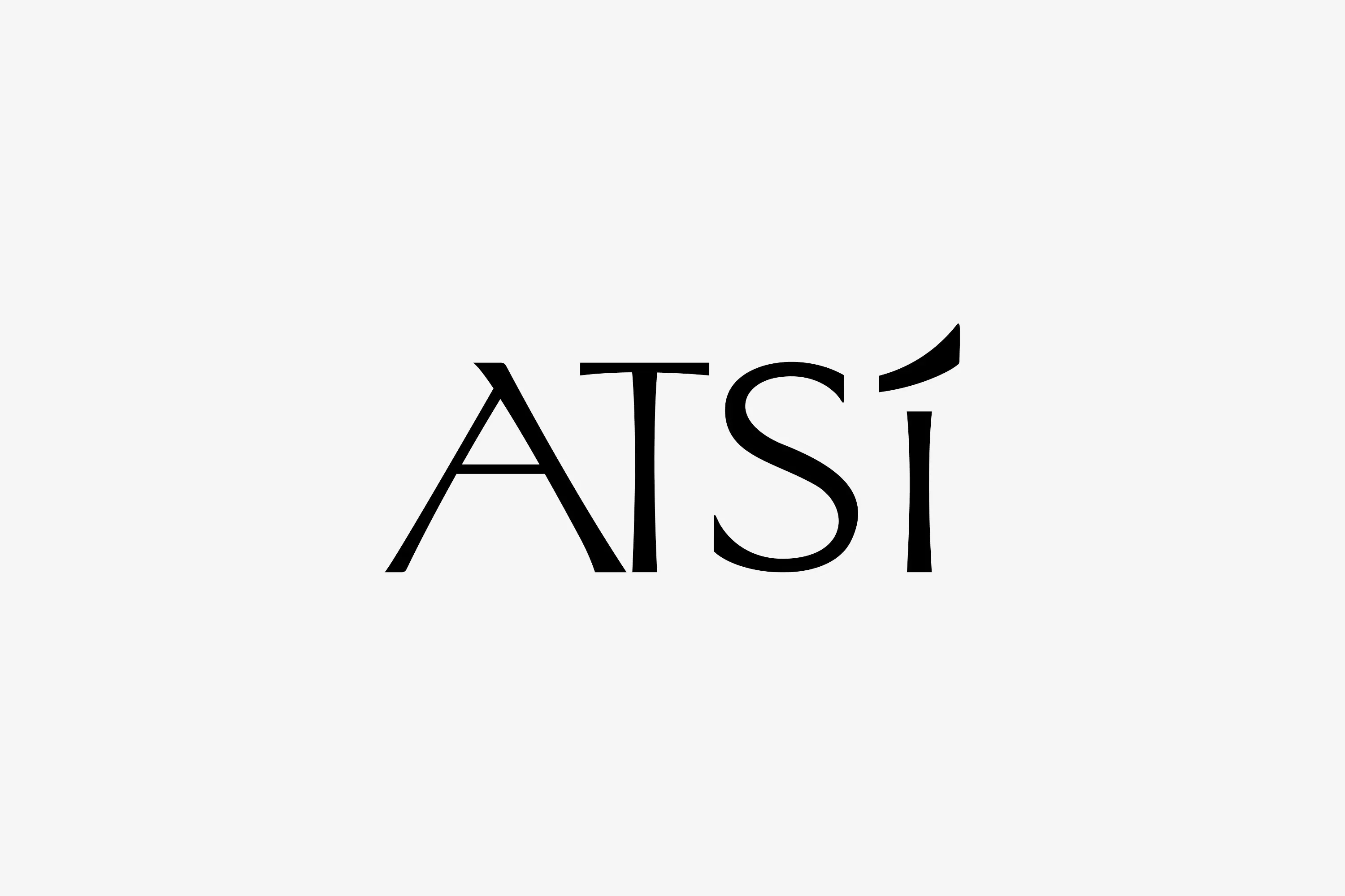
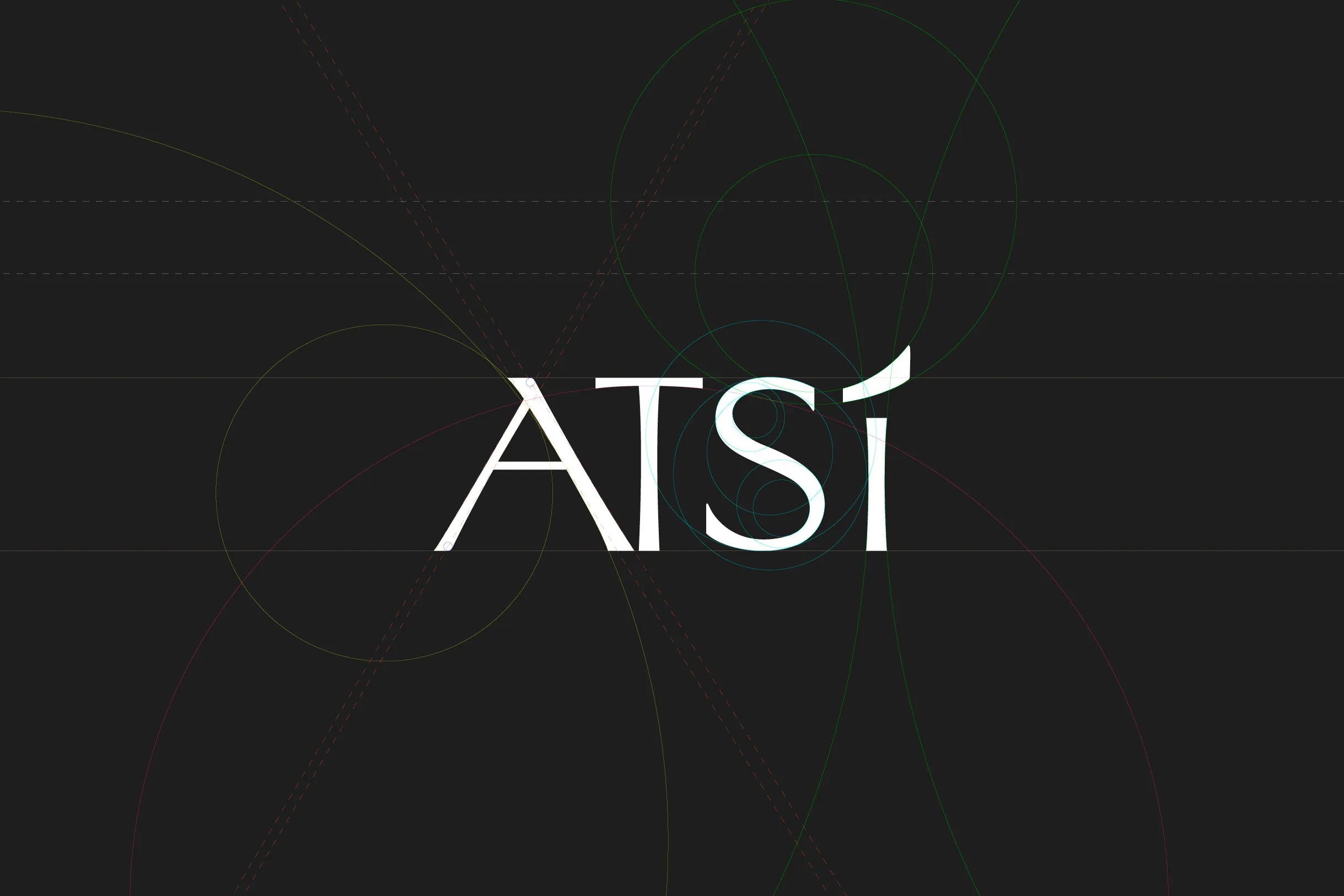
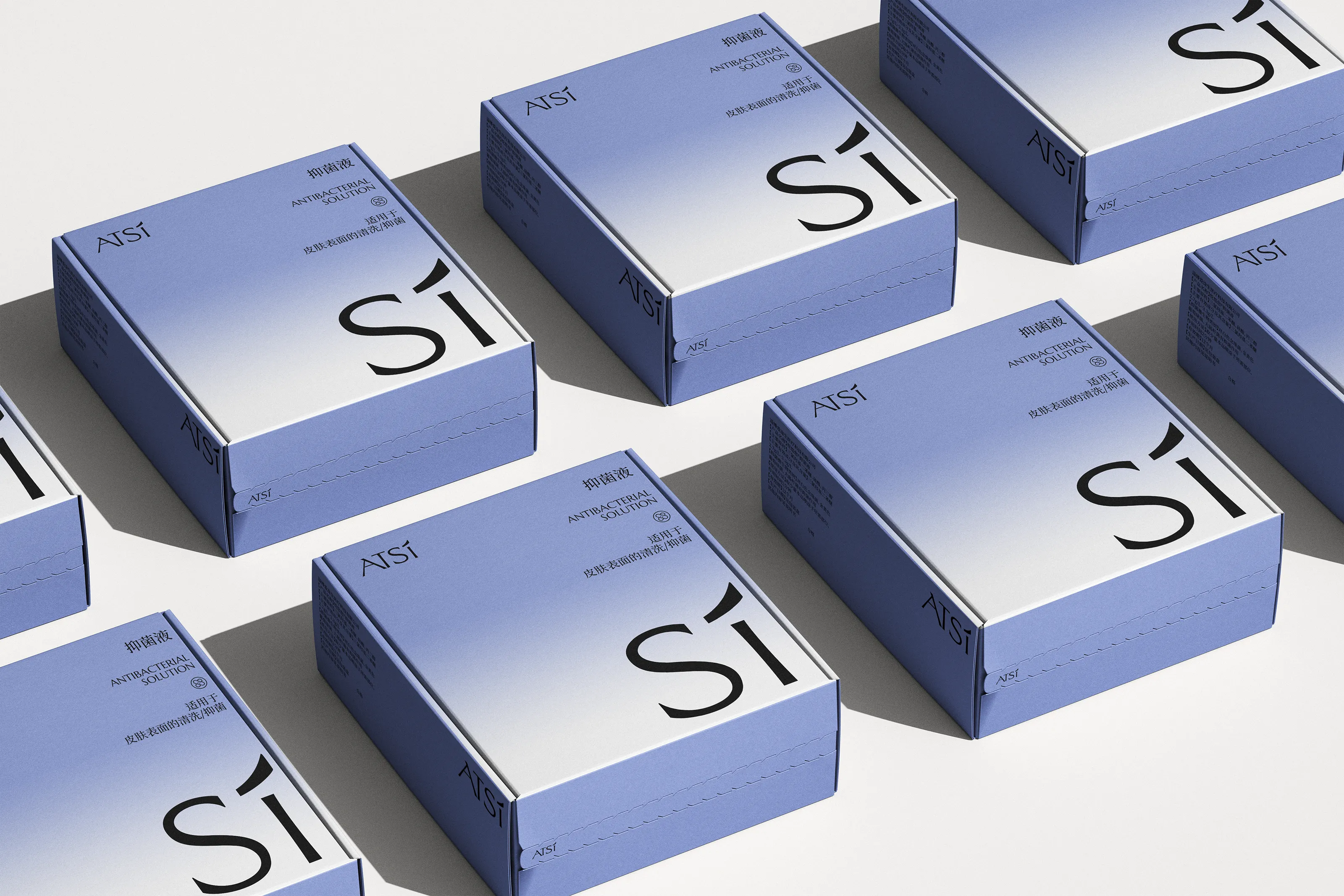
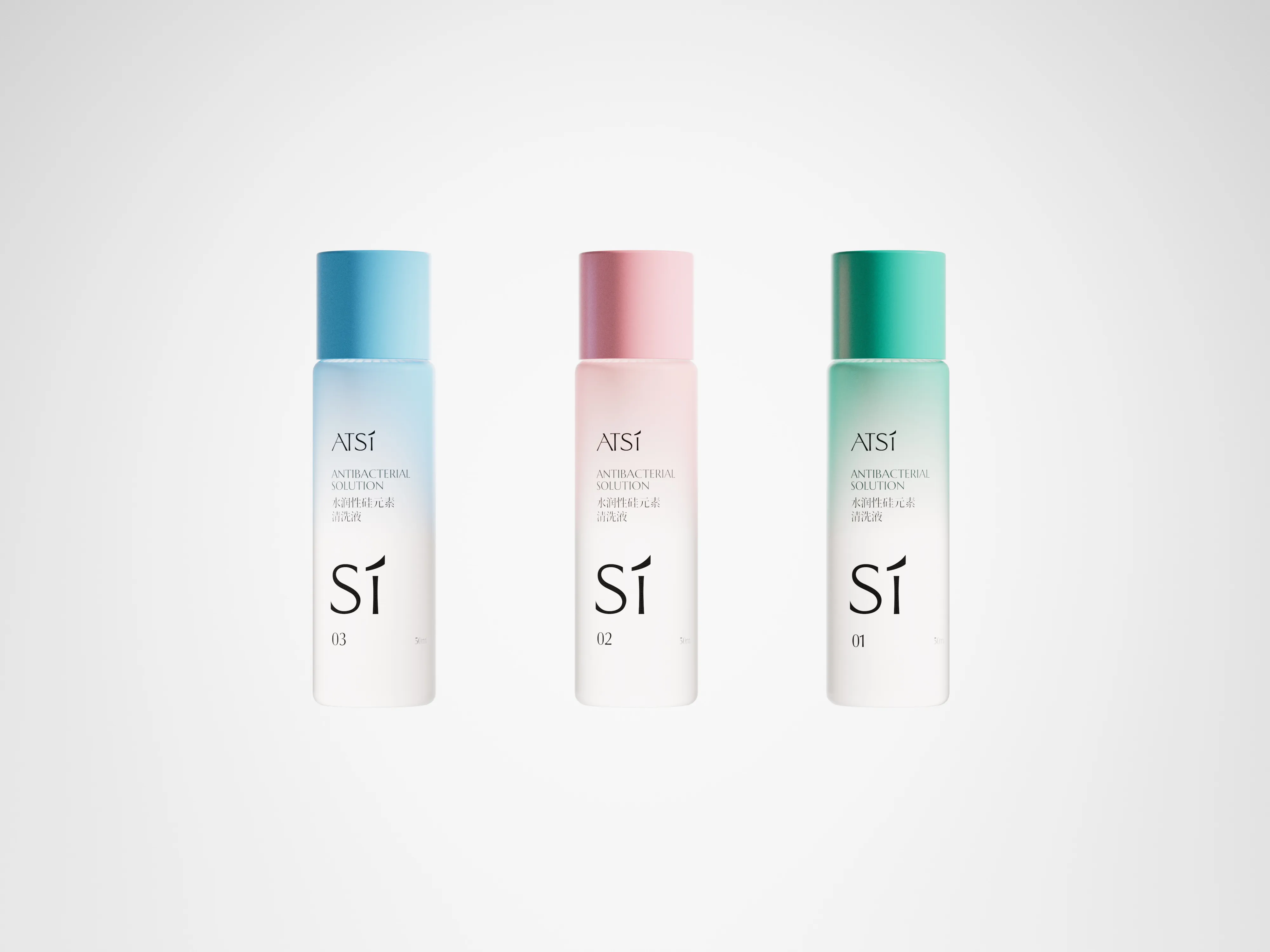
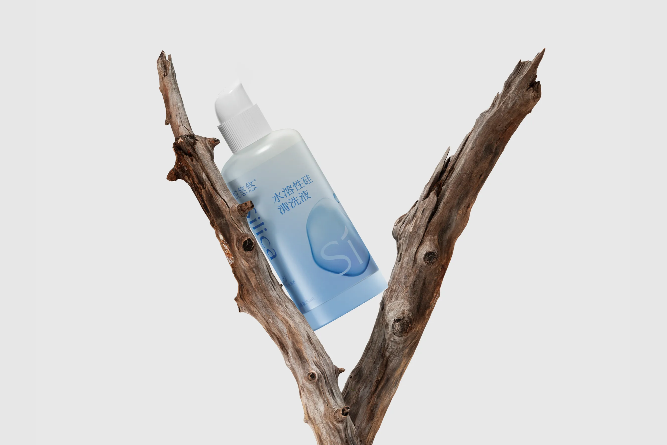
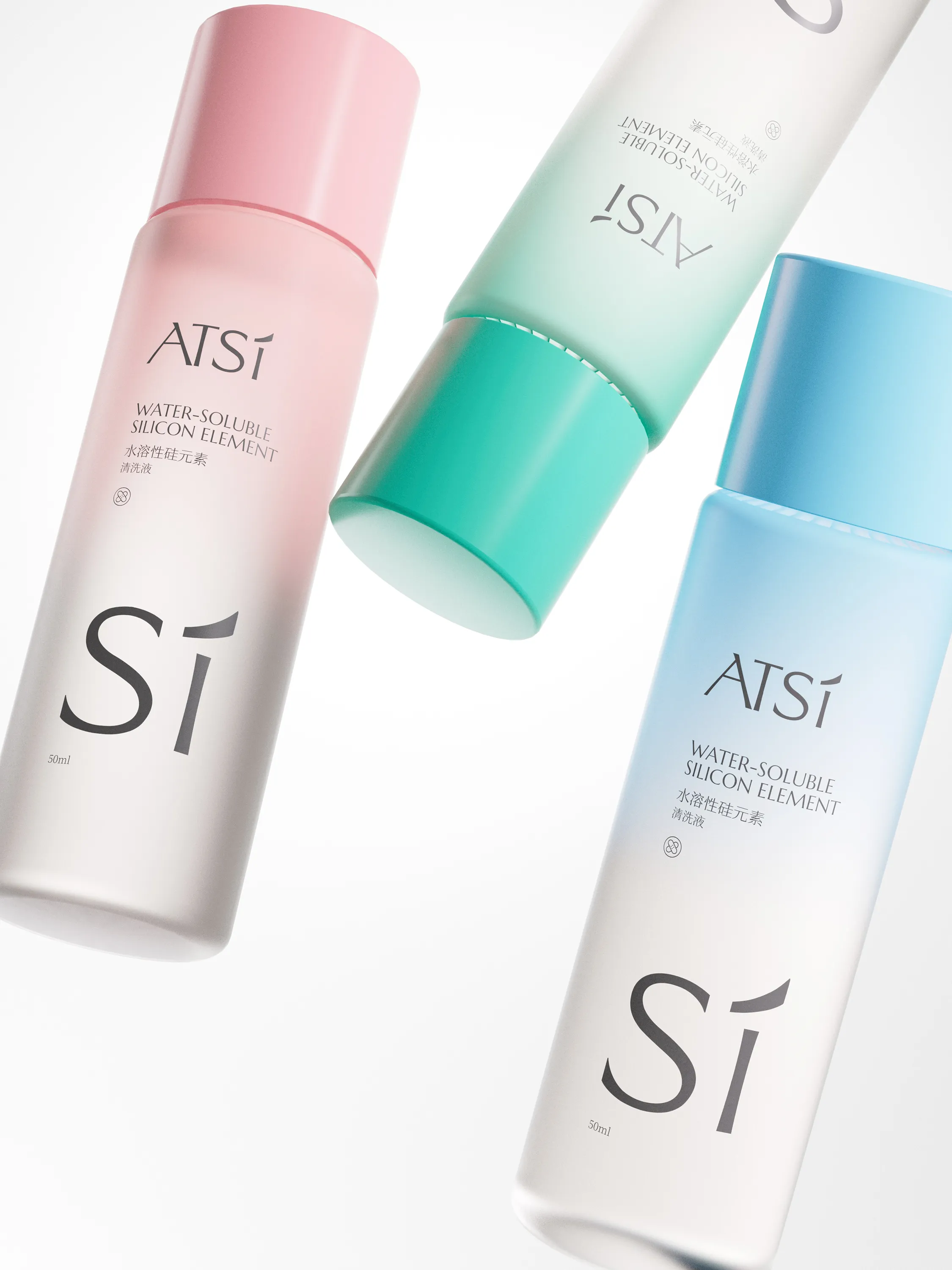
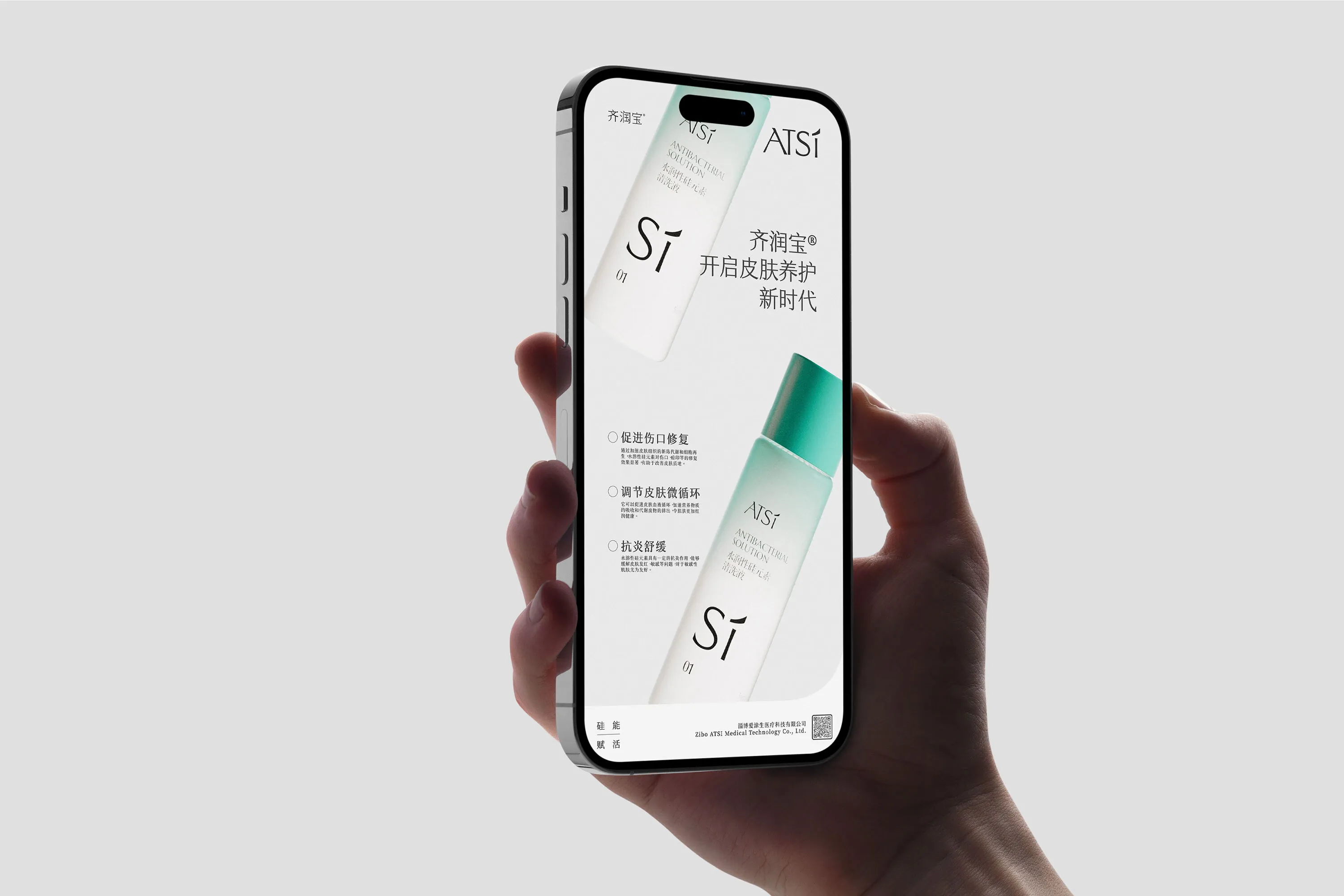
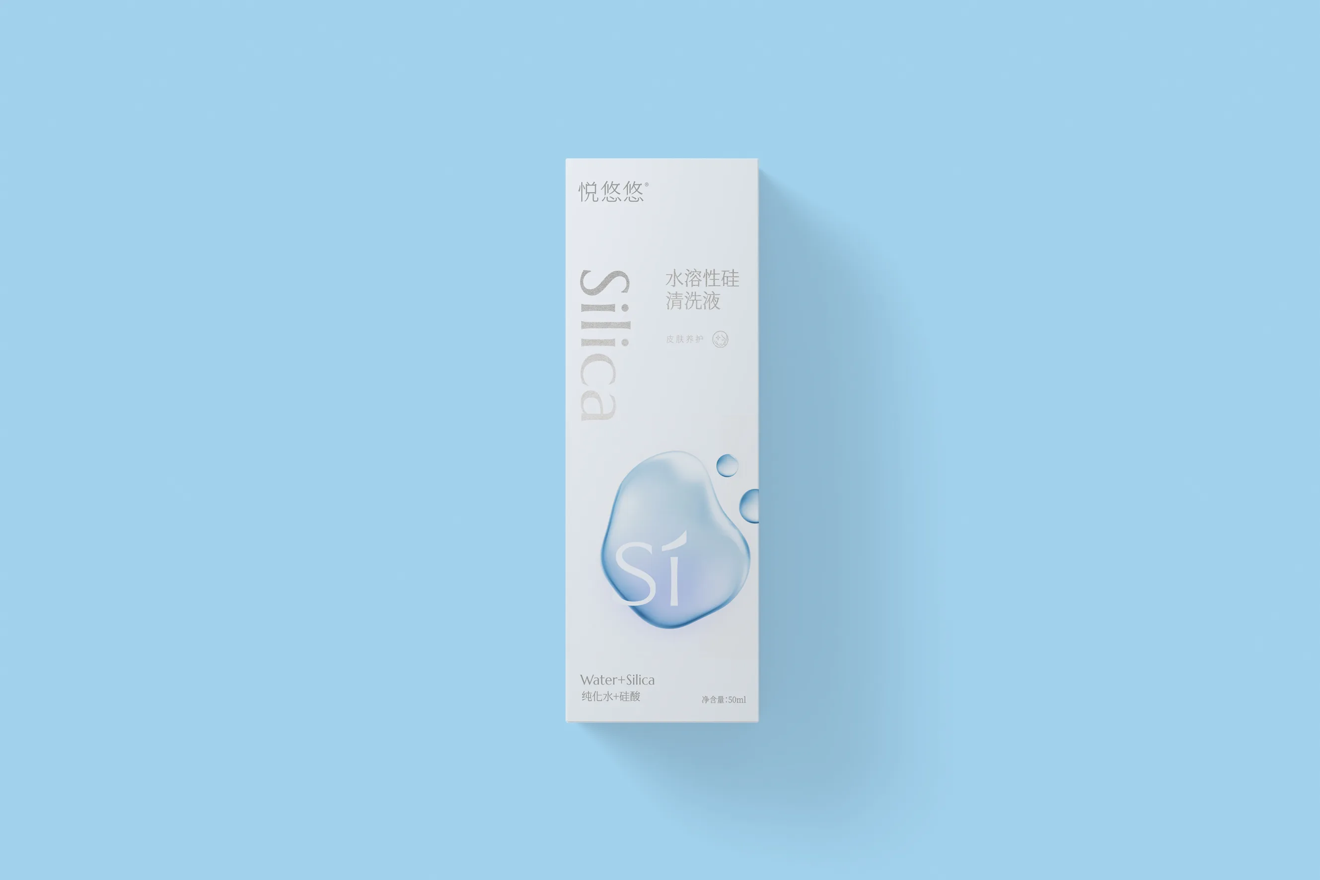
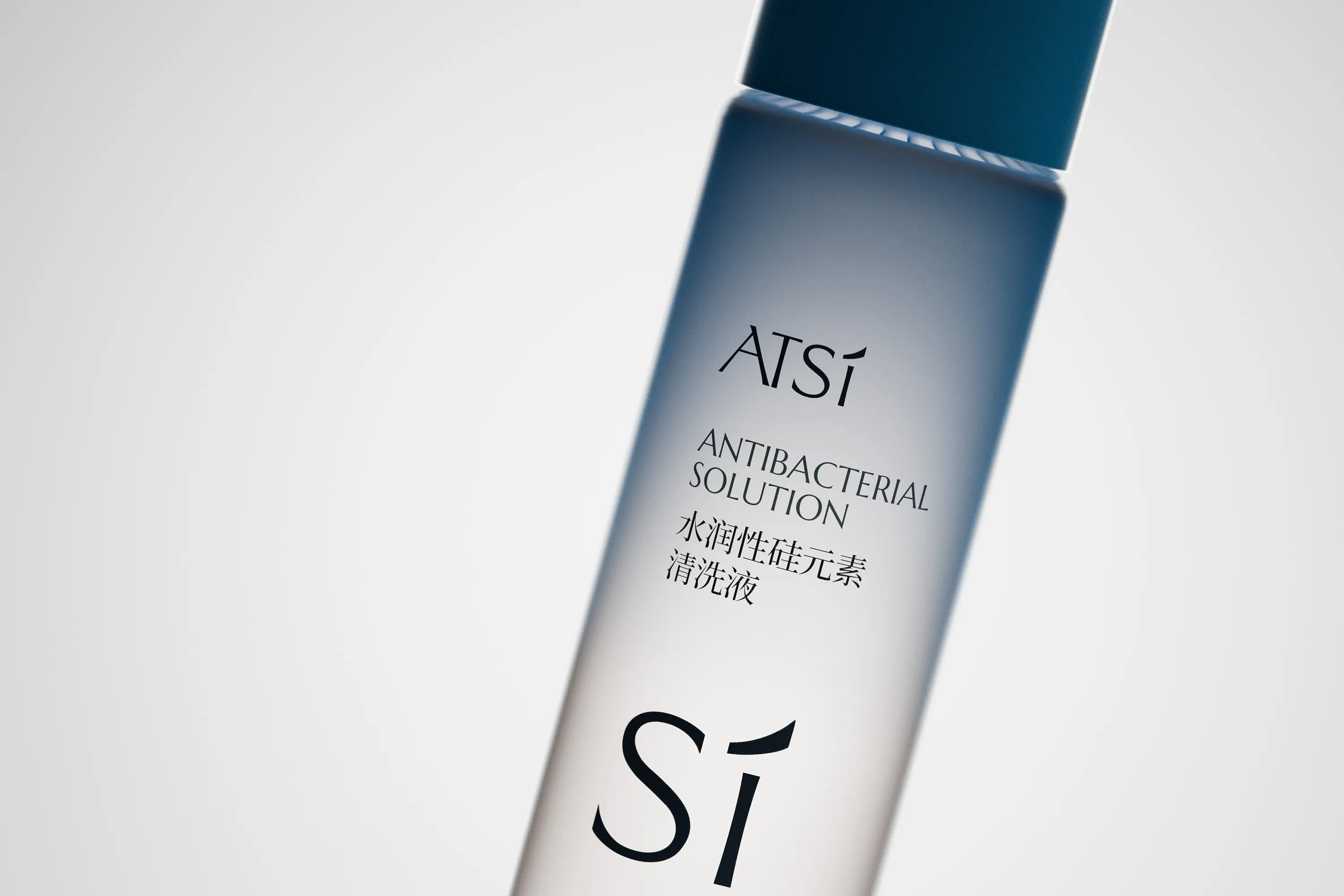
RDA addressed this by developing a silica-inspired visual identity, with the elemental “Si” motif as a brand super symbol. This was applied consistently across the visual system and product packaging. Through elegant typography, a clinically grounded color palette, and a modular packaging structure, we reinforced ATSI’s credibility as a professional and forward-thinking health brand. The result is a clear and scalable design system that transforms ATSI’s scientific narrative into tangible brand trust.
RDA made the silica visual identity the strategic starting point, building a distinctive Si motif that moves across the identity system and product packaging. Refined typography, a calm and professional colour palette and a consistent architecture reinforce the brand's credibility. The result is a clear, scalable system that turns ATSI's scientific narrative into tangible brand trust.
Empower Your Brand
Starting Now.
RDA specializes in brand identity, commercial space design, and digital marketing with a focus on essentialism and international design aesthetics. We create emotionally resonant brands that drive business success. Beyond design solutions, we uncover brand potential through strategic positioning and innovation, delivering lasting value in competitive markets. Whether domestic or global, RDA offers expertise to shape a promising future for your brand. Contact us to start your branding journey.
RDA works across brand identity, commercial space and digital communication, combining essentialism with an international design perspective. We build emotionally resonant brands that help businesses move forward. Through strategic positioning and purposeful design, we turn latent brand potential into durable value. Whether entering a domestic market or building a global presence, RDA gives ambitious companies the clarity and confidence to lead. Start a conversation with us.