A Clear Identity for the Science of Nutrition
BioSchnell: Nutrition Brand Identity and Supplement Packaging
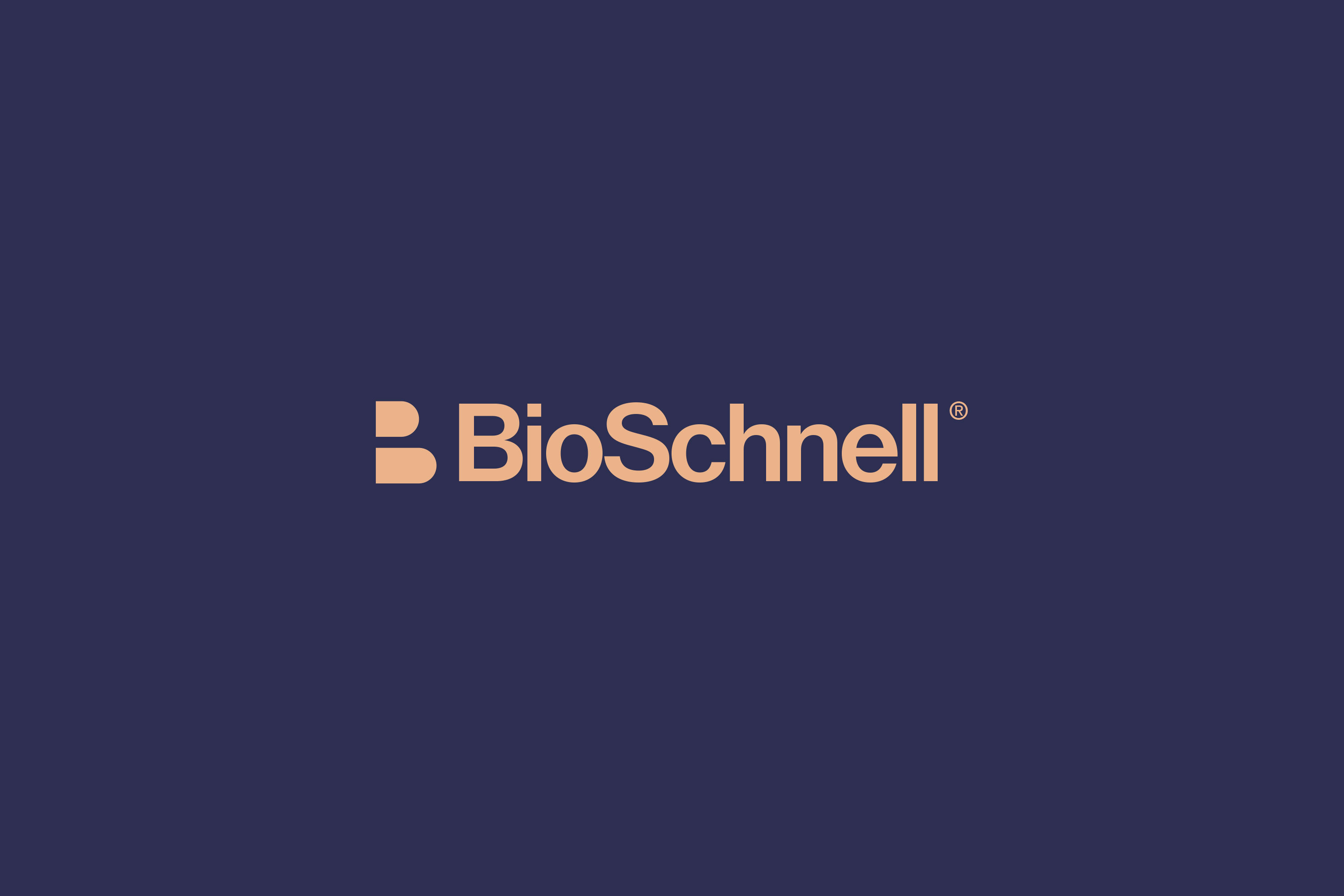
BioSchnell is a life-science and nutrition brand with a focus on emotion, nerve health and nutrition. RDA developed a visual identity and packaging language that brings scientific clarity together with an approachable human character. A distinctive wordmark, a compact geometric symbol and a coordinated colour system connect the brand across product packaging, printed communication and digital touchpoints.
BioSchnell brings together life science, emotional wellbeing and nutrition, with a product portfolio that includes nervonic acid. RDA developed an identity that gives this specialist subject a clear, approachable presence. The name combines Bio, a reference to biological science, with Schnell, the German word for fast. A custom wordmark and compact geometric symbol establish a recognisable centre, supported by consistent colour, typography and layout. The system extends across supplement bottles, presentation boxes, brochures, posters, staff materials and digital communication, giving each application a common foundation as the range develops.
- Brand visual strategy
- Logo and custom wordmark
- Visual identity system
- Nervonic acid supplement packaging
- Presentation boxes and packaging range
- Brochures and brand communication
- Digital and environmental applications
Identity in Focus
A compact symbol and a carefully drawn wordmark give the brand a clear point of recognition.
The identity centres on a restrained wordmark and geometric symbol. Stable letterforms and carefully balanced proportions give the name a professional character, while a reduced symbol remains legible across packaging, print and screens. Contrast and placement are consistent on light and dark backgrounds, allowing the identity to adapt to different surfaces and sizes without losing its structure.
A Living Visual Language
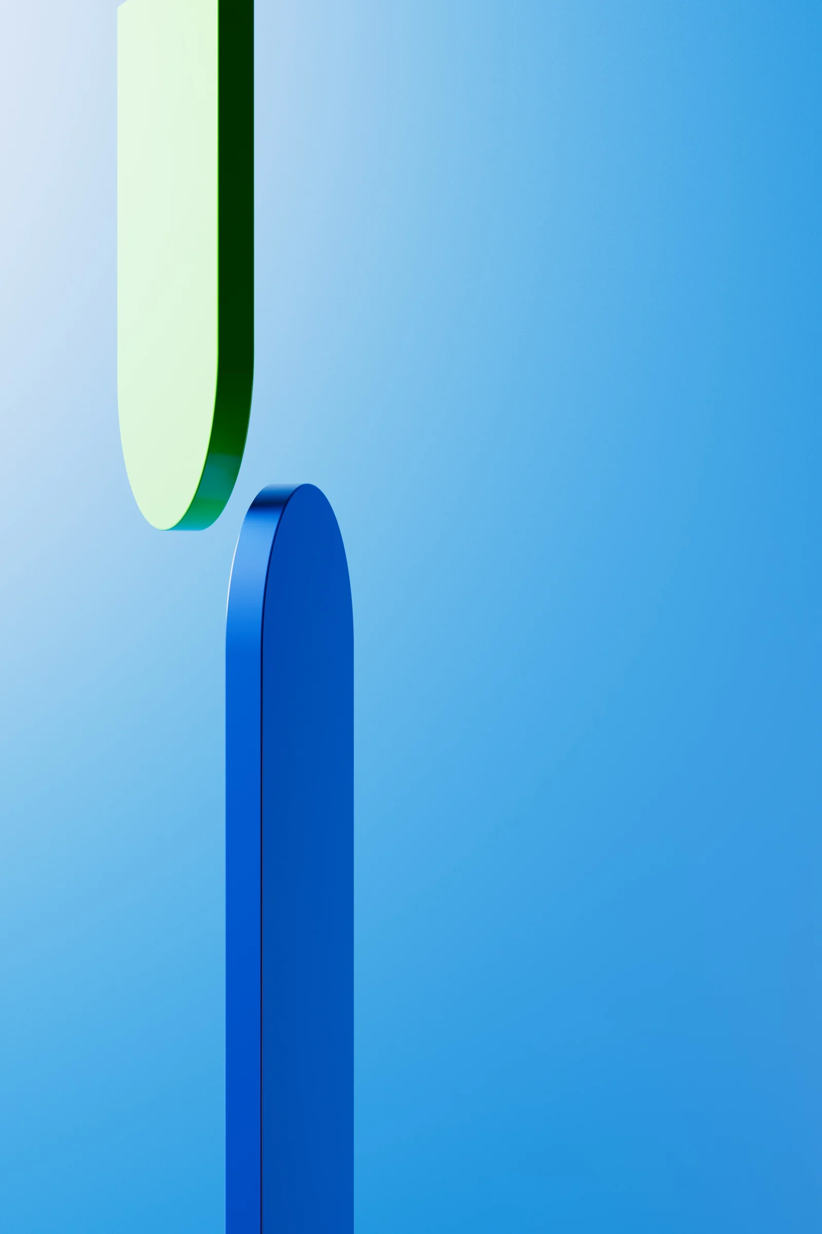
Geometric forms carry the identity into a more expressive visual language.
The supporting graphics develop the geometry of the logo into blue and green forms with layered gradients. They can stand alone as a visual focus or sit alongside people, typography and product information. Clear contours maintain recognition, while colour and depth give the life-science identity a more open, expressive character.
A Consistent Presence
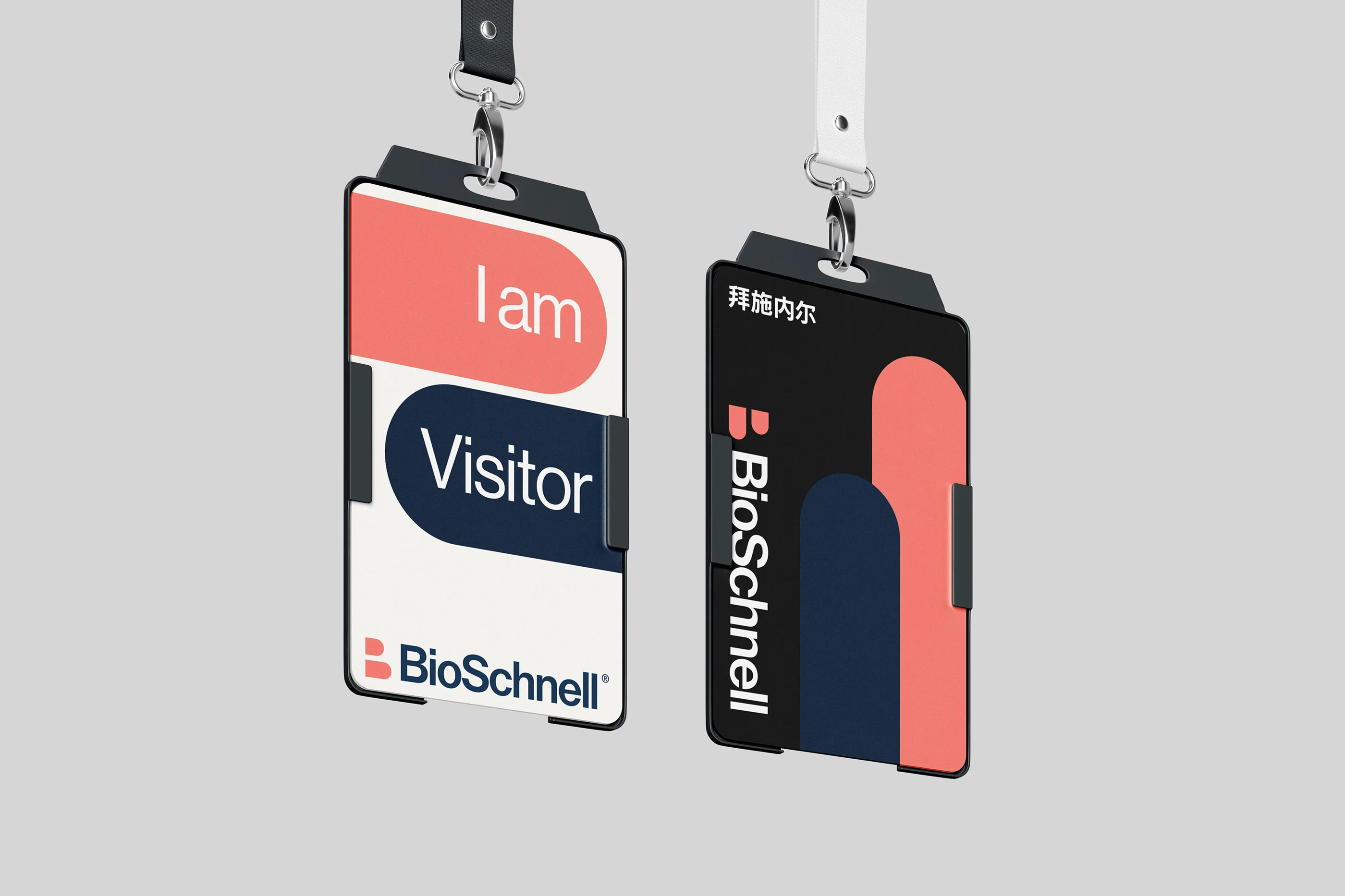
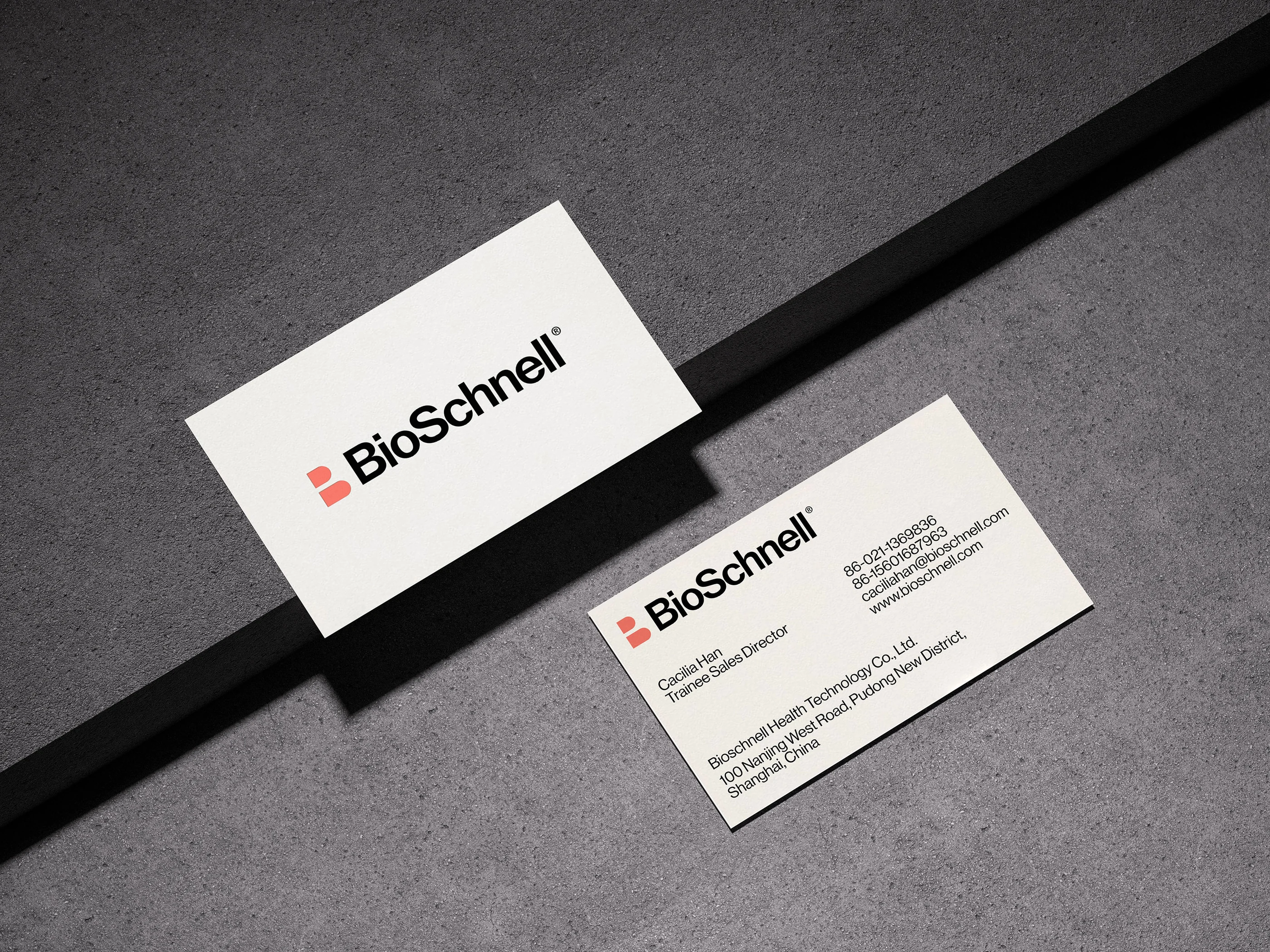
Everyday materials introduce the same identity through clear hierarchy and purposeful placement.
Staff passes, visitor badges and business cards bring the identity into everyday exchanges. RDA established shared rules for the logo, supporting graphics and information hierarchy, then adjusted their scale for each format. Names and roles remain easy to read on smaller items; larger fields of colour provide a recognisable link between internal materials and external communication.
Science, Made Legible
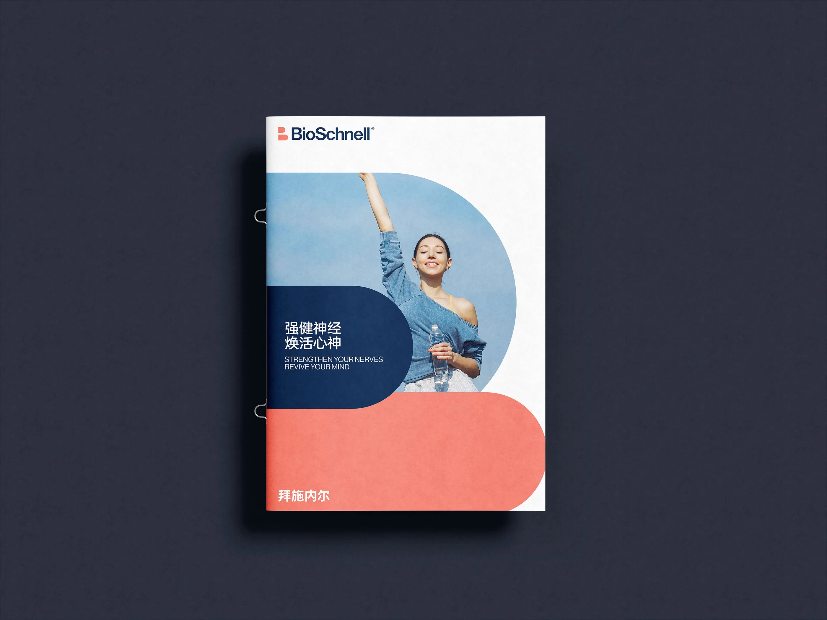
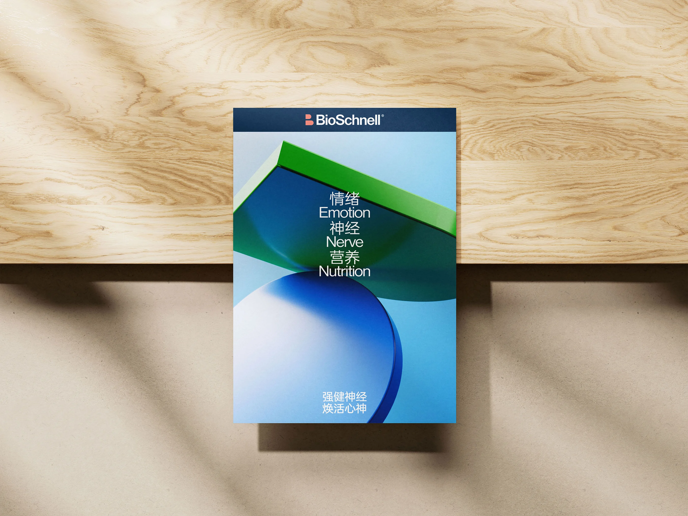
Editorial hierarchy helps a complex product story become easier to follow.
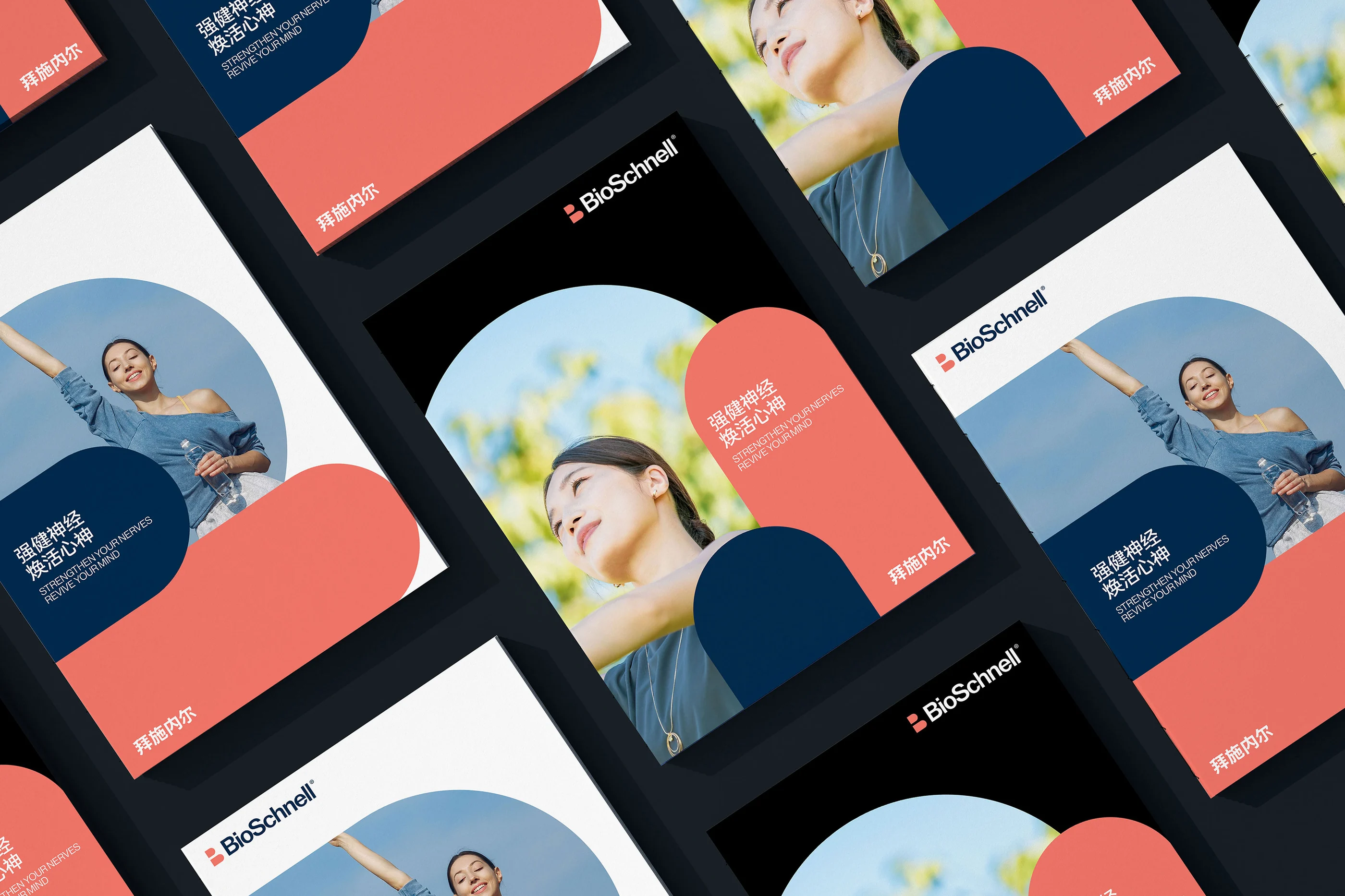
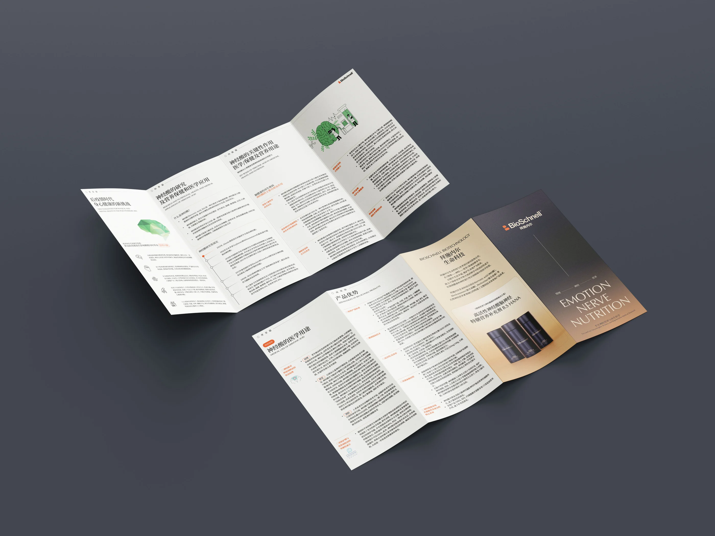
Nervonic acid and related nutrition products involve specialist information. Brochures and leaflets need a clear reading sequence, with distinct roles for introductory themes, product details and supporting explanations. Typography, spacing and consistent layouts organise that information, while people, colour and graphic forms make the communication more approachable. The emphasis is on presenting the brand and its content clearly.
Across the Touchpoints
Print and carry materials retain a common identity while adapting to their own format.
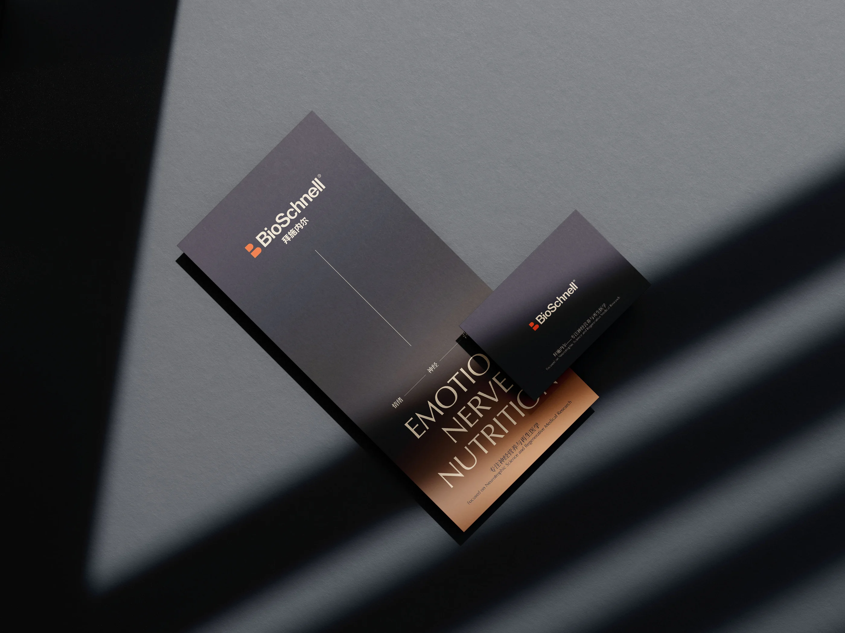
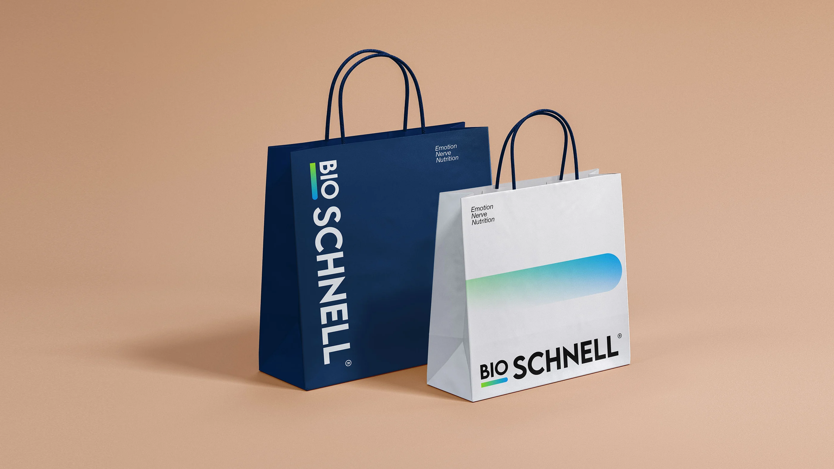
Product literature and carry bags share the same wordmark and colour logic, with different levels of detail for different situations. Printed literature supports closer reading; bags rely on the name and graphic forms for recognition at a distance. These changes in scale carry the identity from a set of design rules into everyday use.
Packaging with Clarity
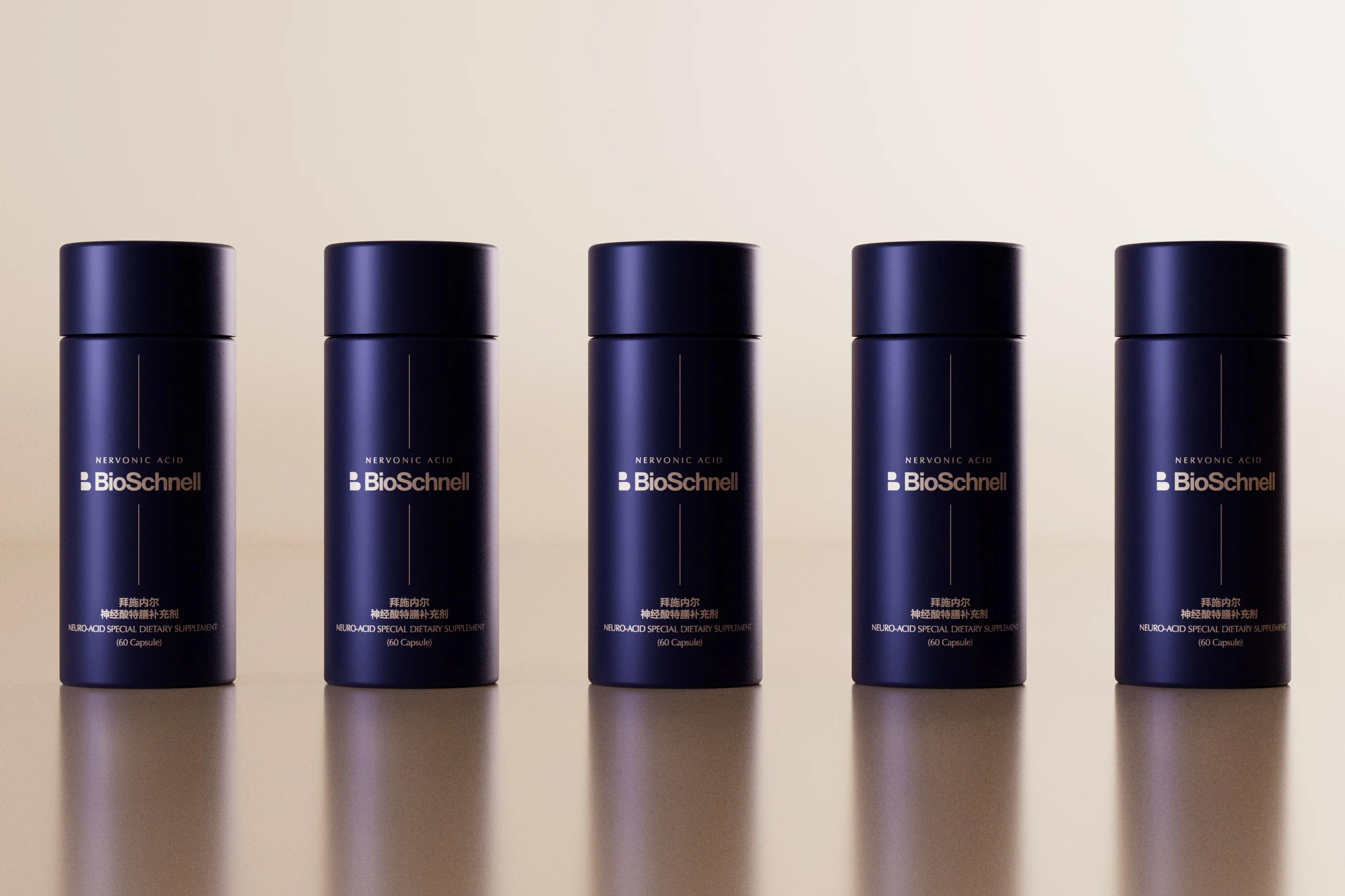
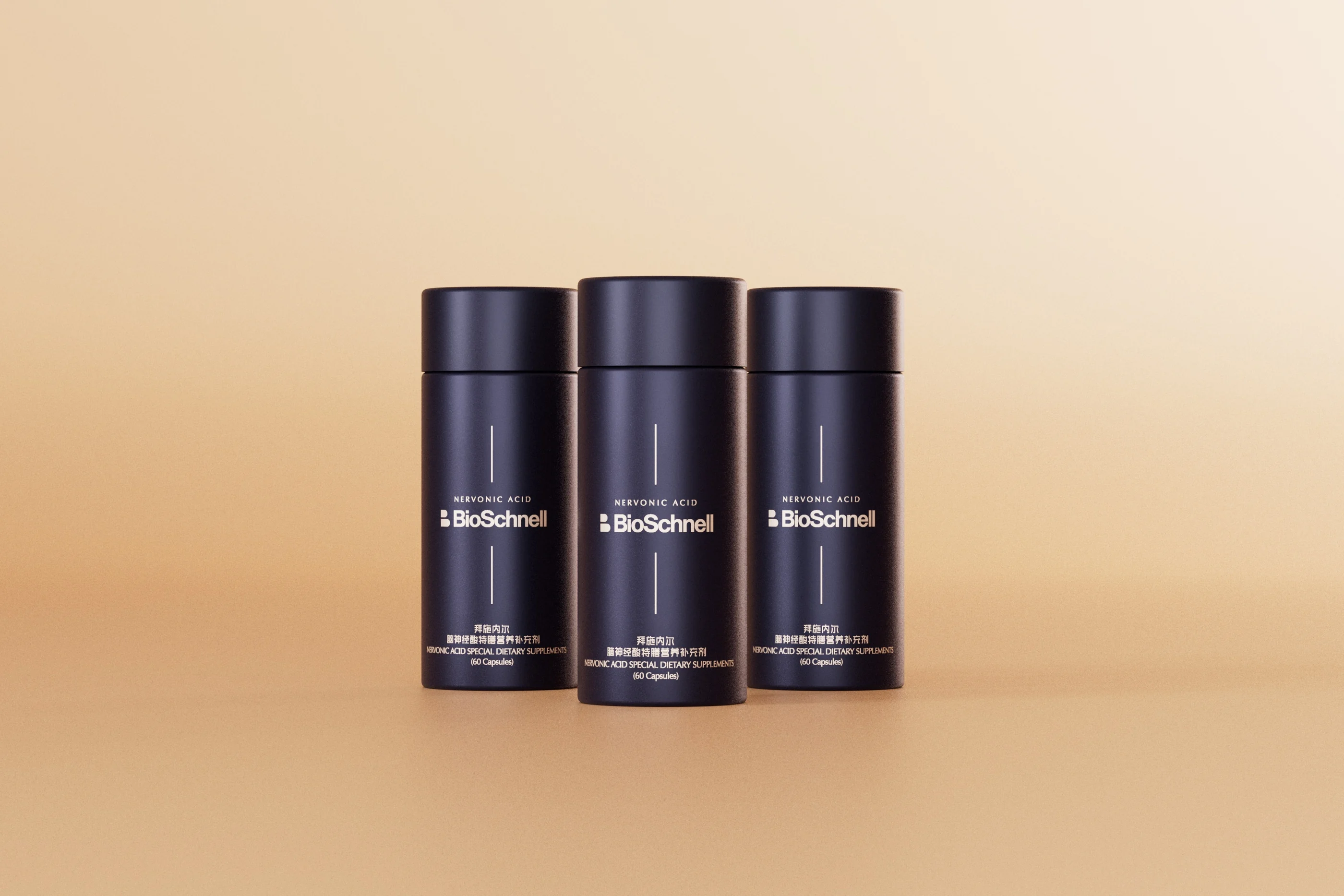
A shared bottle language gives the product range a coherent family resemblance.
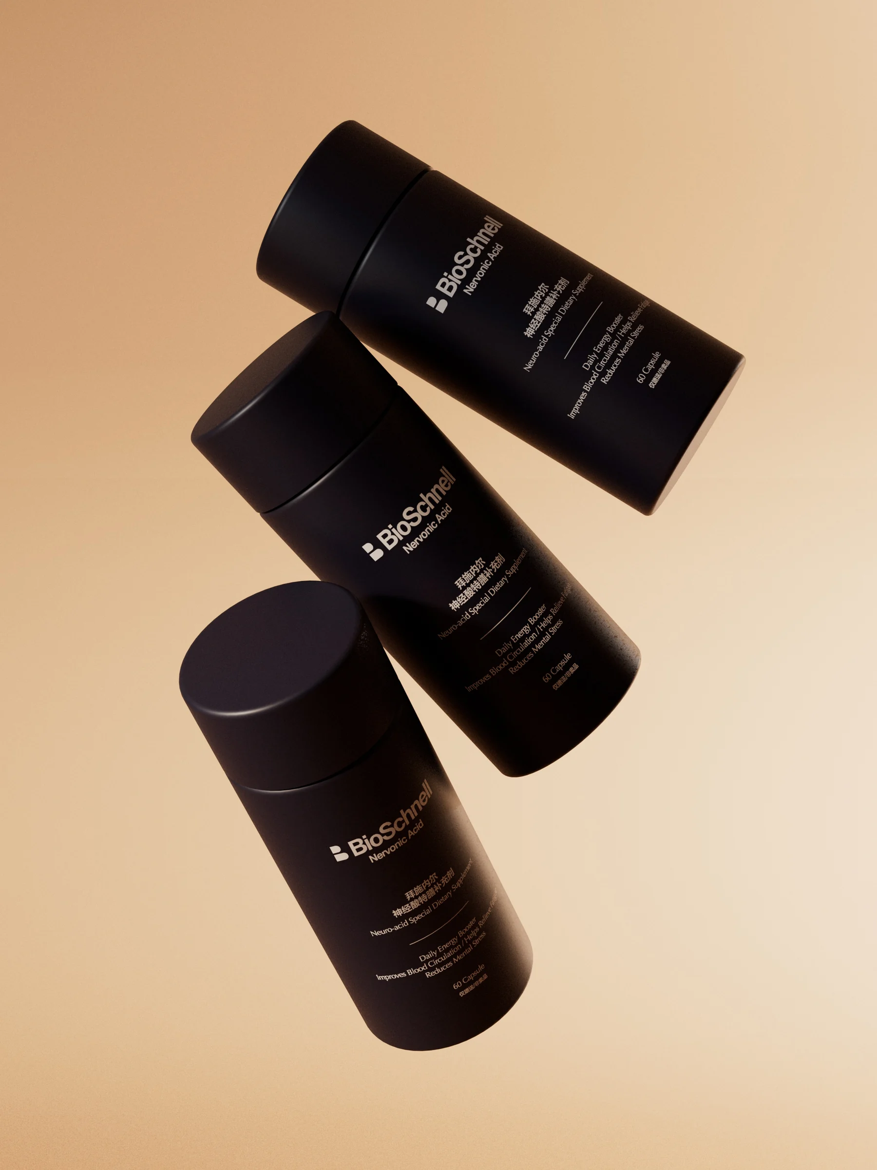
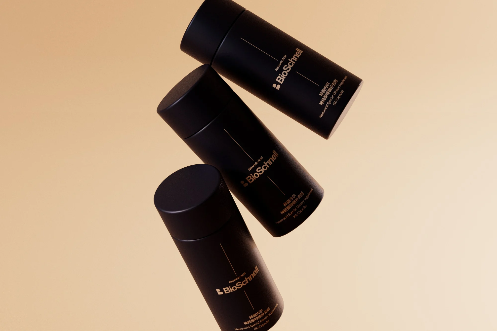
The supplement bottles share a common hierarchy for the brand name, product name and supporting information. Dark containers and restrained labels create a coherent range, whether viewed individually or together. Each product has a clear place within the family, allowing the packaging to distinguish information while retaining a consistent brand presence.
Form and Detail
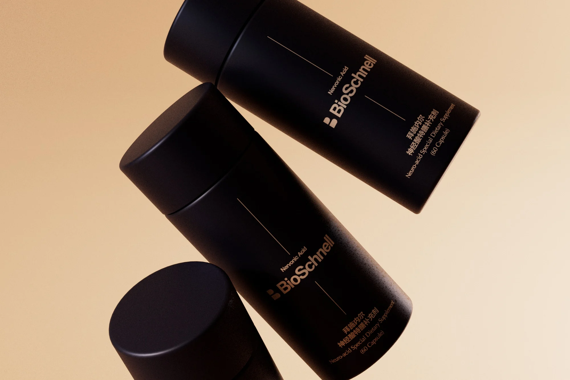
The identity works through proportion, contrast and the surfaces of a physical product.
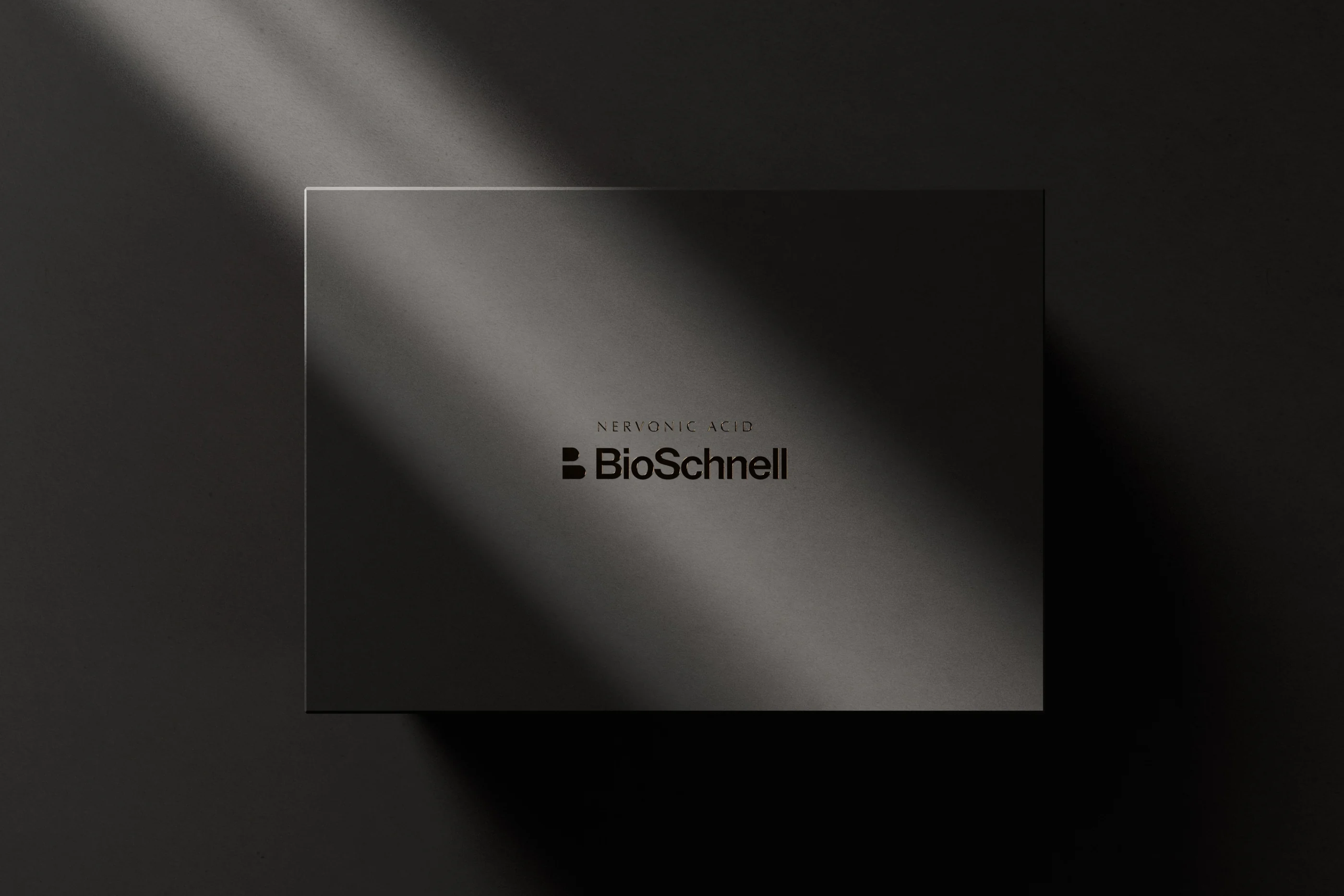
The proportions of the cap, label and bottle determine how the package reads as a whole. RDA considered wordmark scale, label contrast and information placement at close range and across a product display. Material and lighting studies test the legibility of the identity on physical surfaces and under different presentation conditions.
A System of Packaging
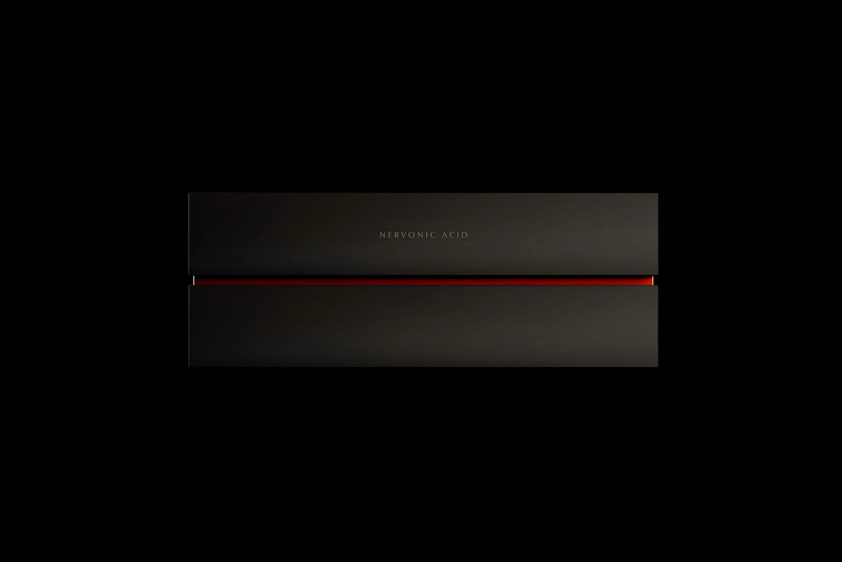
Boxes extend the product identity through colour, material and a controlled graphic language.
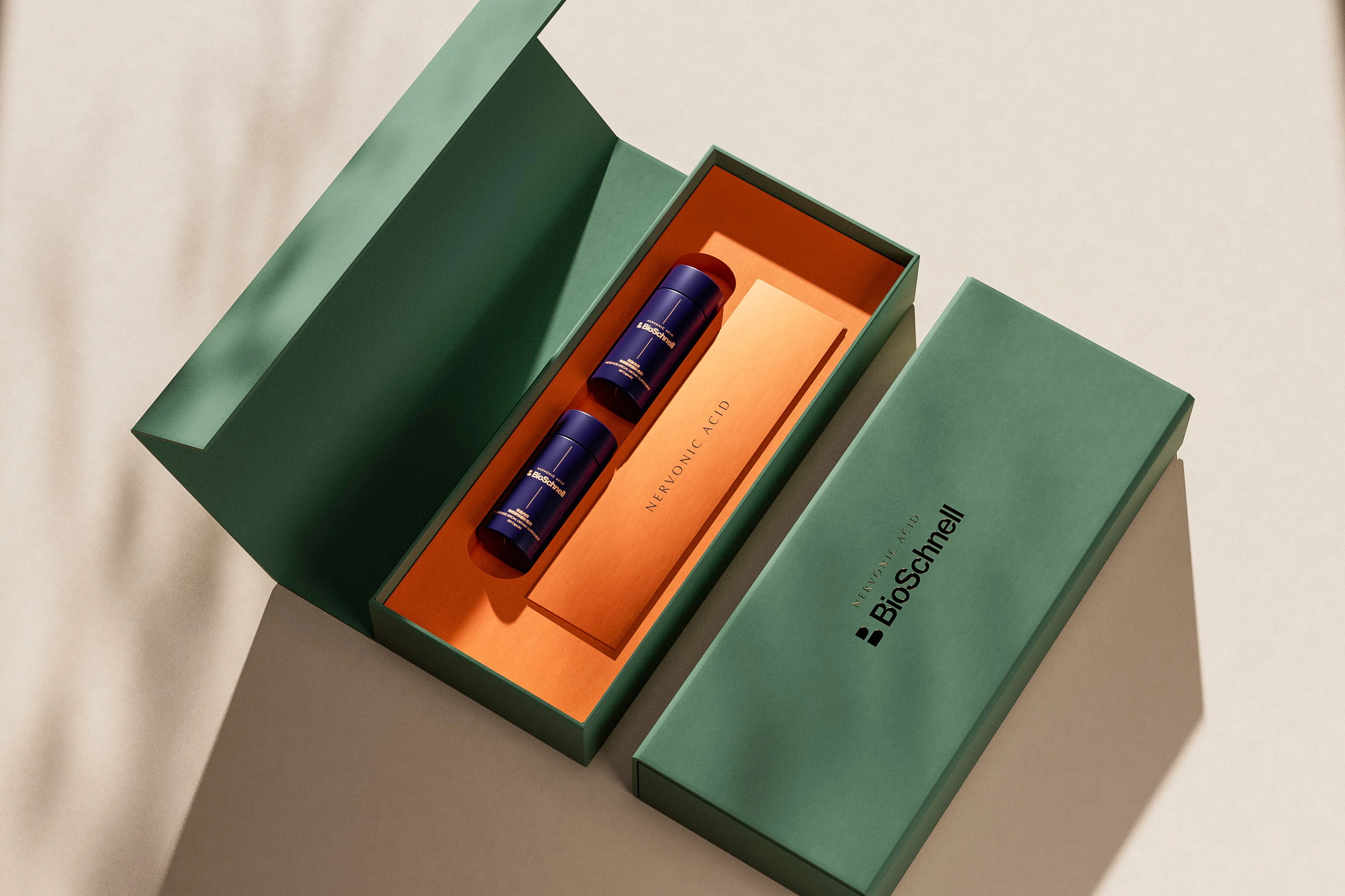
Outer boxes and presentation packs offer different expressions within one identity. Dark packaging provides a restrained setting for the brand; a green box and orange insert introduce stronger contrast. Logo placement, colour relationships and fine graphic details connect the formats, considering both the unopened package and the arrangement revealed inside.
From Outside to Inside
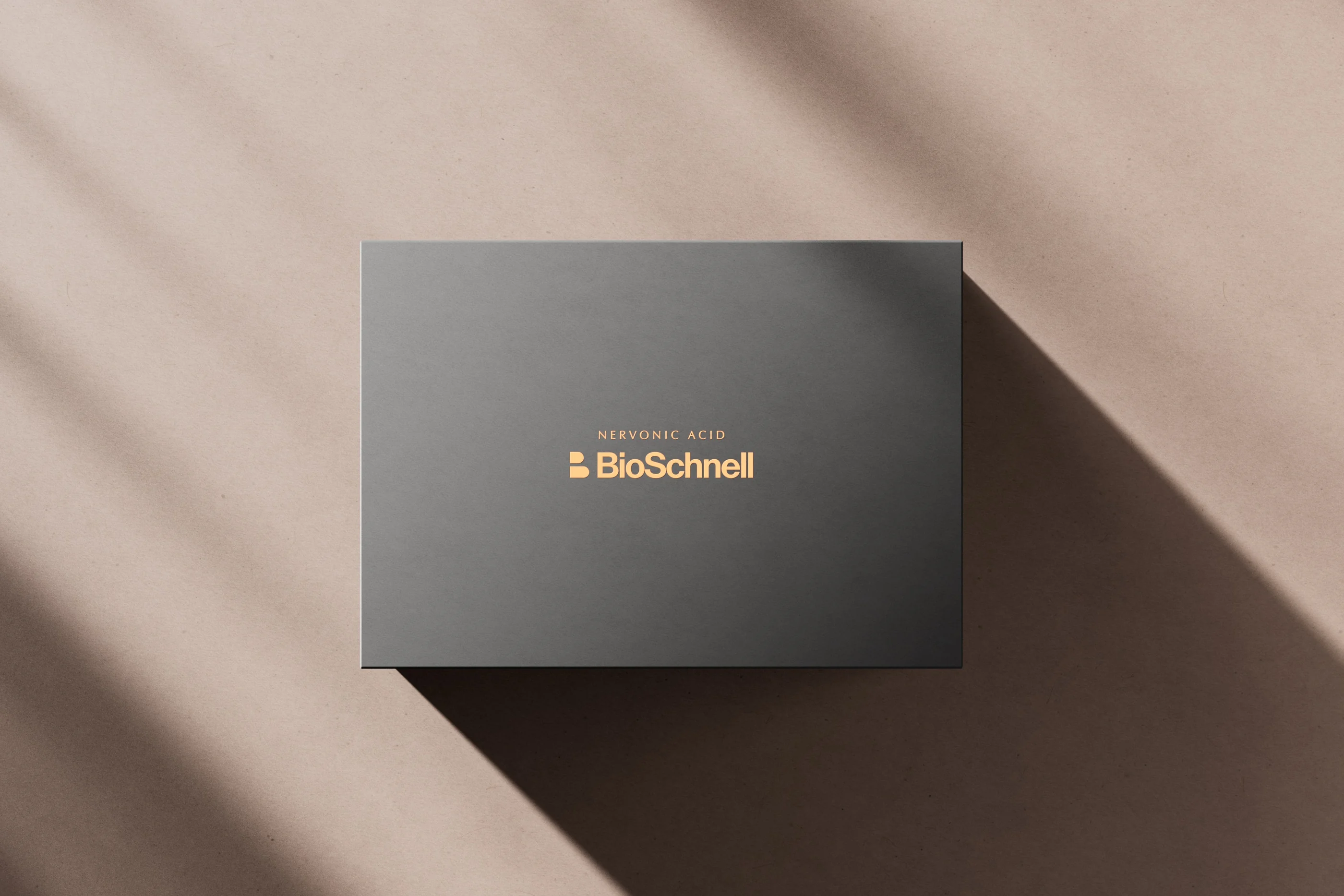
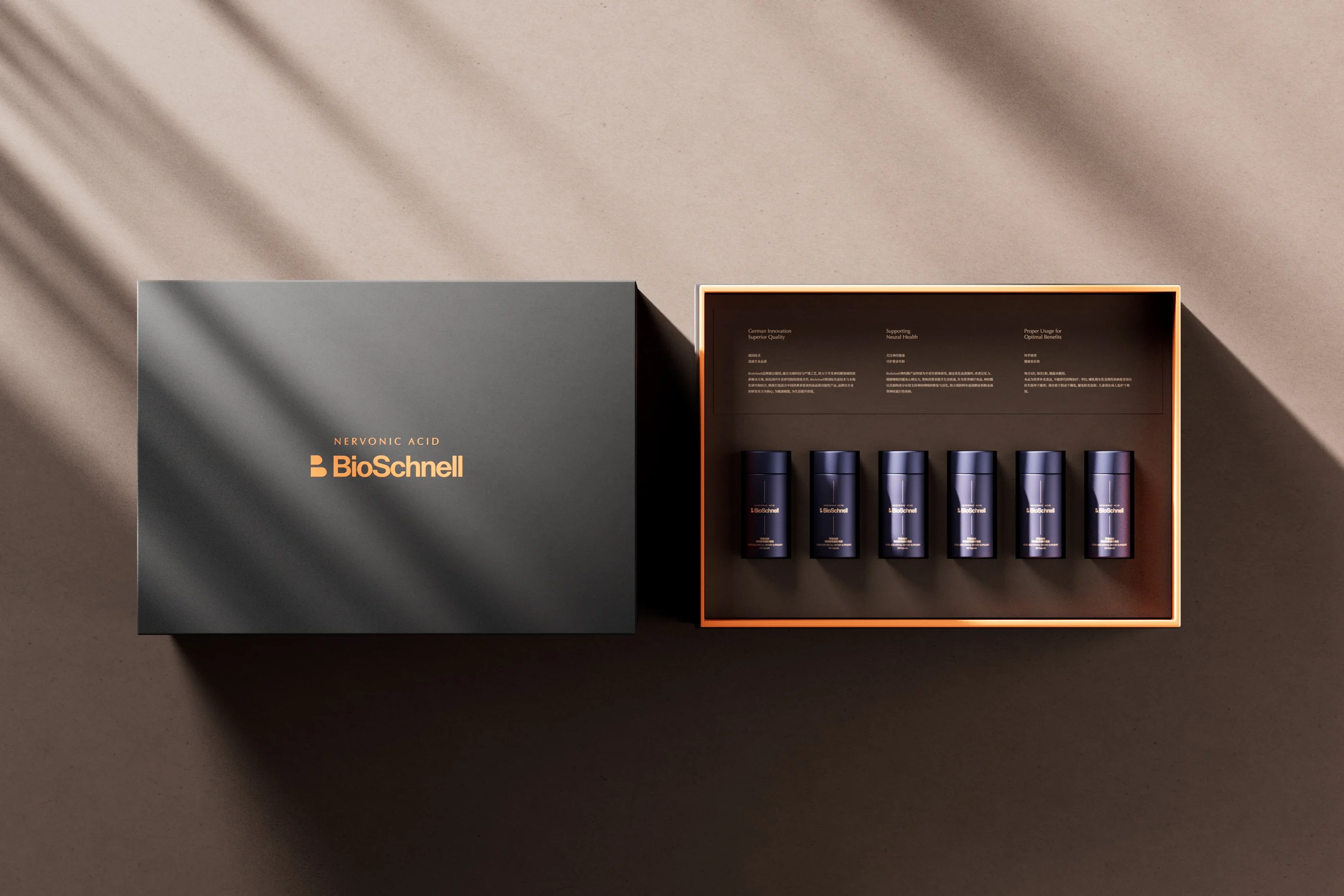
The presentation continues from the cover to the arrangement of the products inside.
The visual structure continues from the cover into the box. Wordmarks, inserts and bottle arrangements shape the first view of the products, with space between information and physical objects. Different materials and colours give each format its own character, while the central identity keeps the range recognisable.
Beyond the Package
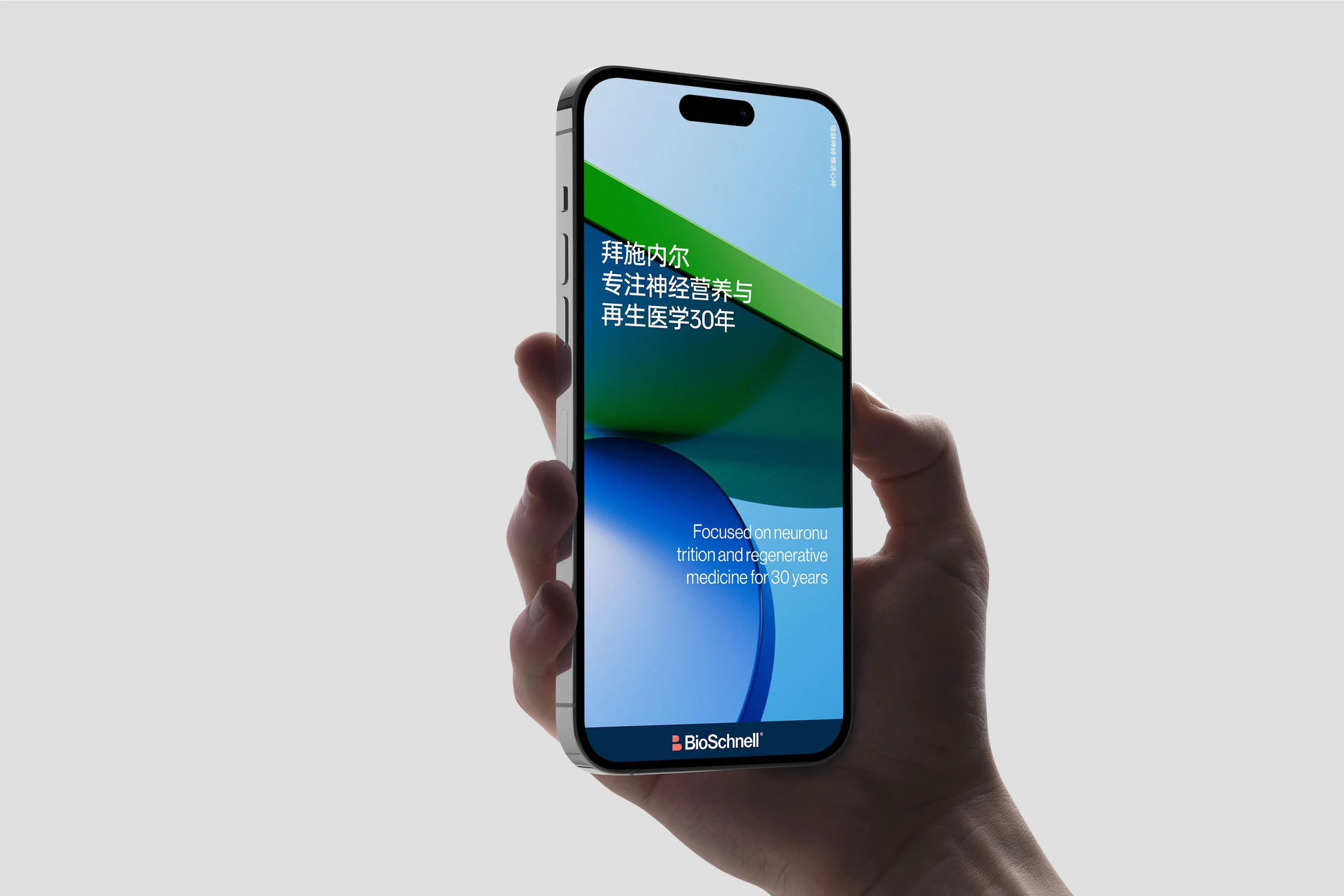
Digital communication and environmental applications extend the same visual vocabulary.
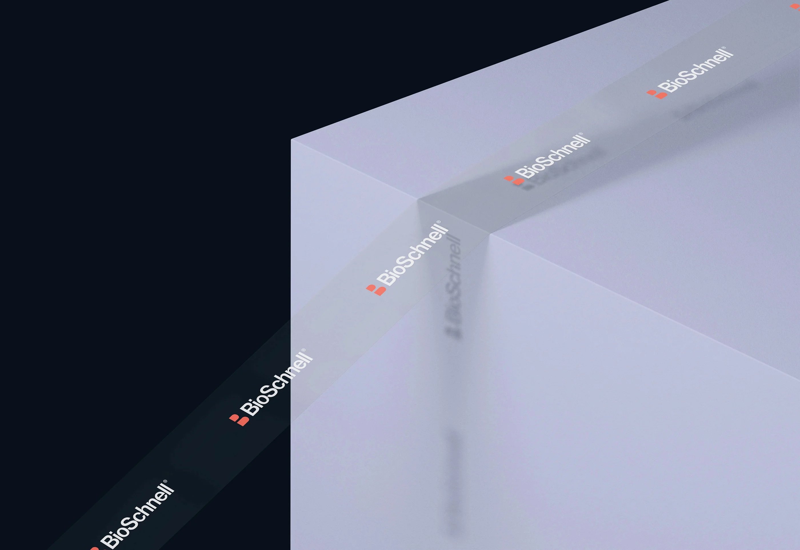
Mobile communication and environmental graphics use the same typography, forms and information hierarchy. A small screen needs immediate recognition; lettering on architectural glass has to work from further away. These application studies show how the visual system extends beyond packaging and print while retaining a clear connection to the brand.
Empower Your Brand
Starting Now.
RDA specializes in brand identity, commercial space design, and digital marketing with a focus on essentialism and international design aesthetics. We create emotionally resonant brands that drive business success. Beyond design solutions, we uncover brand potential through strategic positioning and innovation, delivering lasting value in competitive markets. Whether domestic or global, RDA offers expertise to shape a promising future for your brand. Contact us to start your branding journey.
Working across identity, packaging, space and digital communication, RDA helps businesses turn a clear strategic direction into a coherent design system. Contact our Shanghai studio to discuss your next project.