
A New Language for Longevity Care
Origin Longevity Clinic Brand Identity
RDA developed the brand identity for Origin Longevity, a clinic focused on long-term health management. The challenge was to give an emerging healthcare brand a clear, recognisable presence without losing the warmth of a personal service. Our work connects logo design, a visual identity system, packaging and communication materials with digital and environmental applications, establishing a consistent language for the clinic and its everyday touchpoints.
Origin Longevity positions its clinic around long-term health management. Its name connects the idea of an origin with life over time, giving RDA a starting point for an identity that needed to feel both medically credible and approachable. The design centres on Ō: a circular form that suggests continuity, topped by a horizontal time marker. Greens, supporting colours, typography and layout rules bring that idea into a consistent system. Brochures, product packaging, staff clothing, digital icons and clinic signage carry the same visual language, with room to adapt as the brand develops.
- Brand visual strategy
- Logo and wordmark design
- Visual identity system
- Brand communication materials
- Health product packaging
- Environmental and digital identity applications

The Symbol
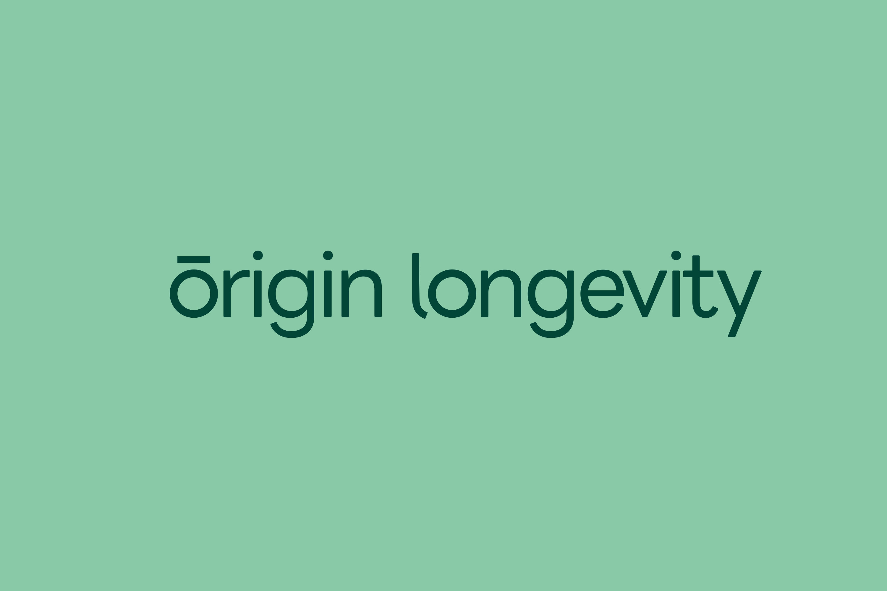
The circle and the horizontal line turn the letter Ō into a distinct brand asset. One speaks to continuity; the other introduces a measure of time.
The mark takes its structure from the letter Ō. Its ring draws on ideas of life, cycles and continuity; the macron becomes a visual reference to time. Reduced to two geometric elements, it remains legible at different scales. Paired with the English wordmark, the symbol gives an abstract idea of longevity a tangible point of recognition, from a small screen icon to a clinic sign.
A Calm System
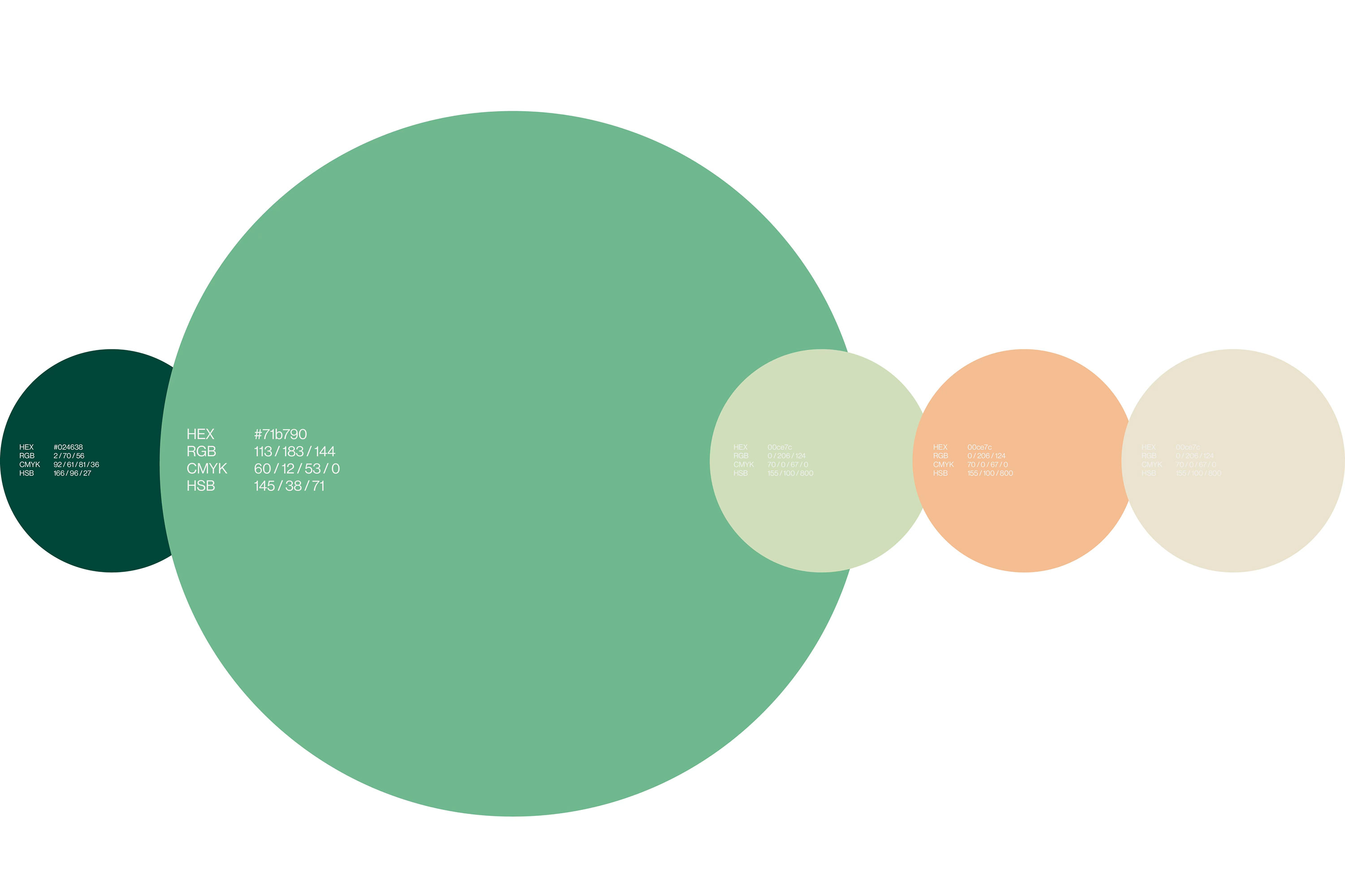
A family of greens connects the identity with vitality and calm. Supporting colours and consistent typography bring distinction to different materials without losing the common brand language.
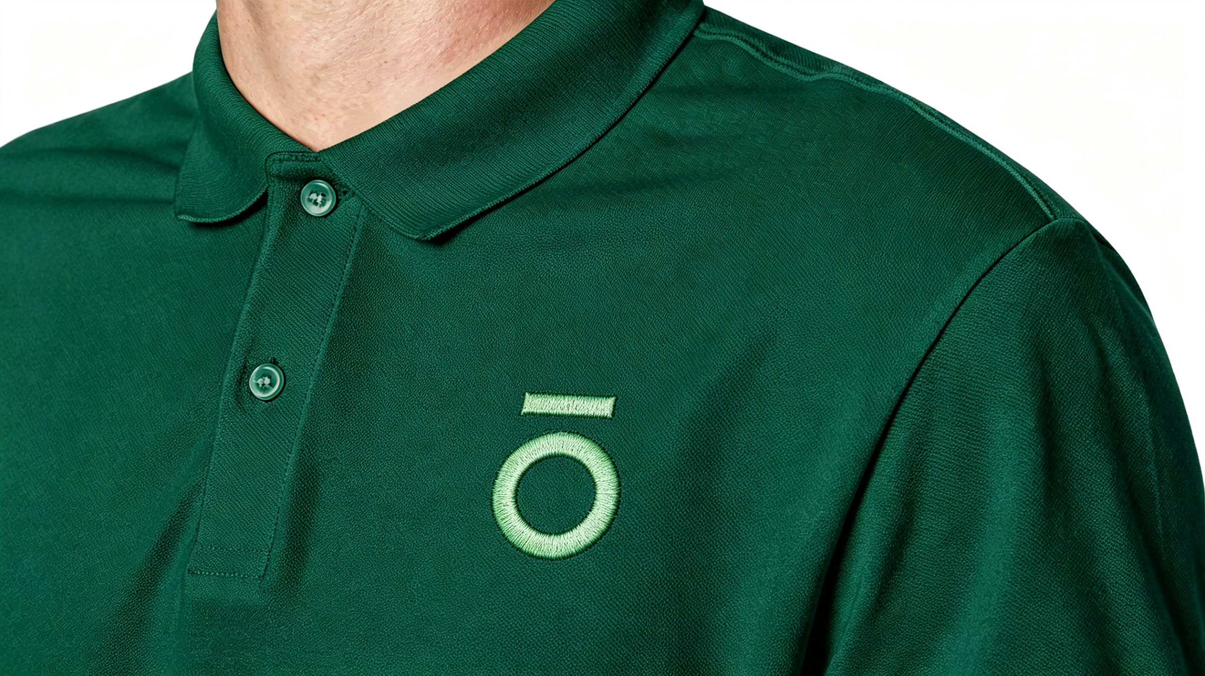
The primary green palette balances a sense of vitality with a quieter, professional character. Supporting colours distinguish applications, while consistent typography and spacing keep them recognisable as one brand. On staff clothing, the symbol becomes a small but visible part of the service experience. The system is designed to work through everyday use, with clear rules for scale, contrast and placement.
Communication
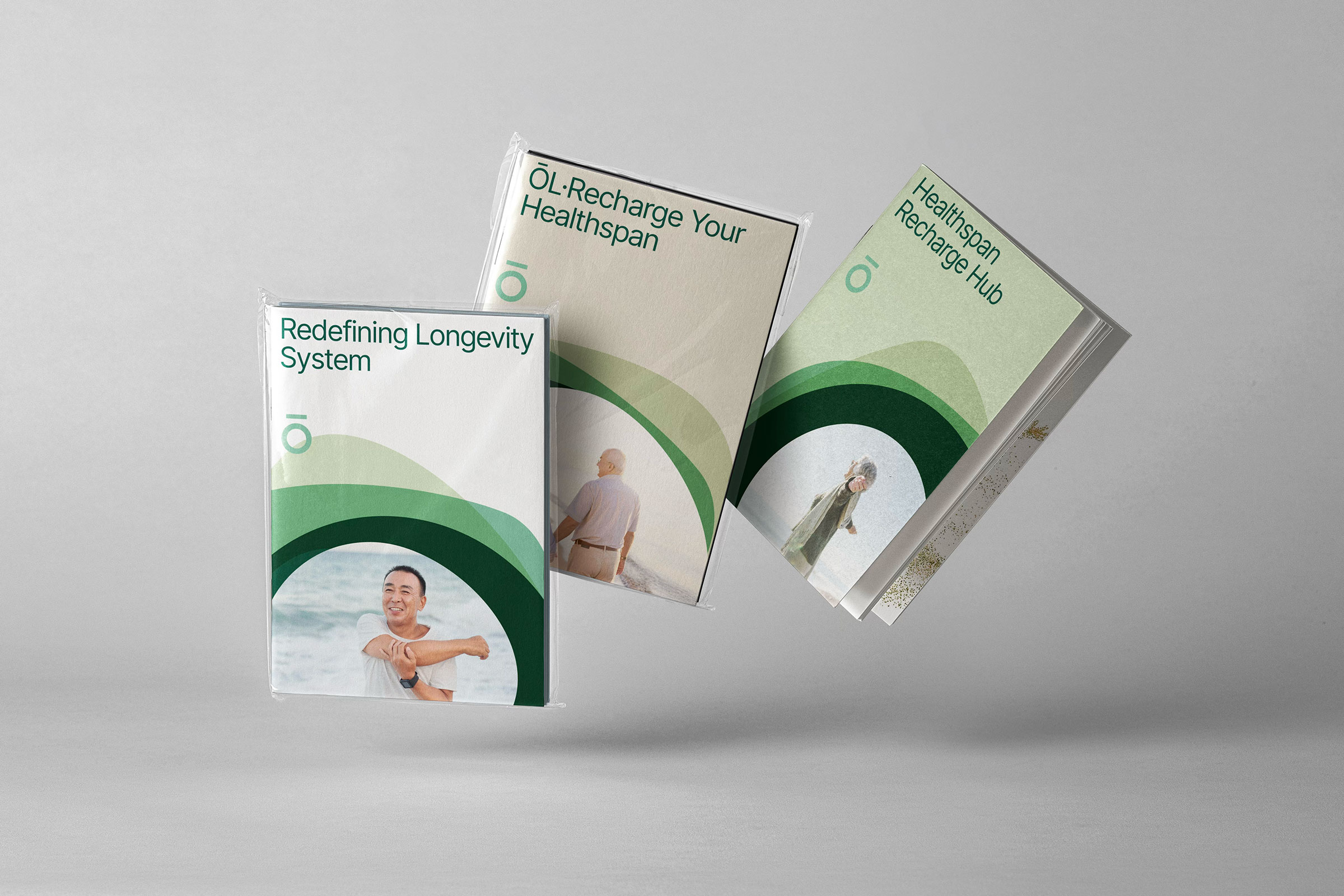
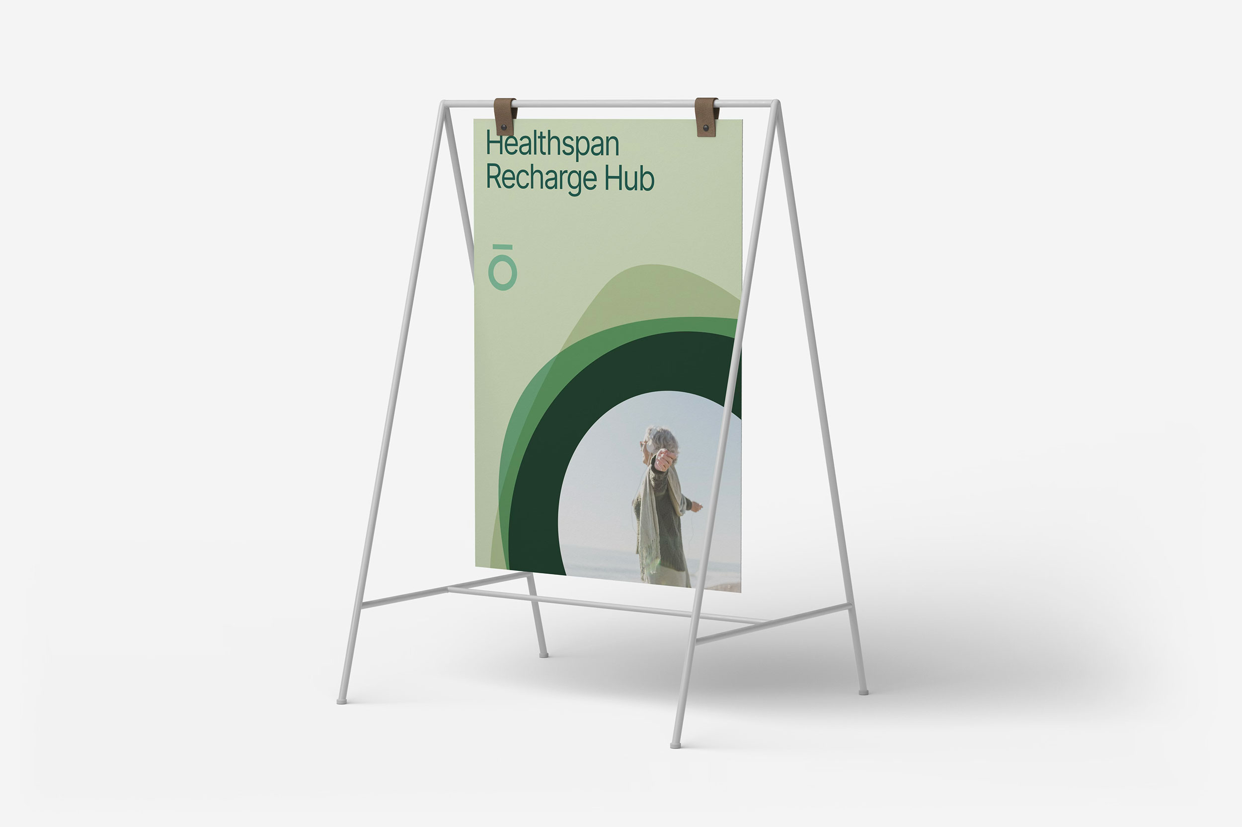
Printed communication brings the identity into everyday encounters. Clear hierarchy, circular compositions and generous space create a recognisable rhythm across brochures and supporting materials.
Brochures, posters and carry bags serve different reading distances and situations. Within a shared framework, RDA adjusts graphic scale, information hierarchy and logo placement to suit each format. Circular compositions and open layouts help the materials feel connected without making every application identical. The aim is a healthcare identity that supports clear communication and builds familiarity through repeated encounters.
Everyday Touchpoints
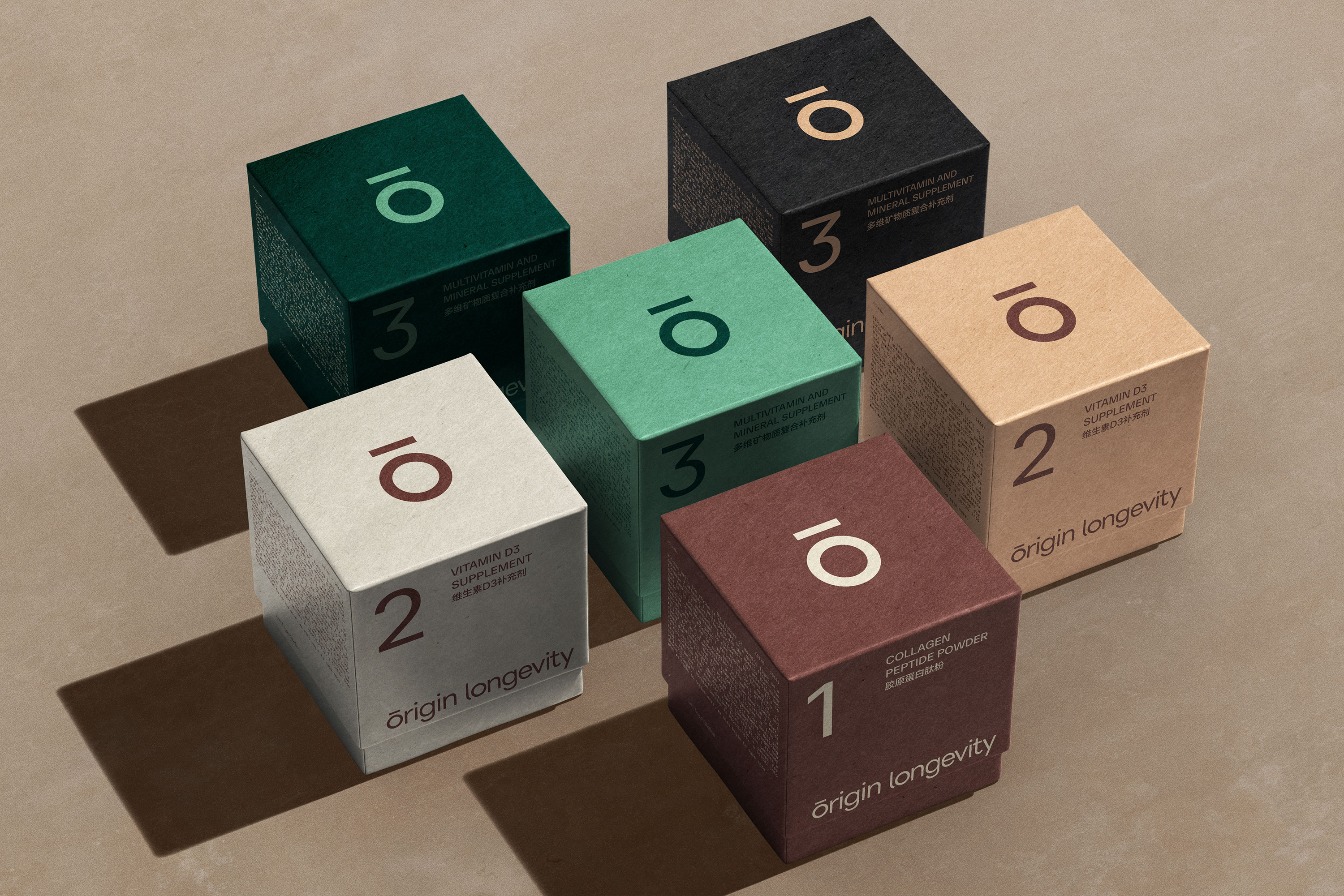
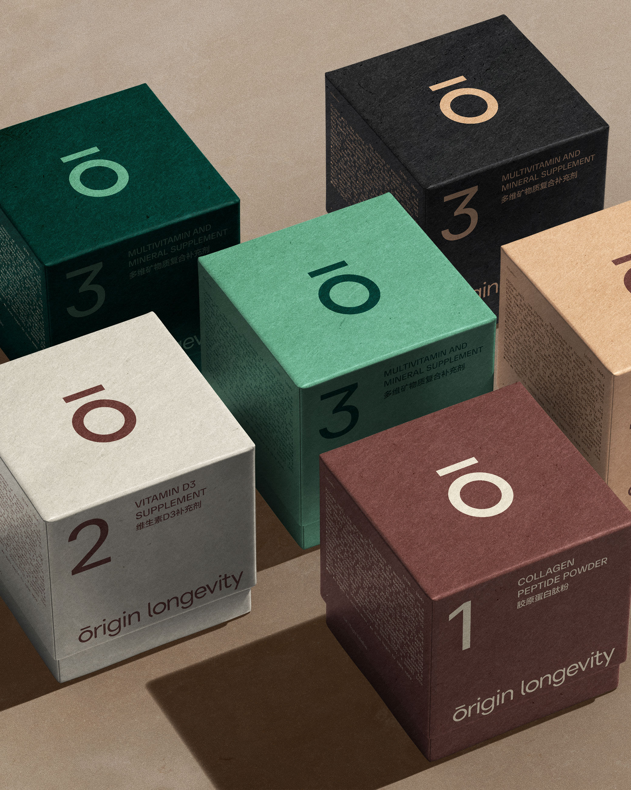
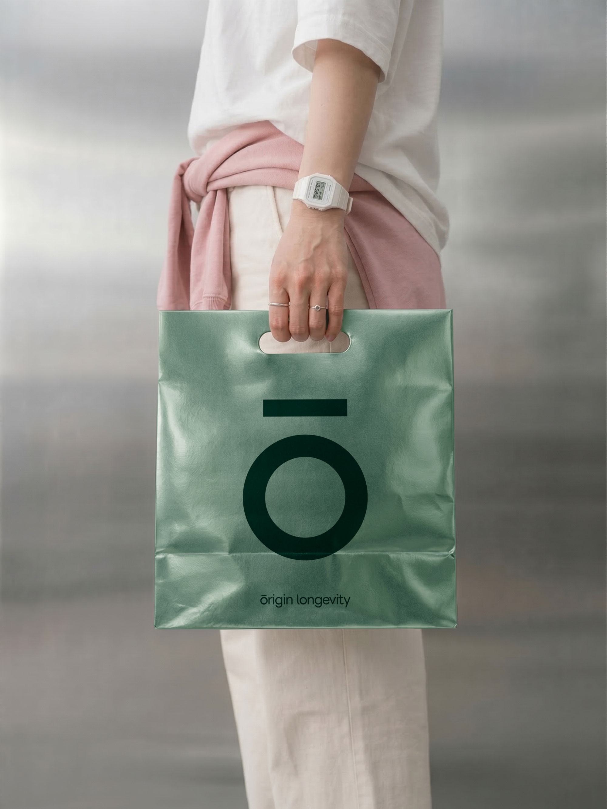
Packaging uses colour and numbering to organise a family of products. The same symbol travels from a box to a carry bag, maintaining a clear connection between the individual item and the wider identity.
Colour, numbering and a consistent logo position organise the packaging as a family. Each product can be distinguished while retaining its connection to the clinic brand. Boxes and carry bags turn the identity into objects people can handle and take with them. Attention to contrast, proportion and reading order keeps the design clear in an individual item and across a grouped display.

A Connected Experience
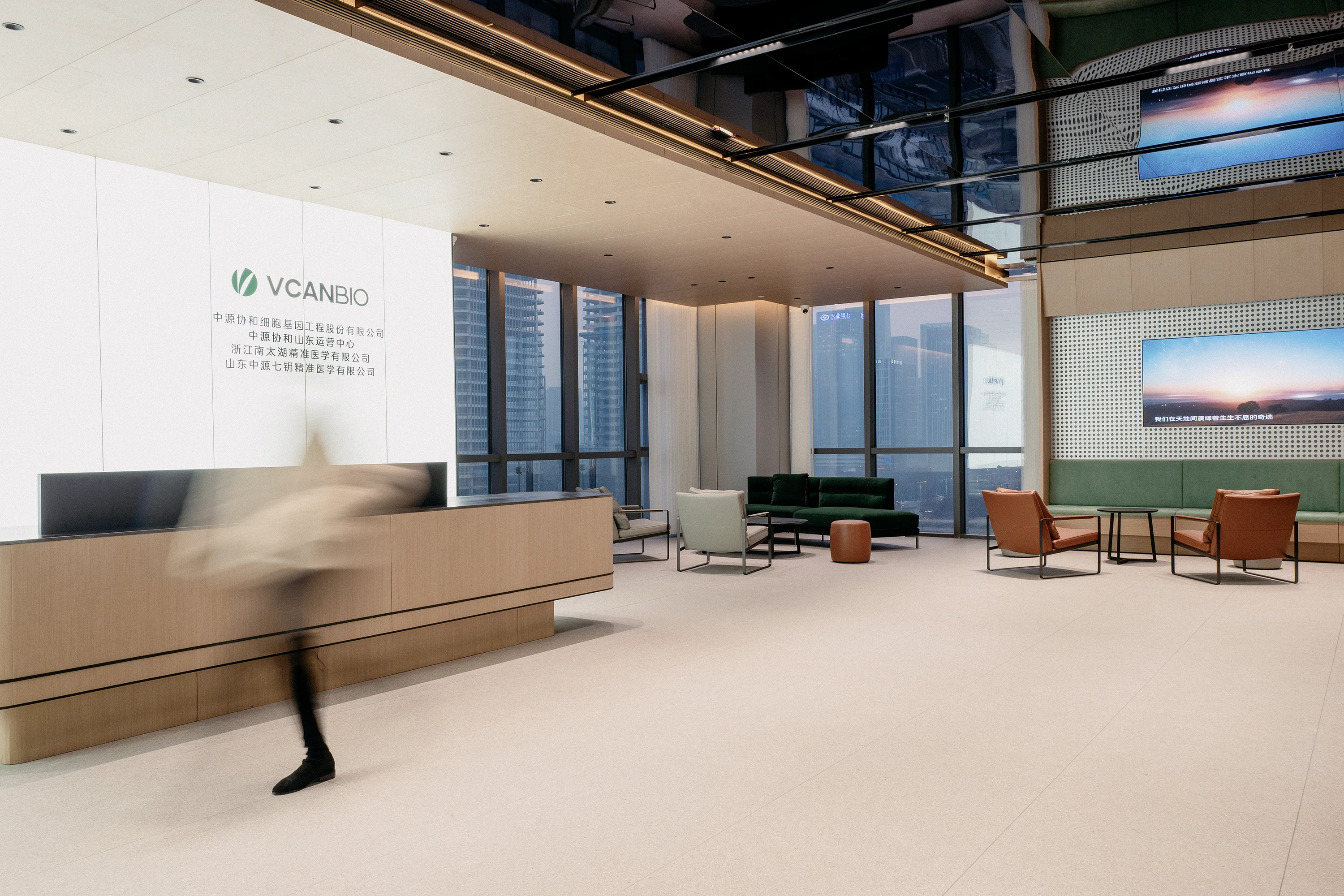
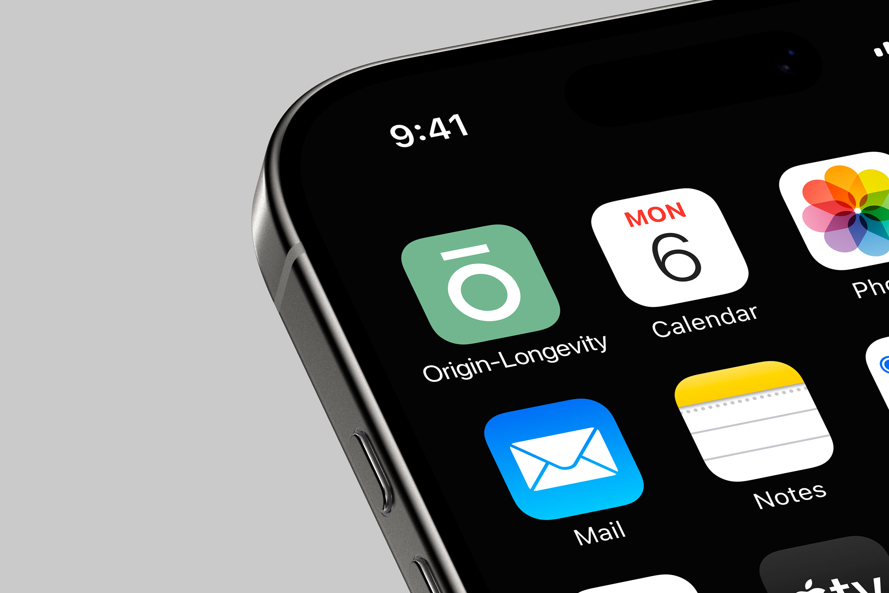
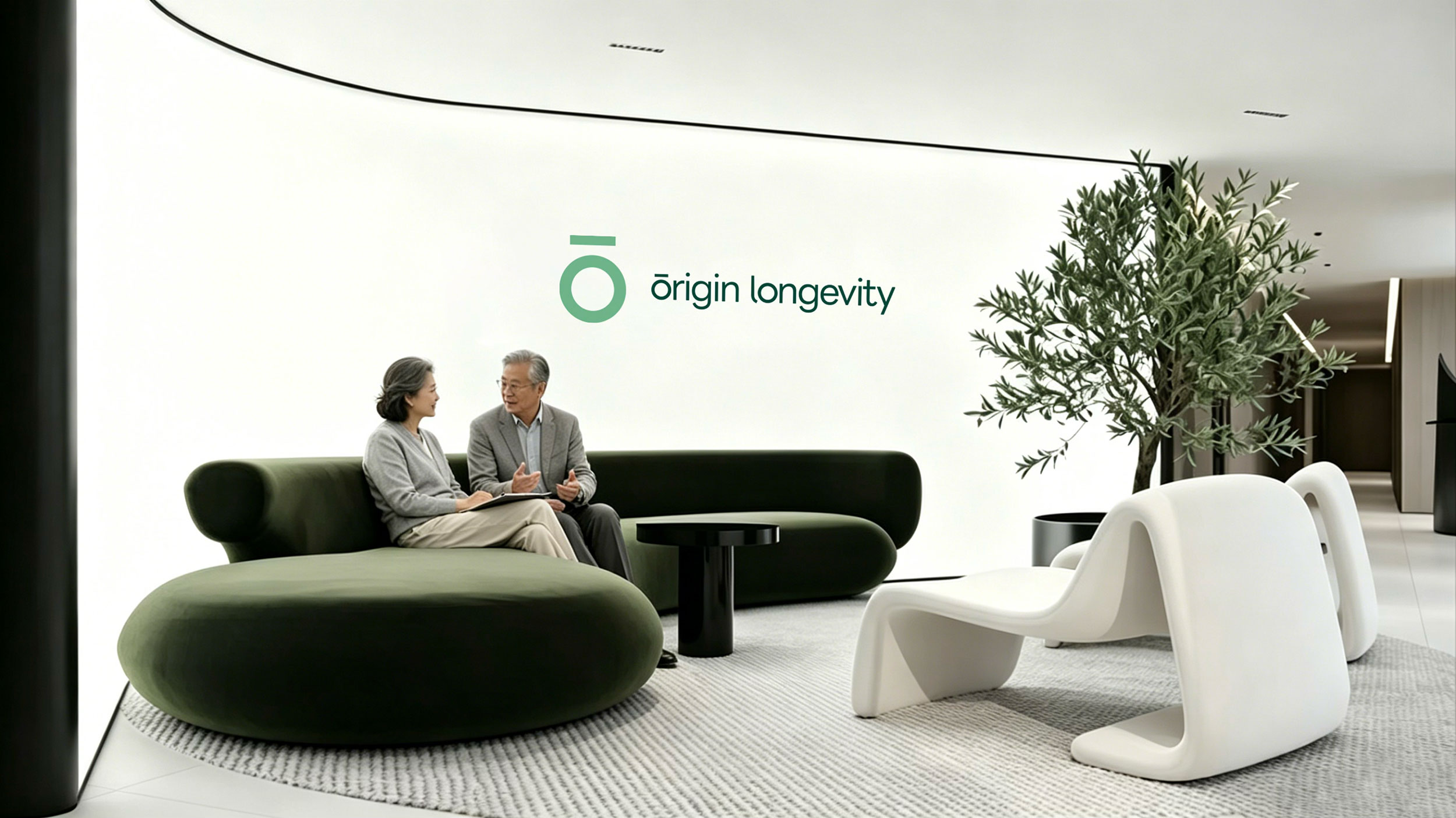
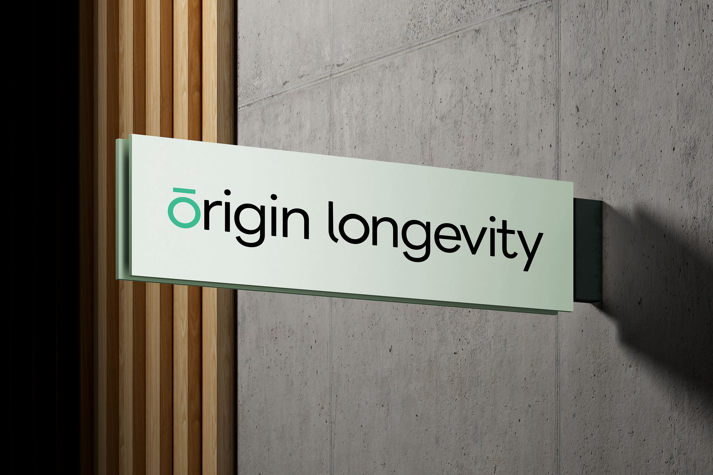
The identity retains its clarity across a digital icon and a physical sign. Environmental applications explore how the brand can become part of an approachable clinic setting.
A phone icon and a physical sign ask different things of the same identity. The simple geometry of Ō allows it to work at both scales. Reception and signage concepts explore how green, materials and open space can bring the brand into a clinic setting. These applications extend the visual system beyond print, suggesting a coherent and approachable experience across service touchpoints.
Empower Your Brand
Starting Now.
RDA specializes in brand identity, commercial space design, and digital marketing with a focus on essentialism and international design aesthetics. We create emotionally resonant brands that drive business success. Beyond design solutions, we uncover brand potential through strategic positioning and innovation, delivering lasting value in competitive markets. Whether domestic or global, RDA offers expertise to shape a promising future for your brand. Contact us to start your branding journey.