


Biotech Branding That Makes Science Clear and Credible
Fornia Biotech Brand Identity Design
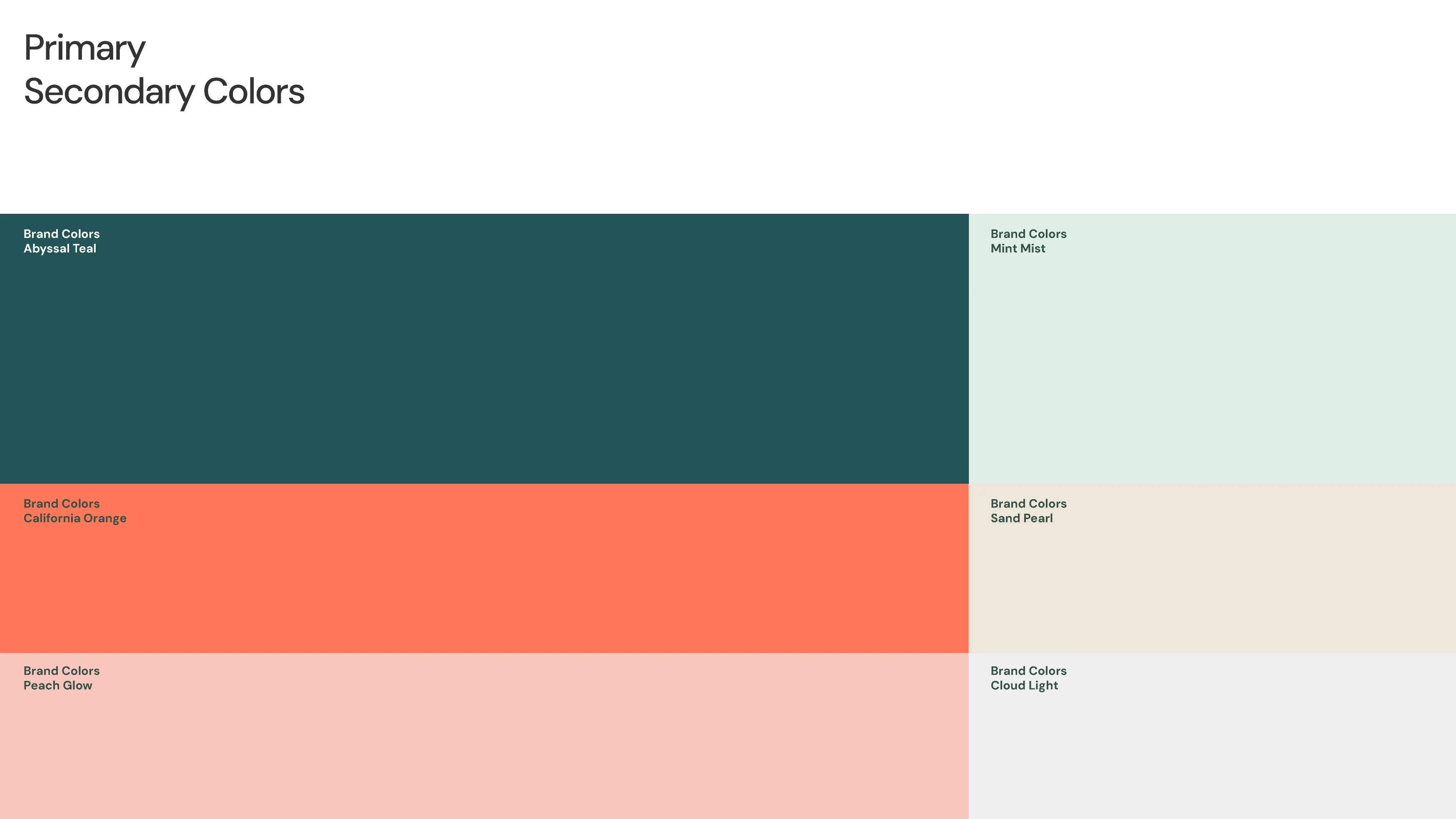
Fornia BioSolutions is a U.S.-based biotechnology company developing enzyme and functional protein solutions for agriculture, food, cleaning and health industries. As the business evolved from a research-driven laboratory into a globally connected manufacturer, it needed a brand identity that could communicate scientific precision, technological innovation and commercial readiness. RDA created a geometric monogram, confident typography and a blue-green colour system that balance technical credibility with human accessibility.
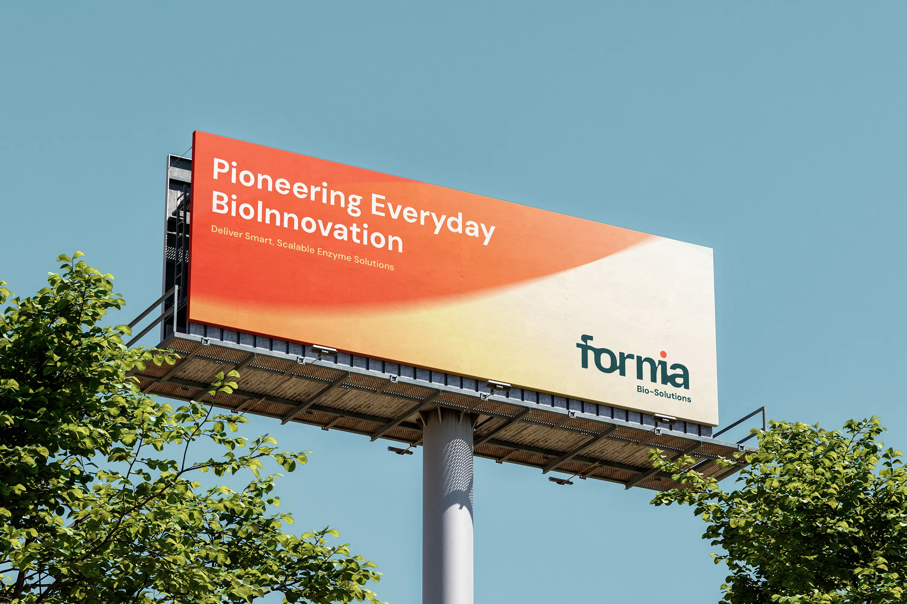
The identity translates complex biotech expertise into a clear B2B brand for international growth. Its visual language supports technical documentation, corporate materials, presentations and business development without losing the rigour expected of a life sciences company.
- Biotech Brand Strategy
- Visual Identity Design
- Corporate Communication Design


Project Background
Fornia BioSolutions is a U.S.-based biotech company specializing in enzyme and functional protein solutions for agriculture, food, cleaning, and health industries. As the company grew from a research-driven lab to a globally connected manufacturer, it required a brand identity that matched its scientific ambition — one that bridges California's biotech heritage with a confident, international presence.
Fornia’s move from laboratory research to international manufacturing required an identity capable of supporting technical credibility, commercial partnerships and a growing portfolio of enzyme and protein solutions.
The Challenge
As a company evolving beyond the lab, Fornia needed more than a functional identity — it needed a brand that could command credibility in global B2B markets, communicate scientific depth, and feel accessible to diverse industry clients. The challenge was to create a visual language that balanced technical rigor with human warmth, and American roots with global resonance.
The challenge was to make complex biotechnology feel precise and accessible without relying on predictable scientific imagery. The identity also needed to work across research, sales and corporate communication.

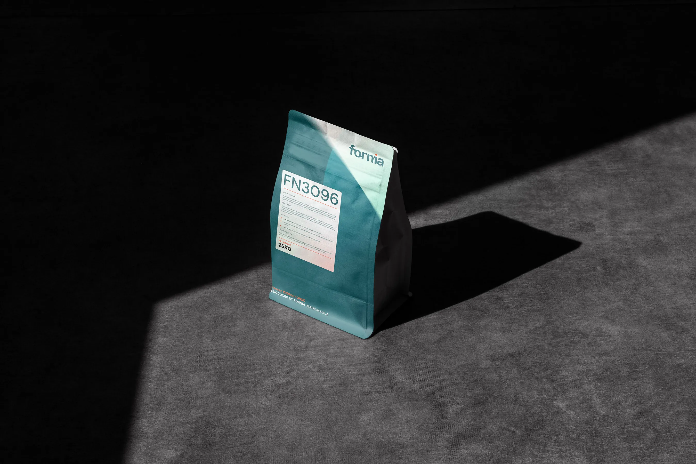

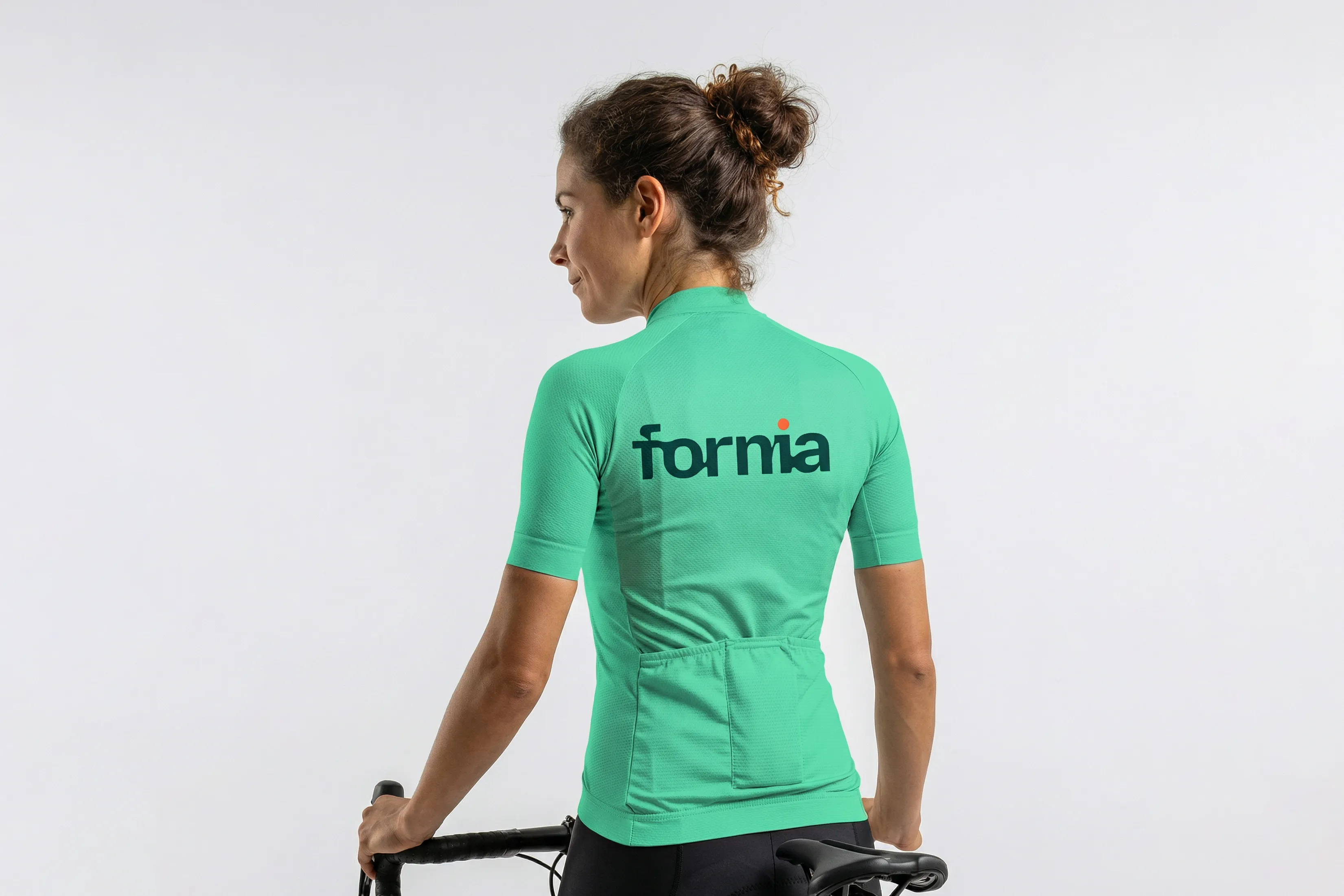
Wordmark & Icon System
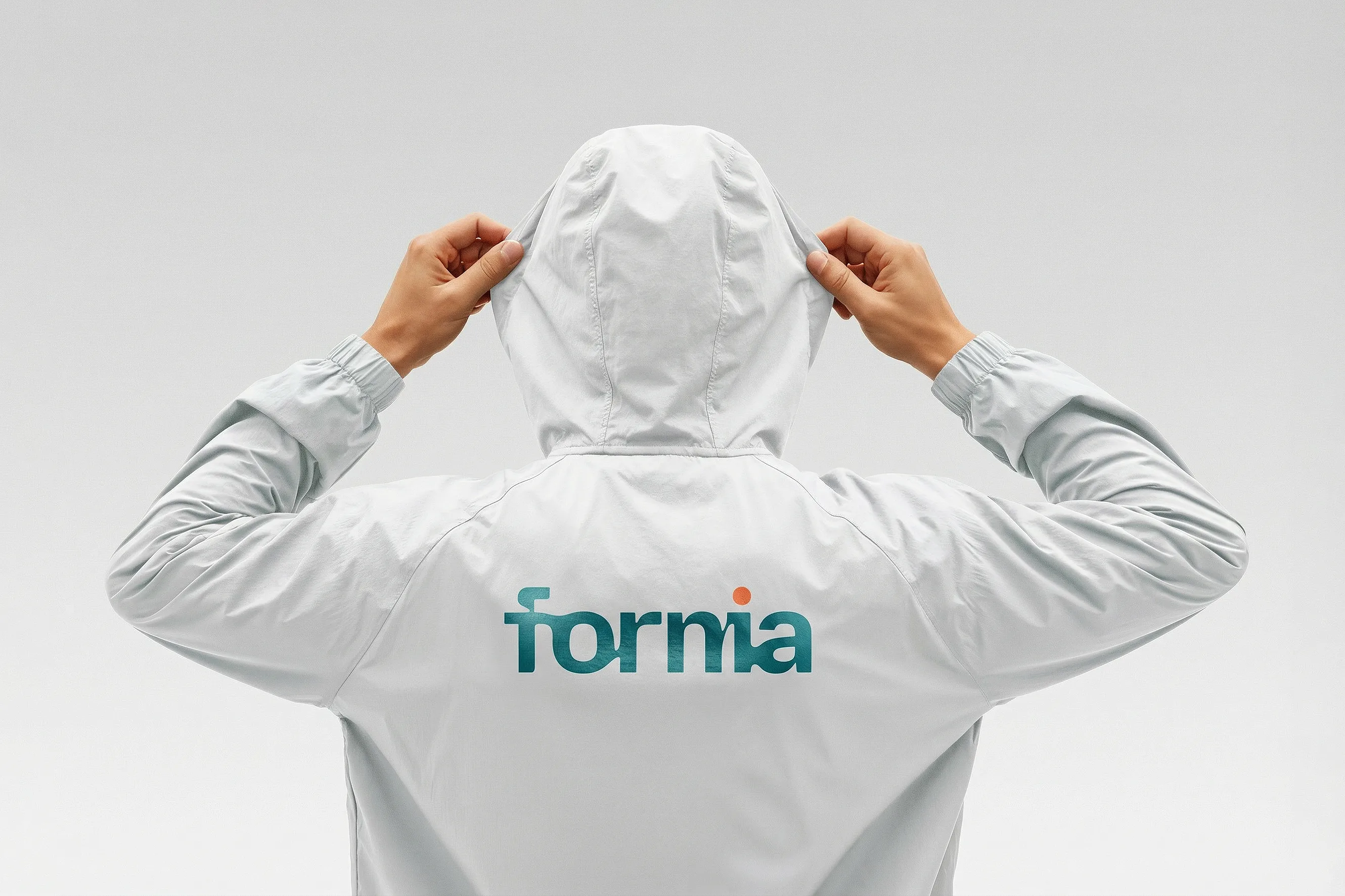
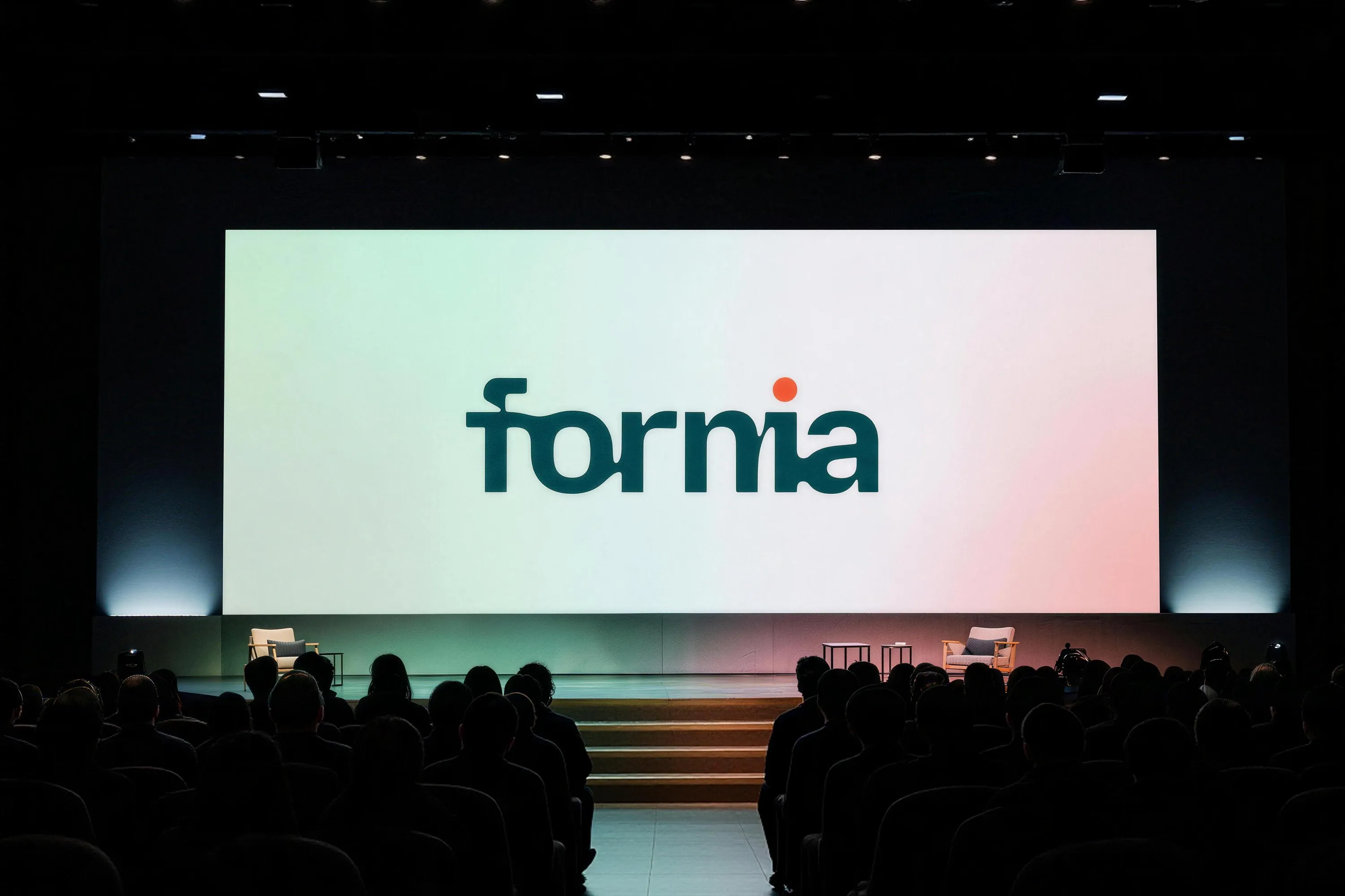
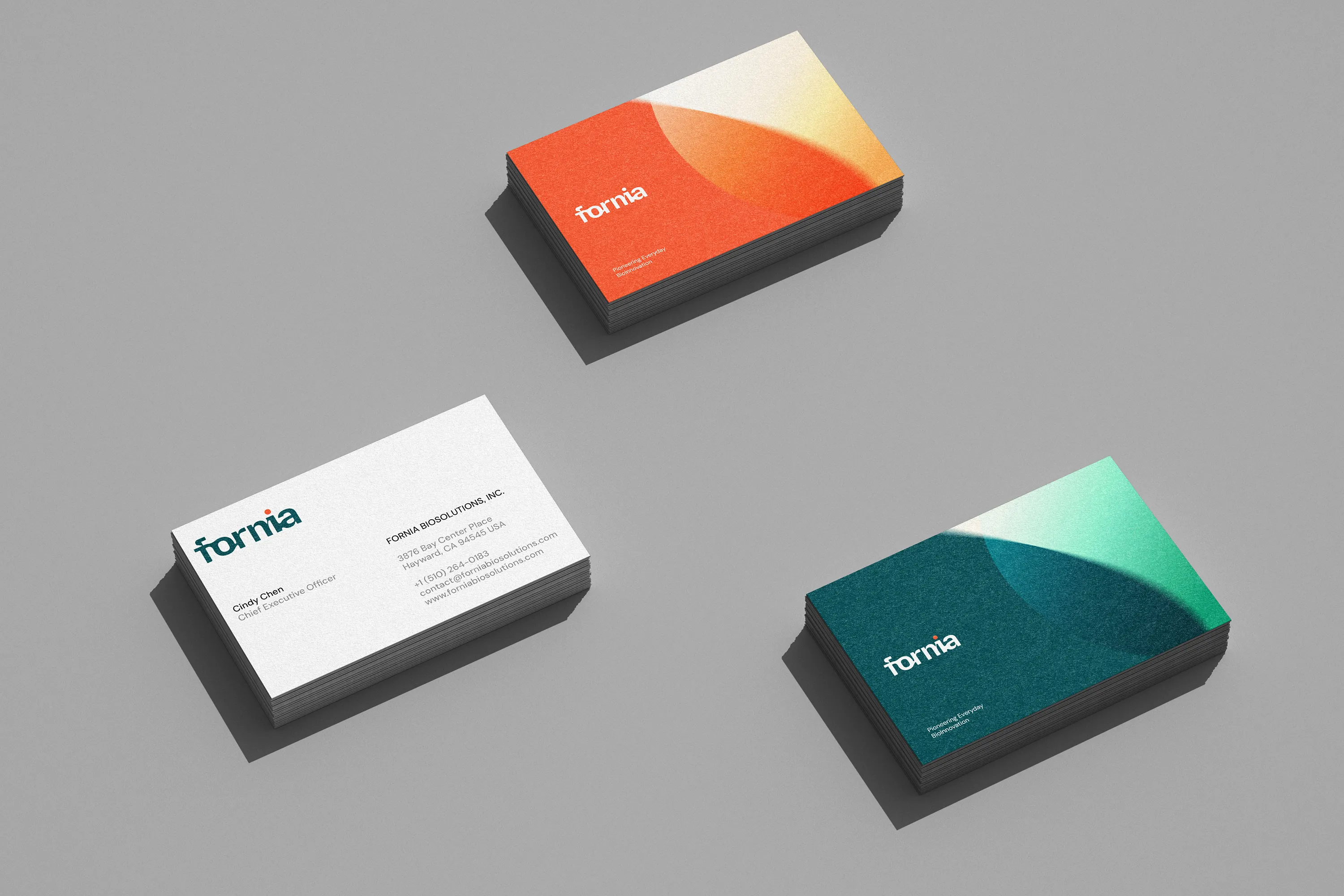
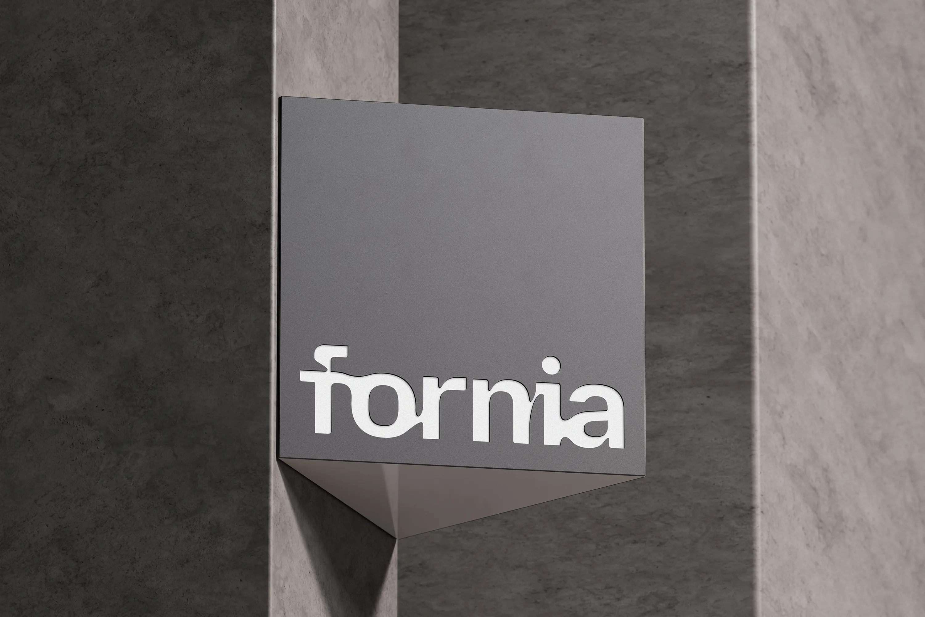
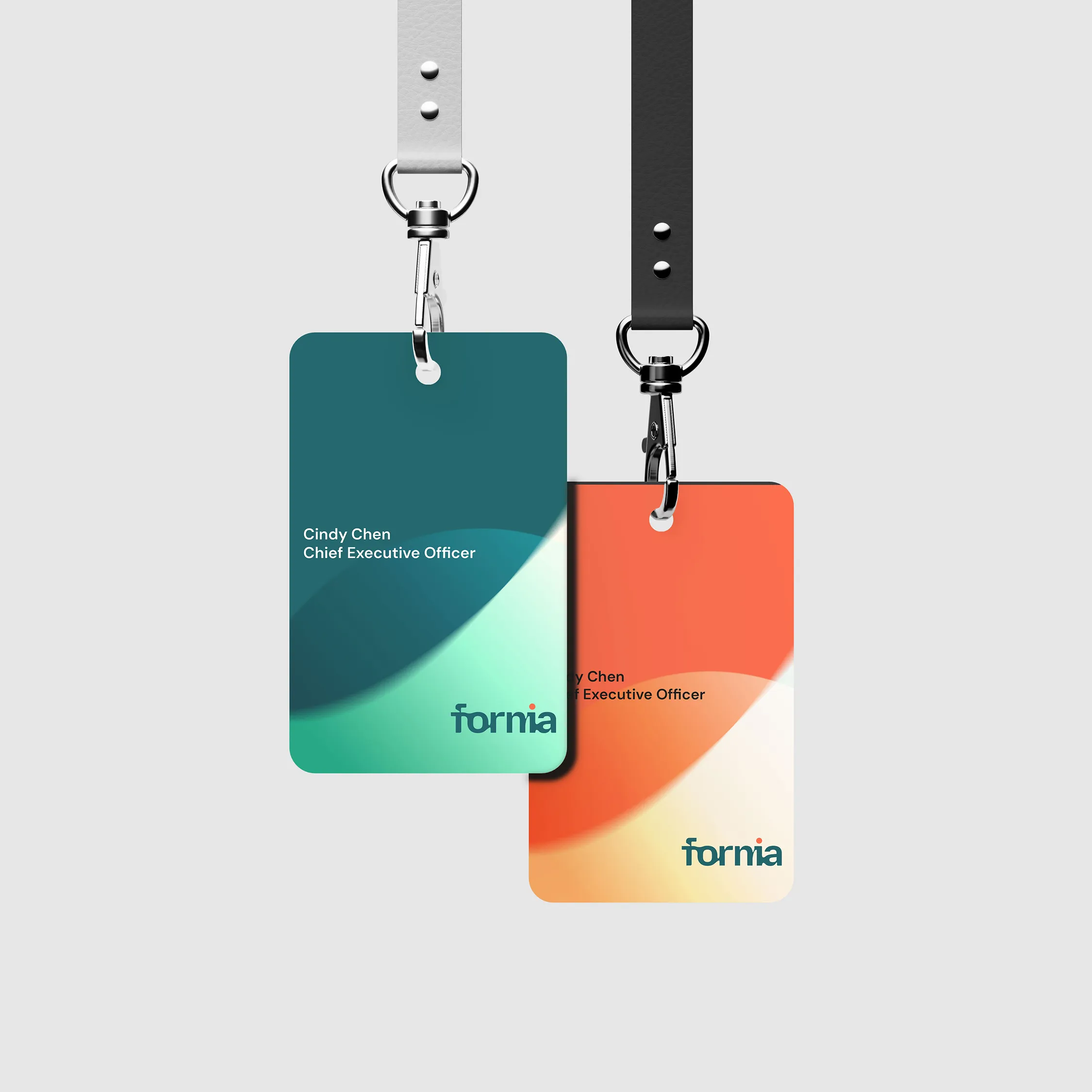
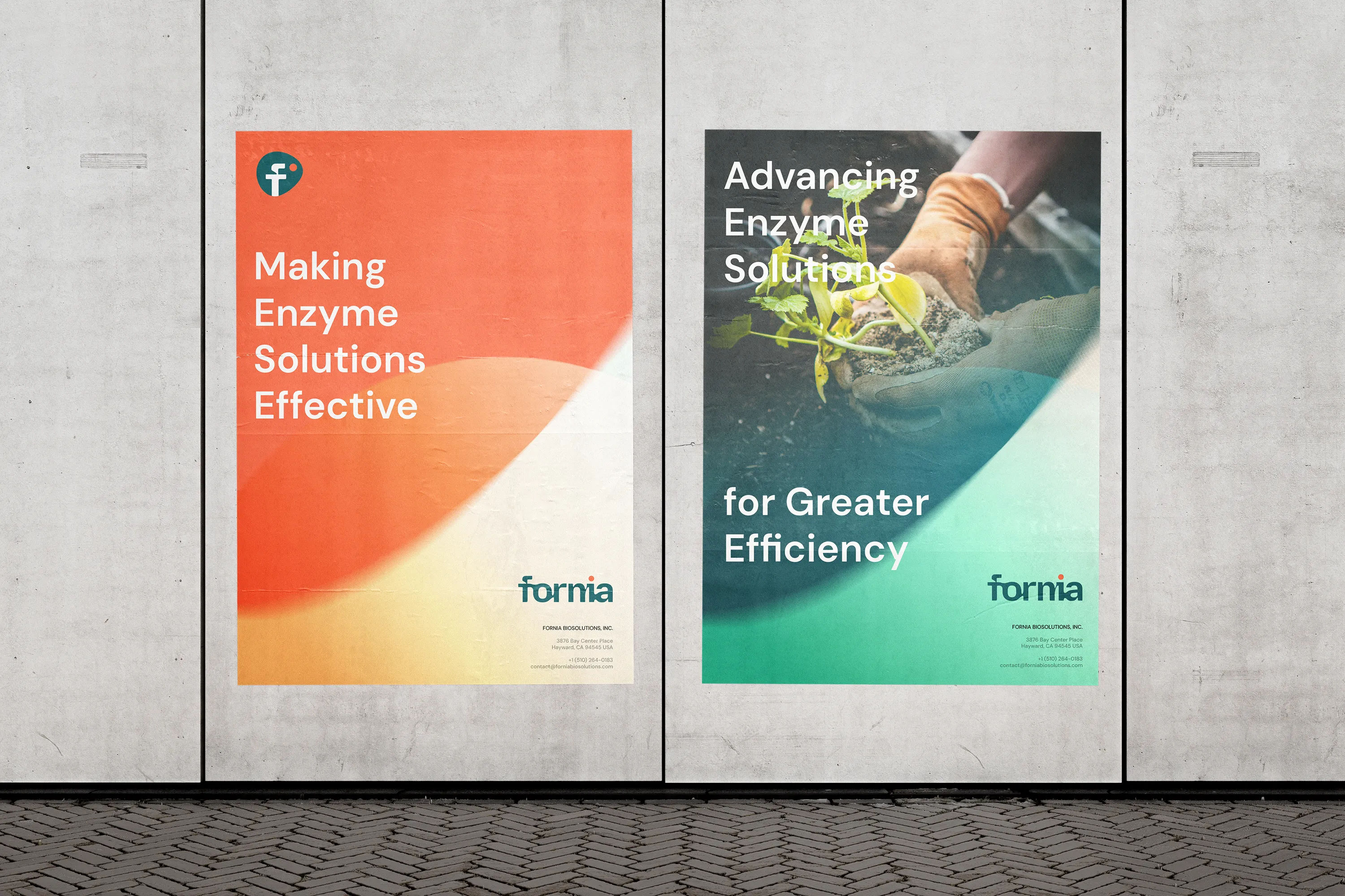
RDA crafted a fluid, lowercase wordmark where letter connections echo enzymatic flow — precise yet approachable. A vivid coral dot above the "i" acts as a spark of vitality, symbolizing activation and life. The brand icon transforms the "F" into a cell-inspired form within an organic shape, conveying precision, innovation, and the active role Fornia plays in advancing bio-based solutions.
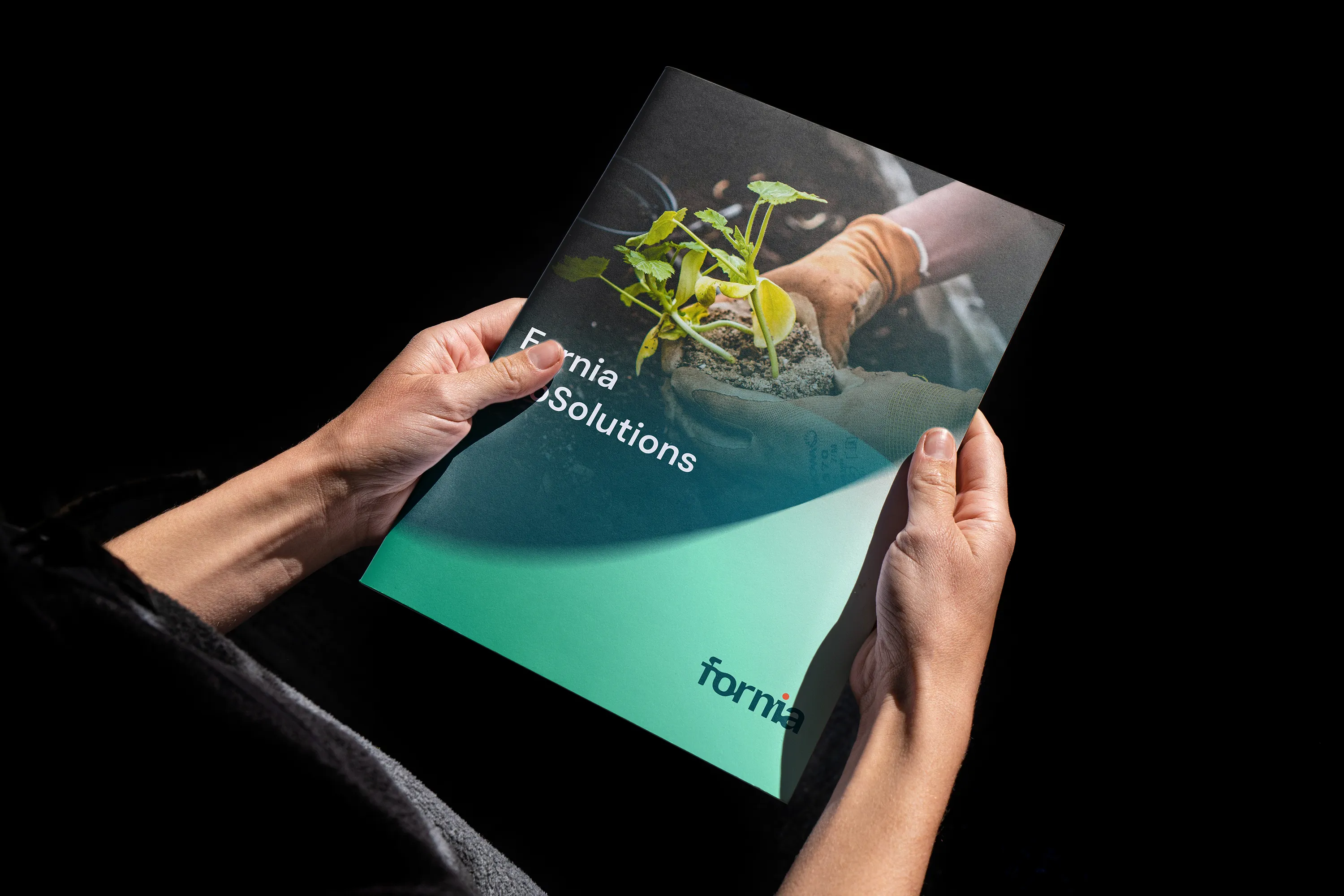
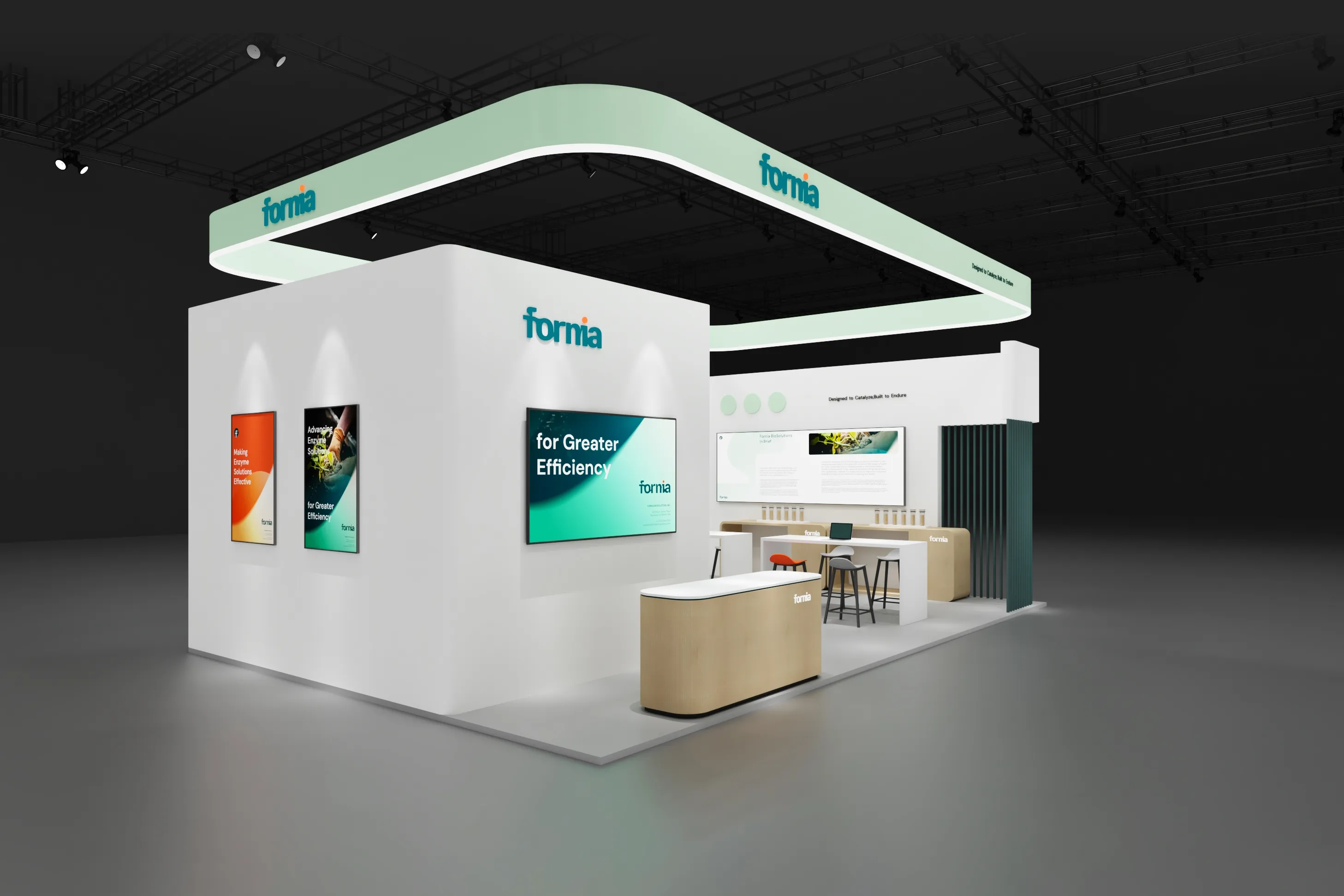
The connected lowercase wordmark and cell-derived “F” symbol turn enzymatic flow into a distinctive visual signature. Coral accents add energy and warmth, while a disciplined application system gives Fornia a credible voice across technical literature, sales materials and international B2B communication.
RDA helps biotechnology and life sciences companies translate specialist knowledge into credible brands for investors, partners and global customers.