Healthcare and Wellness Branding Built Around Care and Trust
Lansidai Healthcare and Wellness Brand Identity
Lansidai is a healthcare and wellness service brand built around care, protection and professional trust. Its former identity carried emotional value but was too figurative and complex for digital use or future service expansion. RDA simplified the care symbol into a balanced geometric mark and developed a pale cyan-blue identity inspired by the Chinese idea that blue is derived from indigo, a metaphor for renewal and growth. The system combines a responsive logo, grid-based typography, packaging and retail applications to create a warmer, clearer and more scalable brand presence.
The project shows how healthcare branding can make an intangible promise of care visible across customer touchpoints. Rather than treating the logo as decoration, RDA used it as the organising principle for the wider wellness brand identity.
- Brand Strategy and Identity
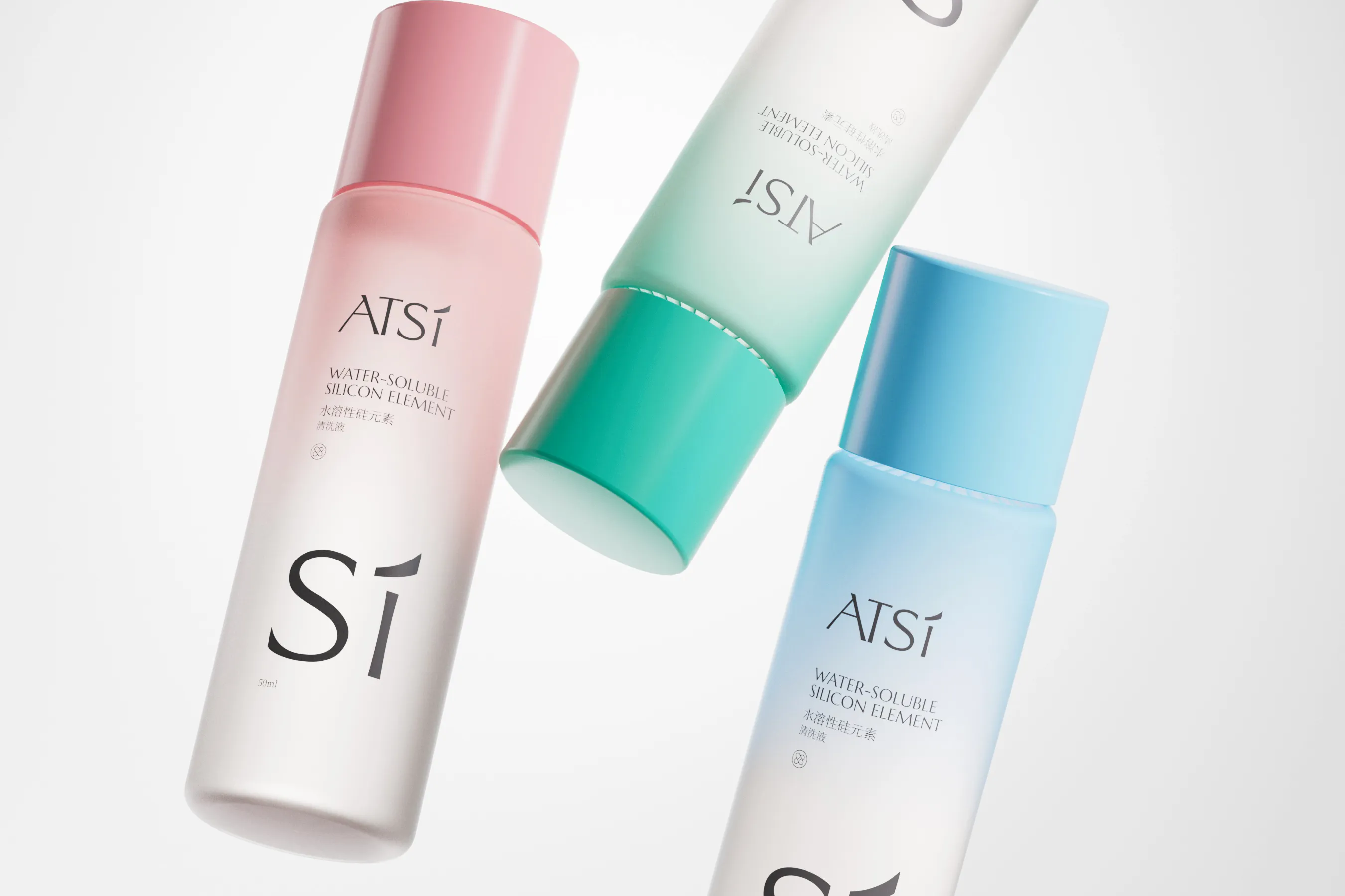
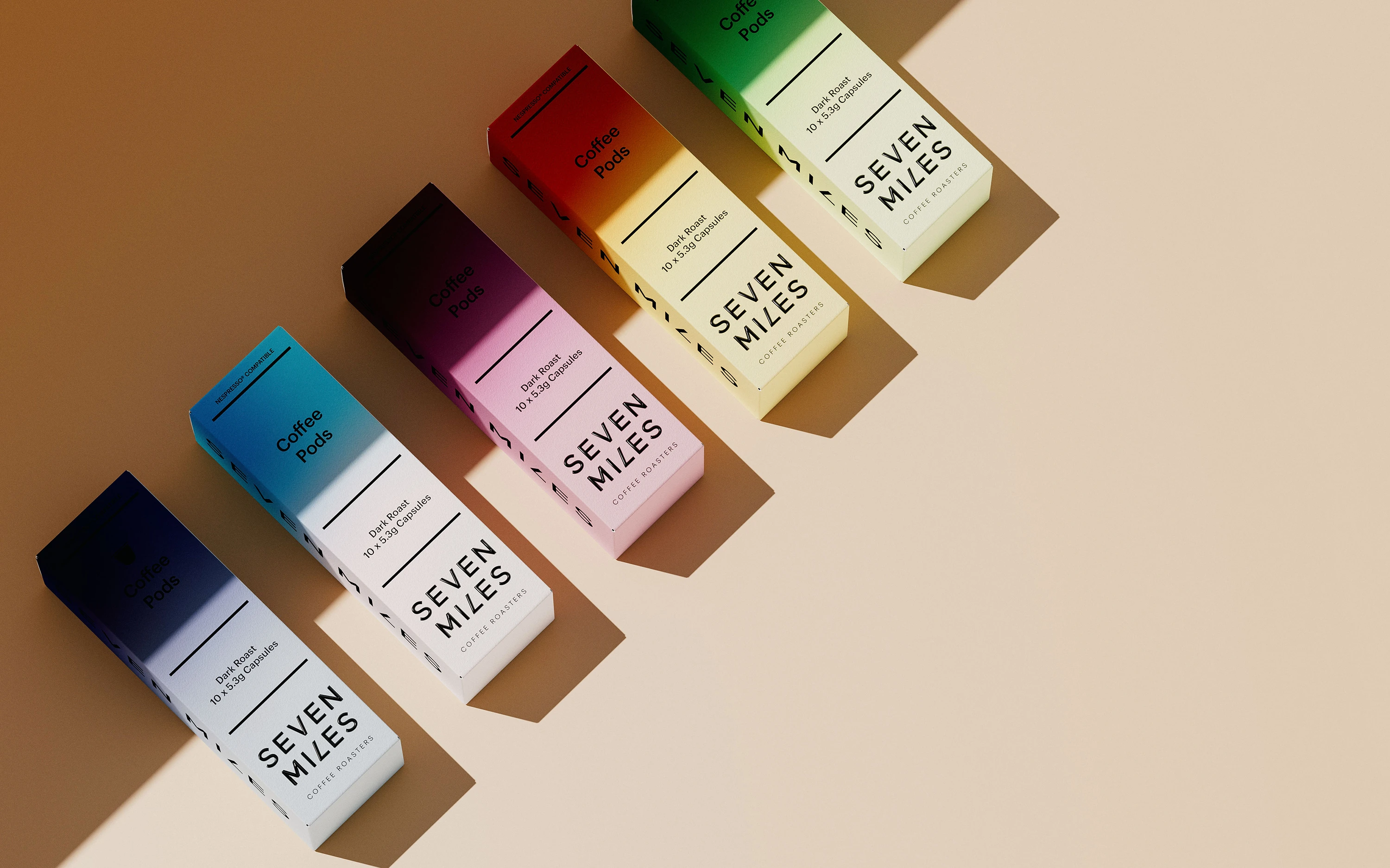
- Packaging Design
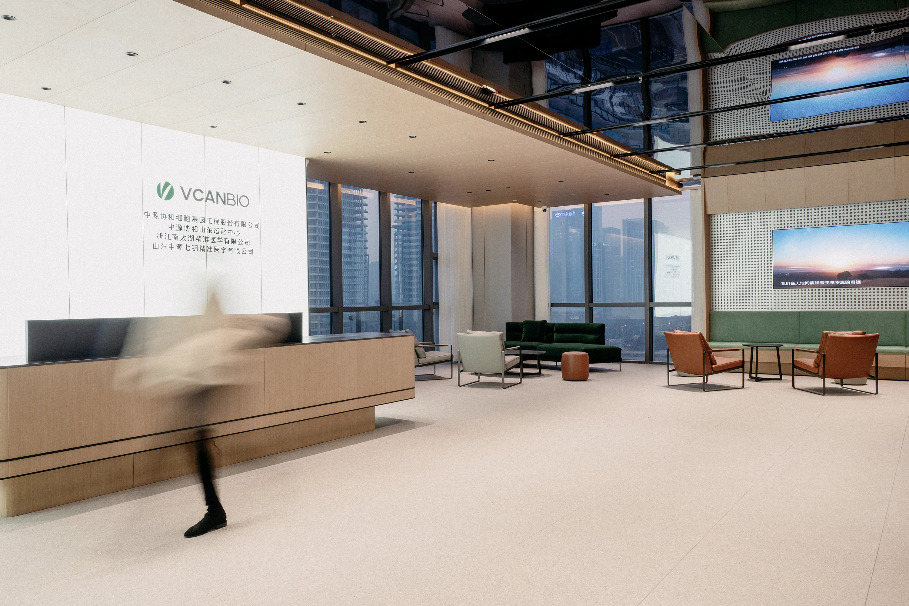
- Retail Space Design


Background
As a long-standing symbol of care and protection, Lansidai carries deep emotional resonance. However, its previous identity lagged behind modern visual and digital expectations. The brand sought a comprehensive upgrade to enhance recognizability, adapt to digital contexts, and build a forward-looking visual strategy.
The previous identity carried emotional meaning but lacked clarity at small sizes and across digital interfaces. The rebrand began by identifying care, reassurance and adaptability as the qualities the system needed to express.


Challenge
The challenge was to go beyond surface-level redesign. The goal was to create a universally adaptable and emotionally intelligent symbol, while preserving the brand’s original spirit. The previous identity was too figurative and structurally complex, limiting its clarity and digital adaptability.
The task was to preserve familiarity while removing literal detail. The new symbol needed to work for healthcare services, product packaging, retail environments and future sub-brands without losing warmth.


Solution
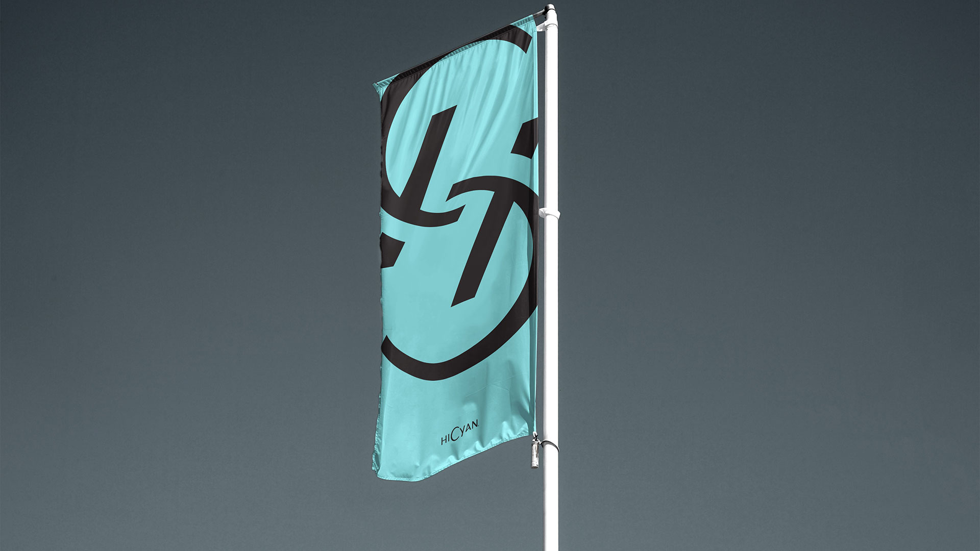
RDA reimagined Lansidai brand using minimal geometry, creating a soft, balanced, and emotionally charged visual language. The new pale cyan-blue embodies warmth and openness, while echoing the Eastern philosophy of evolving from tradition. A sans-serif typeface enhances clarity and adaptability. This systemized visual identity ensures coherence across services, products, and future sub-brands.
Rounded geometry, a cyan-blue palette and a custom wordmark created a calm, contemporary identity. A modular system then extended the same visual logic across print, digital and spatial applications.


Empower Your Brand
Starting Now.
RDA specializes in brand identity, commercial space design, and digital marketing with a focus on essentialism and international design aesthetics. We create emotionally resonant brands that drive business success. Beyond design solutions, we uncover brand potential through strategic positioning and innovation, delivering lasting value in competitive markets. Whether domestic or global, RDA offers expertise to shape a promising future for your brand. Contact us to start your branding journey.
RDA helps healthcare and wellness organisations turn trust, expertise and care into coherent brand identities across physical and digital touchpoints.