A Natural Rhythm for Lefan Yoga
Lefan Yoga Brand Design
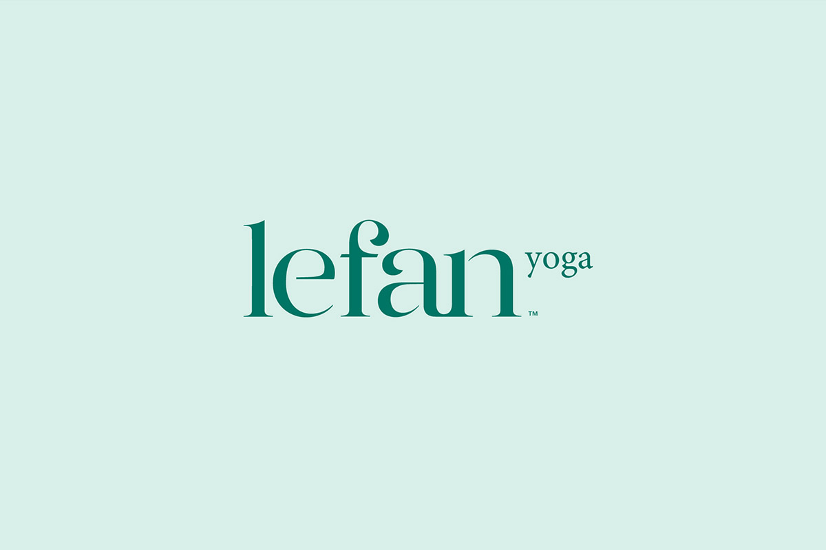
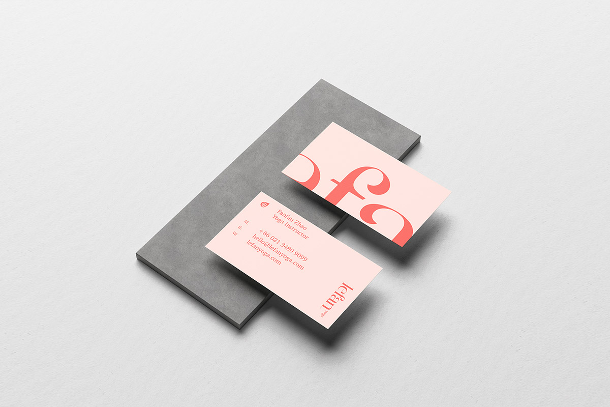
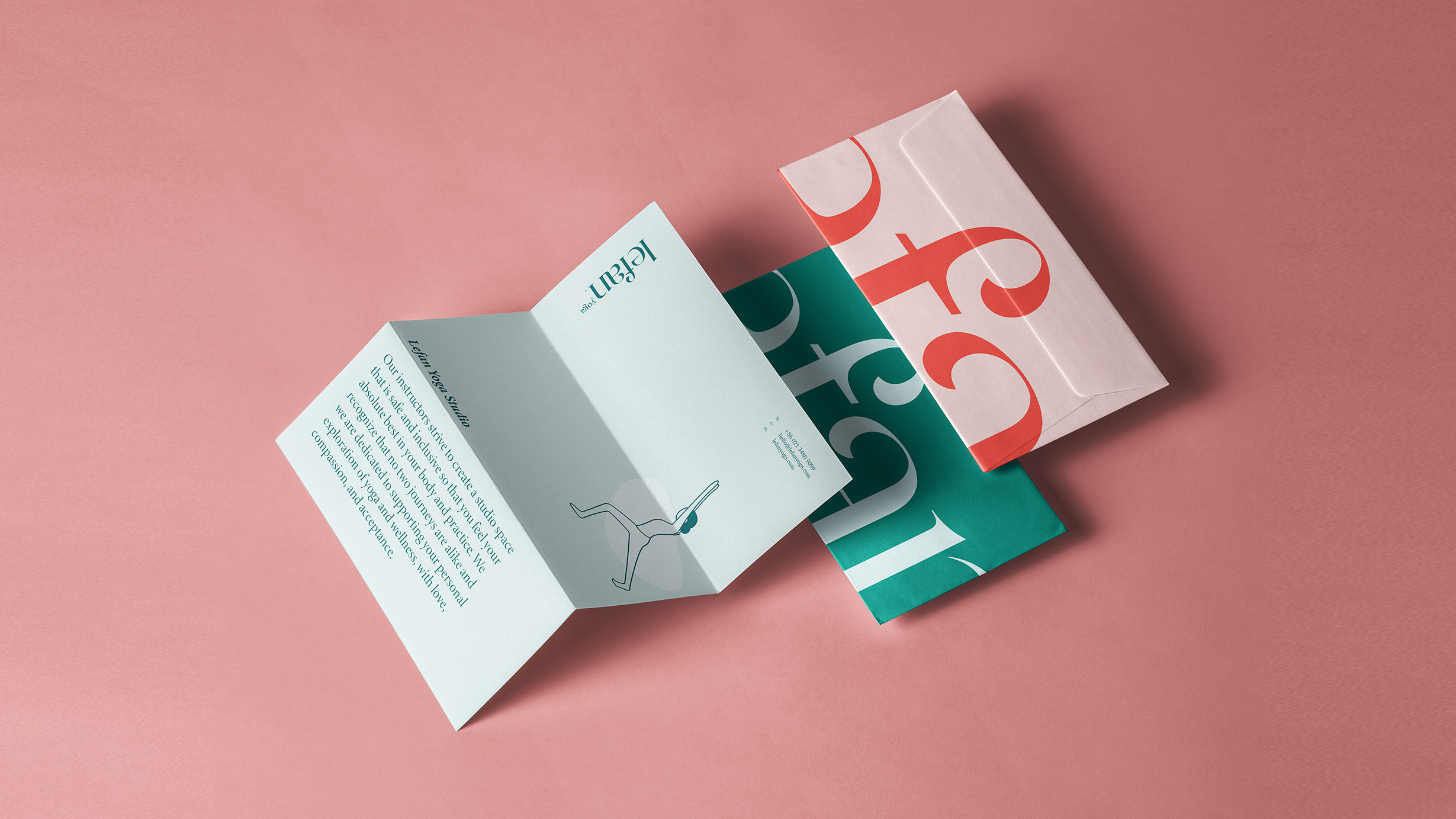
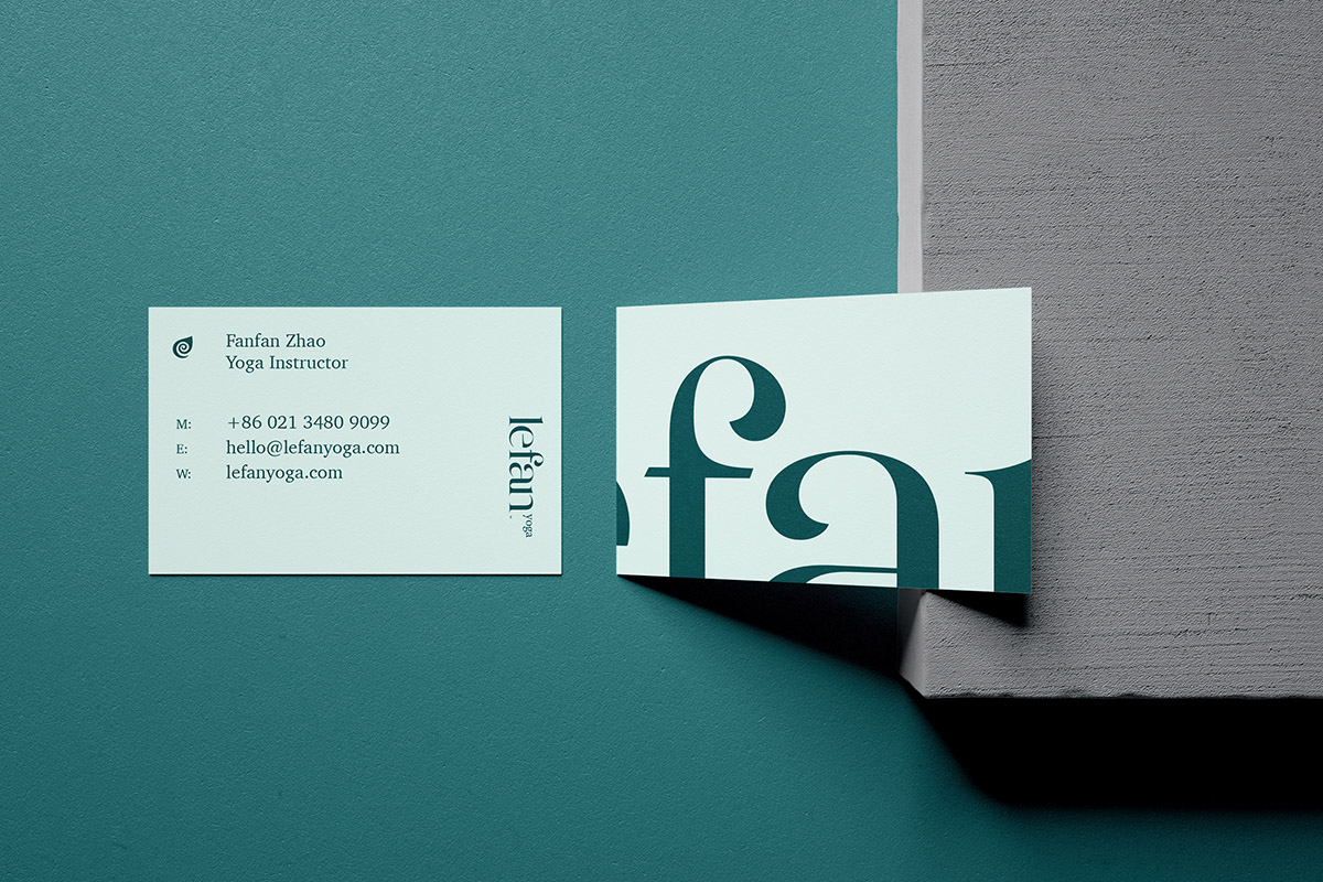
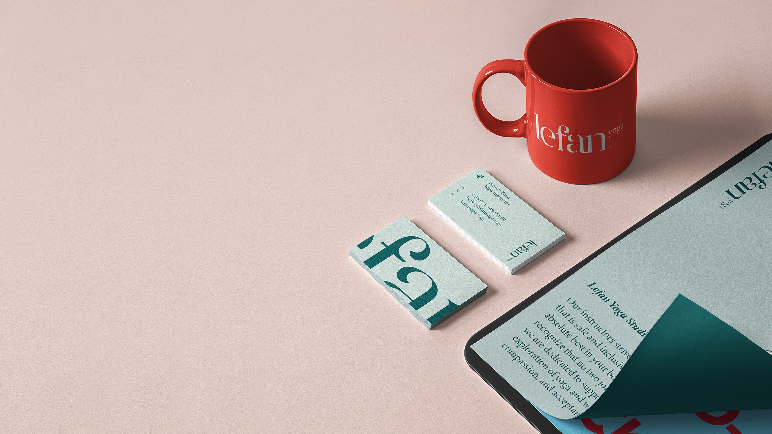
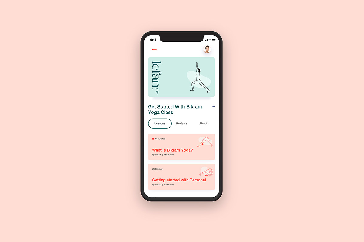
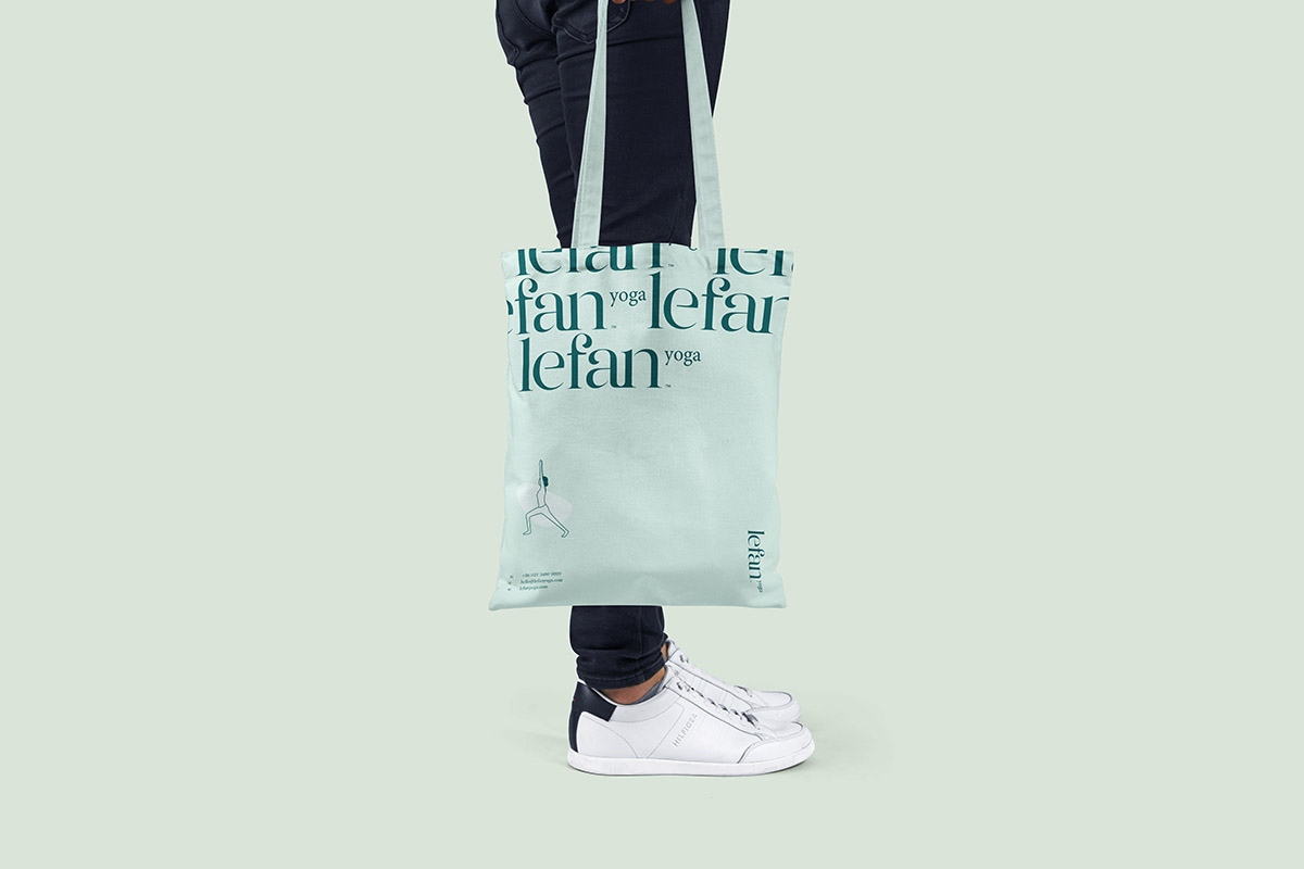
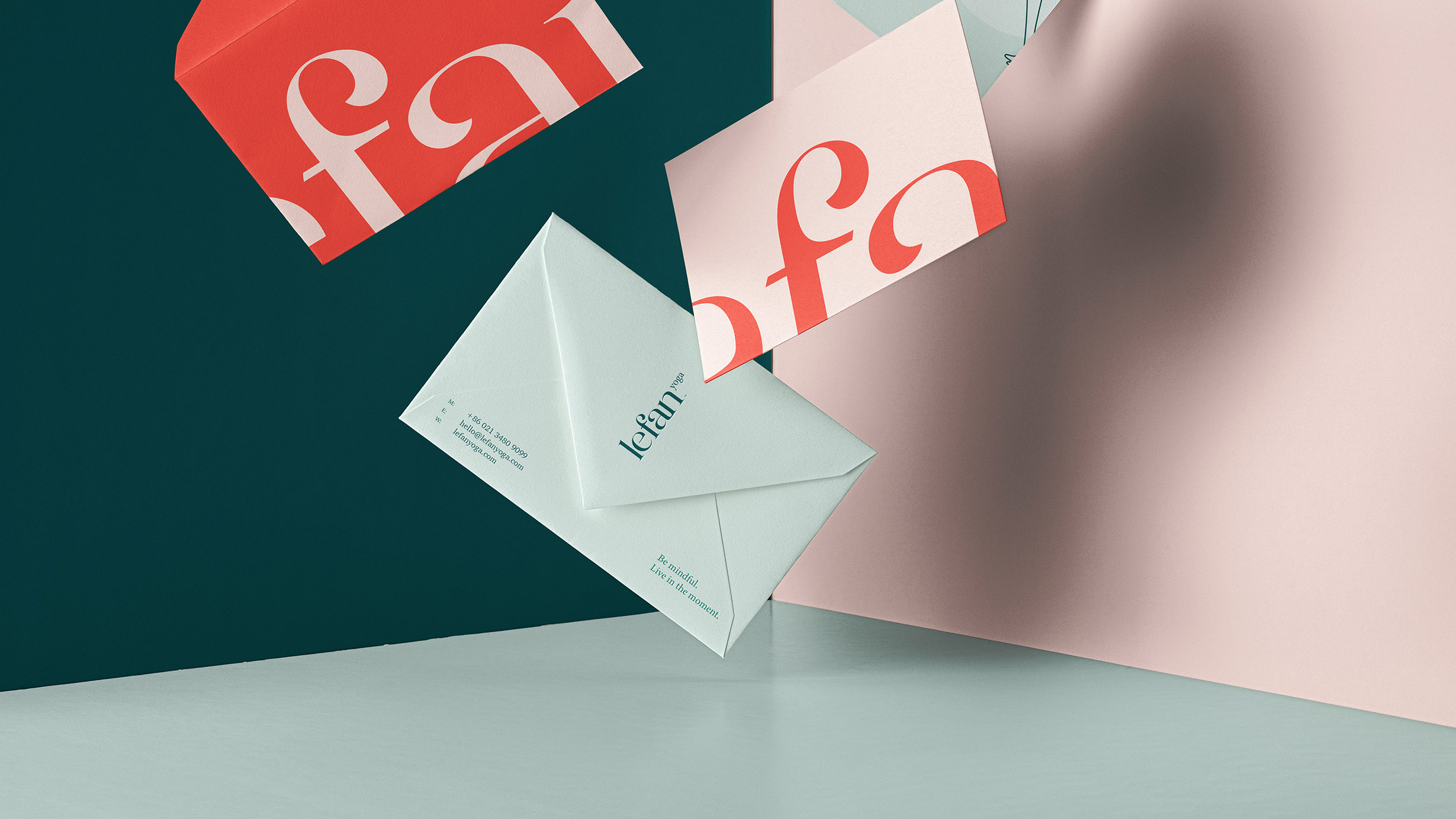
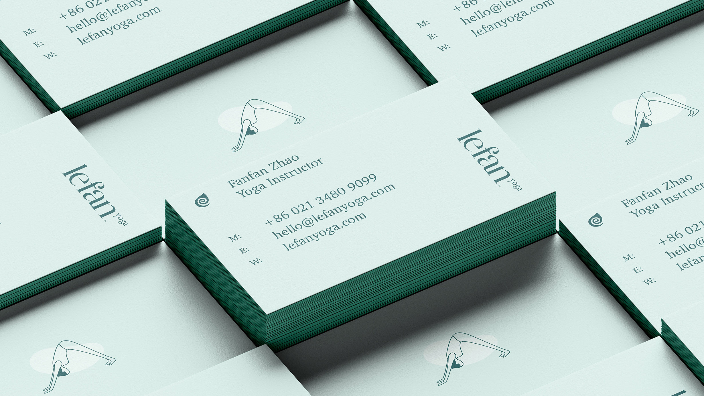
Lefan Yoga is a lifestyle built around balance, breath and a closer relationship with the everyday. RDA developed a wellness brand identity that carries that rhythm across the mark, graphic system, products, digital touchpoints and space.
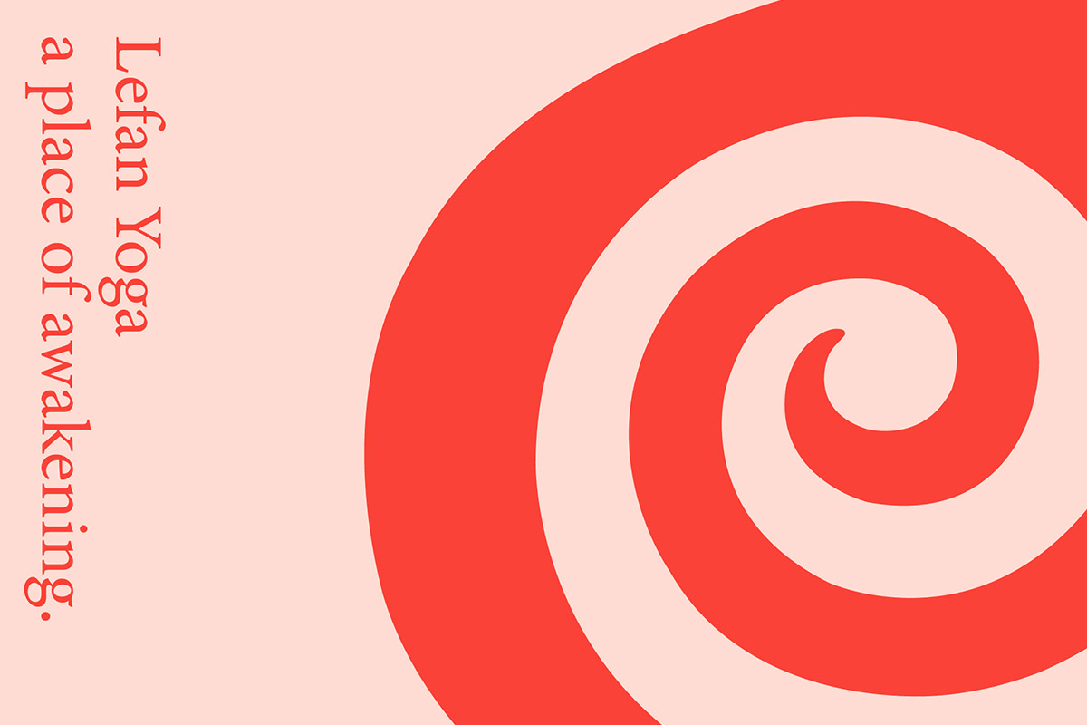
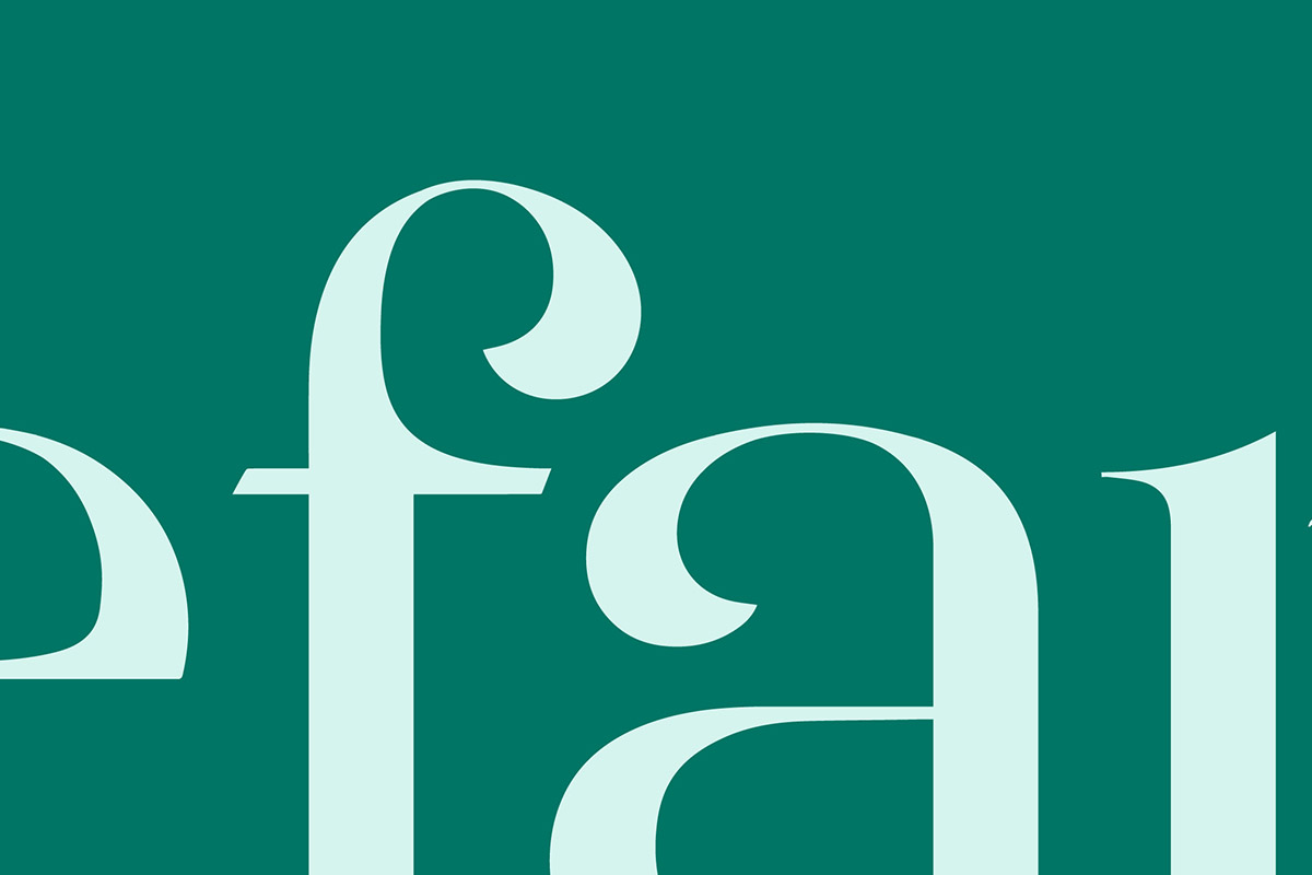
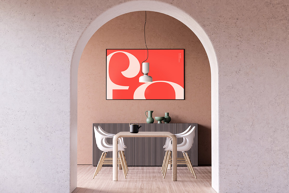
A quiet symbol, organic graphic language and measured typography create a flexible system. It gives classes, products and environments a shared atmosphere while leaving room for personal practice.
- Brand Strategy
- Wellness Brand Identity
- Service Experience
- Packaging & Space
Background
The identity needed to feel calm without becoming passive, and contemporary without losing its connection to nature. Every touchpoint had to support the same sense of attention and ease.
A quiet symbol, organic graphic language and measured typography create a flexible system. It gives classes, products and environments a shared atmosphere while leaving room for personal practice.
Challenge
Lefan Yoga is a lifestyle built around balance, breath and a closer relationship with the everyday. RDA developed a wellness brand identity that carries that rhythm across the mark, graphic system, products, digital touchpoints and space.
A quiet symbol, organic graphic language and measured typography create a flexible system. It gives classes, products and environments a shared atmosphere while leaving room for personal practice.