Restaurant Branding Rooted in Cantonese Food Culture
Lizhen Cantonese Restaurant Brand Identity
Lizhen is a Cantonese restaurant in Zibo that brings ingredients, techniques and culinary references from Guangdong to northern China. Its promise of “Authentic Guangdong Taste in Everyday Life” required a restaurant brand identity that could respect regional food culture while feeling current and approachable. RDA combined cultural cues with a restrained visual language to create a distinctive position in the local dining market.
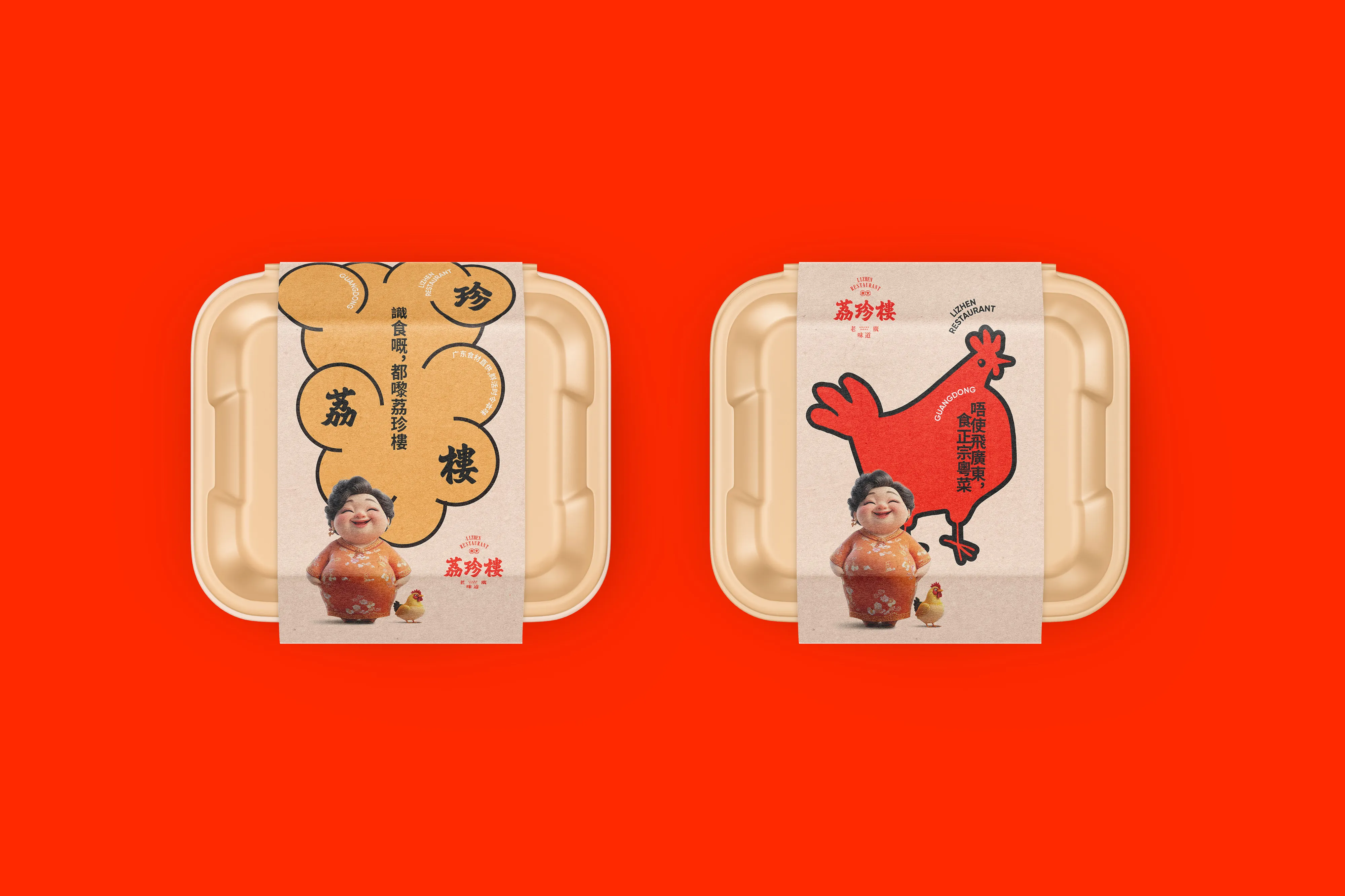
The identity connects the restaurant’s name, typography, colour and graphic applications across menus, packaging, communication and the dining environment. The result is a contemporary hospitality brand with a clear Cantonese character rather than a decorative imitation of tradition.
- Restaurant Brand Strategy
- Visual Identity Design
- Brand Communication and Applications


Background
Located in Zibo, Lizhen Cantonese Restaurant aims to bring authentic flavors of Guangdong to the local dining scene. With a commitment to the philosophy of “Everyday Life, Authentic Guangdong Taste,” Lizhen not only preserves culinary tradition through ingredients and technique but also seeks to express its brand culture through thoughtful design. The restaurant envisioned a space where heritage and modernity coexist seamlessly.
Lizhen’s offer begins with authentic ingredients and cooking methods from Guangdong. The brand identity needed to make that provenance visible while remaining welcoming to a northern Chinese dining audience.


Challenge
The key challenge for RDA was to maintain the authenticity of Cantonese culture while creating a brand identity that feels both modern and regionally relevant. Cantonese cuisine carries deep heritage, but its subtleties can be lost on northern audiences. The task was to translate “authenticity” and “quality” through visual and spatial language, ensuring cultural richness is both accessible and compelling.
The challenge was to avoid familiar decorative clichés and create a contemporary Cantonese restaurant identity that could work across menus, packaging, signage and customer communication.


Solution
RDA created a brand identity that merges the elegance of Lingnan calligraphy with clean, modern typography. The space design blends industrial aesthetics with traditional Chinese detailing—contrasting wood textures, metal elements, and decorative patterns. A green-and-red color palette symbolizes freshness and energy. The result is a brand system that visually communicates both tradition and innovation.
A confident typographic mark, expressive colour palette and culturally grounded graphic language give Lizhen a distinctive position in contemporary Cantonese dining. The system carries naturally across menus, packaging, signage and guest touchpoints, linking regional food culture with a modern restaurant experience.
RDA helps restaurant and hospitality brands turn culinary positioning into coherent identities across communication, packaging and physical customer experience.