

A visual language for German kitchen architecture.
Poggenpohl kitchen brand visual communication design
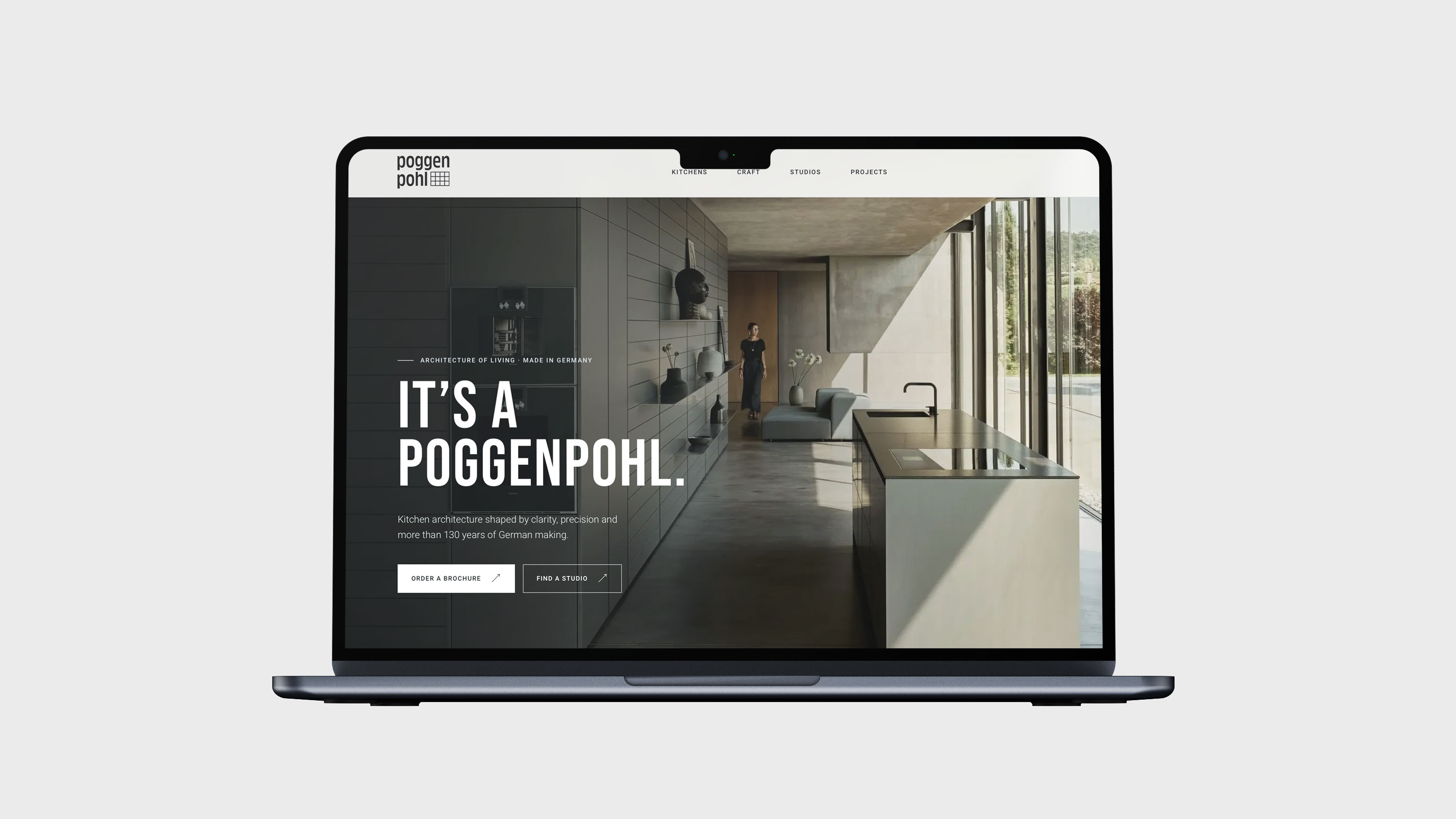
Founded in Germany in 1892 by master carpenter Friedemir Poggenpohl, the brand has grown from a small furniture workshop into a reference for architectural kitchens. Its long-standing idea of “kitchen architecture” brings together the structure of a room, the precision of German making and the rituals of everyday life. For Poggenpohl, we shaped a visual communication system that carries this heritage into digital and editorial touchpoints. From the website to the product catalogue, every detail is designed to make the brand’s material clarity, craftsmanship and architectural attitude tangible.
Founded in Germany in 1892 by master carpenter Friedemir Poggenpohl, the brand grew from a small furniture workshop into a reference for architectural kitchens. Its enduring idea of “kitchen architecture” brings together architectural thinking, contemporary design, German craftsmanship and the rituals of everyday life. Based on this heritage, RDA shaped a clear and restrained visual communication system across the website, product catalogue and digital touchpoints, keeping the product, space and brand story coherent throughout.
- Brand Communication
- Website Design
- Editorial Design
- Product Catalogue


Background
Poggenpohl's products are defined by precision, material sensitivity and a clear architectural attitude. The challenge was to make these qualities legible across the brand's communication, without reducing them to a decorative style.
A kitchen is more than a functional product. It is a composition of spatial order, material sensibility and everyday life. We used Poggenpohl's German quality and architectural character as the starting point for a unified communication language across the website and product catalogue.
Challenge
The challenge was to translate Poggenpohl's long-standing idea of kitchen architecture into a clear visual language across the website and product catalogue. The system needed to keep the brand's material precision visible while allowing each touchpoint to remain calm, spacious and easy to navigate.
The challenge was to translate Poggenpohl's long-standing idea of kitchen architecture into a clear visual language across the website and product catalogue. The system needed to keep the brand's material precision and German craftsmanship visible while allowing each touchpoint to remain calm, open and easy to understand.


Approach
We connected editorial rhythm, product imagery and digital navigation into one restrained system. The layout gives the kitchen architecture room to breathe, while a precise typographic and image language keeps the brand recognisable from one touchpoint to the next.
We connected information structure, editorial rhythm and product imagery into one restrained system. Space, proportion, typography and image direction work together to create a quiet but precise sense of quality, allowing the brand expression to serve the products themselves.
Experience
The resulting system connects product imagery, editorial rhythm and digital navigation into one coherent brand experience. It gives the kitchen architecture space to speak, while keeping the identity clear across every designed touchpoint.
The resulting system connects product imagery, editorial rhythm and digital navigation into one coherent brand experience. It gives kitchen architecture space to speak while keeping the identity clear across every designed touchpoint.