Art Education Branding Designed to Inspire Creativity
WOA (World of Art) is an art education brand offering creative programmes for different age groups alongside exhibitions and cultural activities. For its tenth anniversary, the organisation needed a renewed identity that could communicate imagination, growth and the lasting value of art education.
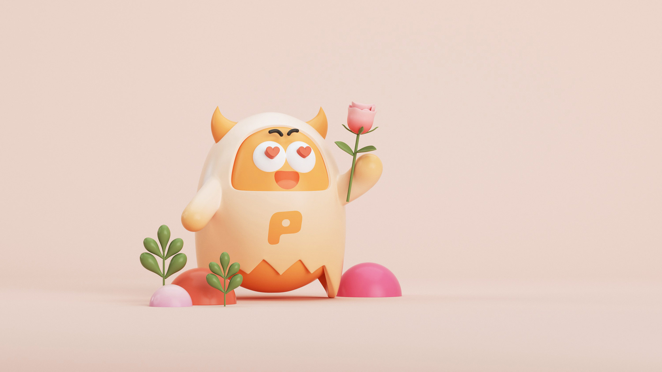
RDA reinterpreted the egg as a symbol of creative potential and new beginnings. The idea became a flexible identity across learning communication, exhibition materials and educational spaces, helping WOA feel welcoming to students and families while retaining the credibility of an established arts organisation.
- Art Education Brand Identity
- Learning Communication Design
- Education Space Identity


For a decade, WOA has used art courses and exhibitions to make creative learning accessible to students of different ages.


The tenth-anniversary renewal needed to respect WOA's established recognition while giving the education brand a more open and contemporary voice.


The egg-inspired symbol represents creative potential and becomes a flexible graphic device across course communication, exhibitions and learning environments.